
Summary
In this essay, we will briefly summarise the analysis in our “Has poor station quality biased U.S. temperature trend estimates?” paper, which we have submitted for peer review at the Open Peer Review Journal.
A recent voluntary project, called the Surface Stations project, led by the meteorologist and blogger, Anthony Watts, has found that about 70% of the weather stations in the U.S. Historical Climatology Network are currently sited in locations with artificial heating sources less than 10 metres from the thermometer, e.g., buildings, concrete surfaces, air conditioning units. We found that this poor station quality bias increased the mean U.S. temperature trends of the raw records by about 32%.
Some researchers have argued that these biases have been removed by a series of artificial “homogenization” adjustments which had been applied to one version of the U.S. Historical Climatology Network. However, we found that these adjustments were inappropriate and led to “blending” of the biases amongst the stations.
While this blending reduced the biases in the most biased stations, it introduced biases into the least biased stations, i.e., the adjustments just spread the biases uniformly between the stations, rather than actually removing the biases.
It seems likely that similar siting biases also exist for the rest of the world. So, poor station quality has probably led to an exaggeration of the amount of “global warming” since the 19th century.
Introduction
We have written a series of four papers assessing the reliability of the weather station records which are used for calculating global temperature trends. It is these weather station records which are the main basis for the claim that there has been “unusual global warming” since the Industrial Revolution. But, unfortunately, most of these records were not meant for studying long term temperature trends, and so they are often affected by various non-climatic biases. Many of these biases introduce artificial warming trends into station records. For this reason, some fraction of the apparent “global warming” we have heard so much about is probably not real, but an artefact of the non-climatic biases.
So, before we can start attributing any of the alleged “unusual global warming” to “man-made global warming”, it is essential to first figure out how much of the apparent trends are real, and how much are a result of the non-climatic biases.

In three of our papers, we discuss one of the most significant non-climatic biases – urbanization bias – and we find that urbanization bias has introduced a strong warming bias into the current global warming estimates. See here for a summary of these papers.
In this essay, we will summarise the findings of our fourth paper, in which we investigated the effects of a different type of non-climatic bias, siting biases (or station quality biases). These are biases which are introduced by inappropriate siting of the weather stations. As we will see below, these siting biases seem to have also introduced a warming bias into the global warming estimates – at least for the U.S. region, which we studied.
When these biases are taken into account, the “unusual global warming” that everybody has become so worried about becomes a lot less “unusual”. In fact, it seems likely that global temperatures were just as warm in the 1930s-1940s, when CO2 concentrations were still nearly at pre-industrial levels. If global temperatures were just as warm in the early 20th century as they are now, then there is no need to blame the recent global warming on CO2!
As we mentioned in our other summary essays, we have submitted all of our papers for peer review at the Open Peer Review Journal. We have chosen to use this new open peer review process, because we believe that it should be more thorough and robust than the conventional closed peer review system. Any readers who want to read our papers or have some technical comments/criticism of our analysis are welcome to join the peer review process here. But, for the benefit of our readers who want a less-technical summary of our main findings, we have written this essay.
The Surface Stations project
The analysis for our paper is based on the results of a recent survey of U.S. Historical Climatology Network stations by the Surface Stations project. This was a volunteer-run project led by the meteorologist, Anthony Watts, who is based in California (USA), and runs one of the most popular climate blogs, Watts Up With That.
Watts has more than 25 years of experience as a broadcast meteorologist on both TV and radio, and at one stage had been a strong supporter of man-made global warming theory – he even tried to promote local campaigns for carbon footprint reductions on his shows. But, when a colleague of his, Jim Goodridge, described the urbanization bias problem to him, Watts started to become sceptical about the reliability of the current “global warming estimates”.
Here’s a 10 minute interview with Anthony Watts for PBS News Hour in September 2012:
In 2007, Watts began wondering how reliable the individual station records were. He decided to visit three of his local weather stations, and was shocked to discover that in two of the three cases, the weather station was set up in a remarkably poor manner.
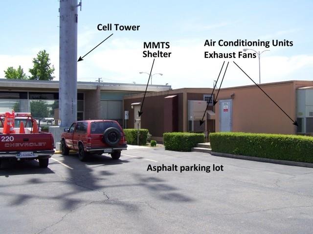
In one case, the thermometer was surrounded by heat-producing radio electronics. In the other case, the thermometer screen was only a few metres from several different heat sources. The screen was right beside an asphalt car park, and if you have ever touched asphalt on a sunny day, you will probably have noticed it gets much warmer than grass. It was also a few metres from the exhaust fans from air conditioning units of a nearby building, and as Watts was standing by the thermometer, he could even feel warm exhaust air from the nearby cell phone tower equipment sheds blowing past him!
It is quite likely that at least some of these irregular siting conditions could have introduced non-climatic biases into the station records, and it would not be surprising if the net effect of these biases was to introduce an artificial warming bias into the global temperature trend estimates.
With this in mind, Watts realised that it was very important to physically check the siting of those stations being used for analysing global temperature trends before the estimates of “global warming” could be treated as real. Surprisingly, nobody seemed to have done this! The groups calculating the global warming trends had all just been assuming the stations were ok, without checking.
As Watts was based in the U.S., and the U.S. component of the “Global Historical Climatology Network” is generally considered one of the most reliable, he decided to focus on the stations in the U.S. component. This component comprises 1,221 stations and is known as the U.S. Historical Climatology Network (or USHCN) dataset.
Over the course of the next few years, Watts inspected a large number of stations, and recruited a team of more than 650 volunteers through his Surface Stations website to inspect the rest. By spring 2009, more than 860 stations had been inspected, photographed and evaluated. At this point, he published an interim report which revealed that his initial concerns about the station sitings were justified – Watts, 2009.
The vast majority of the stations that had been evaluated had at least some serious siting problems. Thermometer stations are supposed to be located on a flat and horizontal grass or low vegetation surface, ideally more than 100m from any artificial heat sources. However, Watts and the Surface Stations team found that only 1% of the stations they surveyed met these requirements!

The most frequent siting issue was that the thermometer was beside one or more artificial heating or radiative heat surfaces. These nearby heat sources, such as concrete and asphalt, can heat nearby air. By doing so, this could bias thermometer readings upwards.
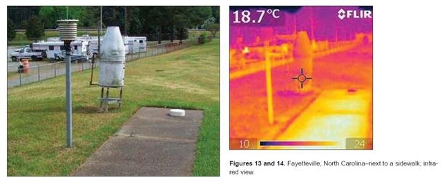
We can get a feel for this by looking at the infrared photography in Figures 2, 3 and 4. For instance, in Figure 3, we can see that on a cold day, the power transformer beside the Glenns Ferry, Idaho weather station can be considerably warmer than its surroundings.

Meanwhile, in Figure 4, we can see that the concrete building wall facing the Perry, Oklahoma fire department weather station is noticeably warmer than its surroundings. This heat source could easily heat up the surrounding air on some days, and since the thermometer station is close by, this could introduce a warm bias into the thermometer record.
Some stations had multiple siting problems, such as the Urbana, Ohio station shown in Figure 5. The Urbana station is located at a wastewater treatment plant and is within a few metres of several potential heat sources.
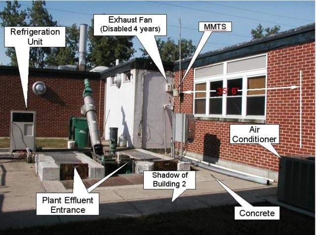
First of all, the thermometer (labelled “MMTS” in the photo, after Minimum-Maximum Thermometer System) is placed over a concrete surface, rather than on a grass lawn. It is also surrounded by several buildings. Both of these factors would create an artificial “micro-climate”, unrepresentative of the climate of the area. In addition, the station is beside an air conditioning unit, a refrigeration unit and the plant effluent entrance.
It is also beside an exhaust fan, although this had been disabled for 4 years by the time Watts visited it. Any of these artificial machines and features could have biased some of the daily temperature readings, and thereby introduced biases into the long-term station record.
It is worth having a quick look through the Watts, 2009 report, which shows photographs of some of the more problematic stations.
In 2011, Watts (along with several other authors) published the results of the survey in the article Fall et al., 2011 (Abstract; Google Scholar access). Out of the 1,221 stations in the U.S. Historical Climatology Network, they had determined ratings for 1,007 of them (82.7%).
To rate the quality of the station siting characteristics, the Surface Stations group used the same rating system that NOAA’s National Climatic Data Center used when they were setting up the U.S. Climate Reference Network (or USCRN). This was a high quality weather station network, founded in 2003. The National Climatic Data Center are the same organisation that maintain the Global Historical Climatology Network and U.S. Historical Climatology Network datasets. So, it seems reasonable to assess the quality of the stations in the U.S. Historical Climatology Network using the same rating system.
Each station was given one of five possible ratings, ranging from most reliable (Rating 1) to least reliable (Rating 5), depending on the distance of the station from nearby artificial heating sources.
However, only a few of the stations were of a high enough quality to be given a Rating of 1. For this reason, in our analysis, we grouped the stations with Ratings of 1 and 2 into the same subset. This gave us four subsets:
- Good quality – Ratings 1 or 2
- Intermediate quality – Rating 3
- Poor quality – Rating 4
- Bad quality – Rating 5
Let’s have a look at some examples of stations from each of these four subsets.

Fallon, Nevada (ID=262780) is an example of one of the Good quality stations (Rating = 2). The station is located on fairly flat ground with natural vegetation and is more than 30 metres from concrete, asphalt, or any other artificial heat source.
Stations such as this one should be reasonably unaffected by siting biases. Before the Surface Stations survey was carried out, most researchers analysing the climate records probably would have assumed all stations were of this quality. However, as we will see below, these Good quality stations are surprisingly rare in the U.S. Historical Climatology Network.

The Boulder, Colorado weather station (ID=050848) is an example of an Intermediate quality station (Rating = 3). Although the station is located on fairly flat and short grassy surface, it is less than 30 metres from a large building with accompanying car park.
It may well be that the building and car park is too far away to influence the thermometer record. But, they are too close to rule out the possibility of an influence. For this reason, the station only received an Intermediate rating.
It is likely that by carefully assessing each of the Intermediate stations, quite a few stations could be identified which are unaffected by siting biases. Indeed, the Muller et al., 2011 (submitted for peer review in 2011, pre-print version) analysis of the Surface Stations results (which we will discuss later) assumed that the Intermediate stations were relatively unbiased. However, only about a fifth of the stations surveyed by the Surface Stations group received this rating. As we will see, the majority of the stations received a worse rating.

The Napa State Hospital, California, station (ID=046175) is an example of a Poor quality station (Rating = 4). The thermometer (a Minimum-Maximum Thermometer System, or MMTS) is correctly located on a flat, grassy lawn, and the lawn is cut.
But, it is less than 10 metres from:
- The hospital building;
- An asphalt drive-way;
- The exhaust from an air-conditioning unit.
All of these factors could potentially have introduced non-climatic biases into the thermometer record, and thereby made the record unreliable.
The Surface Stations survey revealed that the majority of the stations in the U.S. Historical Climatology Network are of a similarly poor quality.
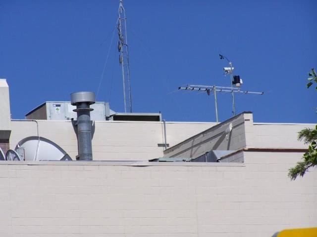
The Santa Rosa, California station (ID=047965) is one of the Bad quality stations (Rating = 5). Rather than being located in a flat, open vegetated field far from any buildings or artificial heating sources, it is actually located on the roof of a building!
Spots such as this often result in very pronounced “microclimates”, which are quite unrepresentative of the actual climate of the surrounding area. While badly-sited stations like this one will probably still detect the main climatic trends of the region, their thermometer records are also likely to be strongly biased by the artificial temperatures of the thermometer’s immediate surroundings.

The results of the Surface Stations survey are summarized by the pie chart in Figure 10. As we mentioned above, only a few stations were actually of a Good quality (8%), and only 1% of the stations merited the top rating of 1.
In itself, this is a serious concern. But, even if we assume that the Intermediate quality stations are relatively unaffected (as Muller et al., 2011 did), that only counts for an extra 22%.
70% of the stations in the U.S. Historical Climatology Network are of either a Poor quality (rating 4 = 64%) or a Bad quality (rating 5 = 6%)!
Although we can take some comfort from the fact that the worst rated stations only comprise 6% of the network, this is still an appalling result. Rather than poor siting issues being an occasional problem for the U.S. Historical Climatology Network, as most researchers would probably have assumed, it turns out that the network is plagued by them!
In response to the preliminary Watts, 2009 report, NOAA’s National Weather Service Forecast Office carried out their own independent assessment of 276 of the stations that the Surface Stations team had rated. Although they probably would have liked to show that Watts was exaggerating, and that their stations were ok, their assessment actually confirmed the findings of the Surface Stations project – see Menne et al., 2010 (Abstract; Google Scholar access). After these two independent surveys, it is now generally accepted that poor siting conditions are a serious problem for the U.S. Historical Climatology Network.
However, there has been considerable controversy over exactly what biases this poor siting has introduced to the U.S. temperature record. As we will discuss in the next section, several groups have used the station ratings from the Surface Stations project to evaluate the sign and magnitude of these siting biases, but each study has come to a different conclusion.
Previous estimates of the biases introduced by poor station quality
At the time of writing, there have been at least seven different studies assessing the results of the Surface Stations survey, including ours:
- Watts, 2009 (non peer-reviewed report, .pdf available here)
- Menne et al., 2010 (Abstract; Google Scholar access)
- Fall et al., 2011 (Abstract; Google Scholar access)
- Muller et al., 2011 (submitted for peer review in 2011, pre-print available here)
- Martinez et al., 2012 (Abstract)
- Watts et al., 2012 (still in preparation at time of writing, draft version available here)
- Connolly & Connolly, 2014 (our paper, currently under open peer review – available here)
Although the Watts, 2009 report speculated that the inadequate station siting of the U.S. Historical Climatology Network could have introduced a warming bias into the current U.S. temperature trends, it did not attempt to quantify what the net bias (if any) was. However, the other studies have attempted to quantify the bias.
Before we discuss the findings of these different studies, it is important to briefly discuss the different versions of the U.S. Historical Climatology Network. When the NOAA National Climatic Data Center were constructing the U.S. Historical Climatology Network, they realised that individual station records often contain non-climatic biases. They developed a series of “homogenization” techniques in an attempt to reduce the effect of these biases. However, they recognised that all homogenization techniques are imperfect, and that some users of their dataset would prefer to work with the non-homogenized data.
With this in mind, NOAA National Climatic Data Center currently provide three different versions of the U.S. Historical Climatology Network on their website.
- The “raw” dataset is the unhomogenized version. In this essay, we will refer to this as the “Unadjusted” dataset.
- The “tob” dataset has had a series of corrections applied to each station record to take into account documented changes in the “Time Of Observation”, i.e., the time of day in which station observers reset their minimum-maximum thermometers. We will refer to this as the “Partially adjusted” dataset.
- The “FLs.52i” dataset has been corrected for “Time Of Observation” changes, but has also had a series of adjustments applied to it, in an attempt to account for non-climatic “step change” biases. In this essay, we will call this the “Fully adjusted” dataset
The differences between these datasets are important, because each of the seven studies has placed a different focus on each of the datasets. This contributed to each of the studies reaching quite different conclusions about the net effect of the siting biases.
Menne et al., 2010 suggested that the National Climatic Data Center’s step-change adjustments had already accounted for any biases which poor siting may have introduced. Moreover, they suggested that if there was any residual bias, it was probably a slight cooling bias!
Muller et al., 2011 found that the linear trends of the Unadjusted records for stations with Ratings 1, 2 or 3 were comparable to those of stations with Ratings 4 or 5, and that there was not much difference between estimates constructed from the Ratings 1-3 and Ratings 4-5 subsets of the USHCN. Therefore, they concluded that poor siting did not have much effect on the temperature trends.
Martinez et al., 2012 used the Surface Stations ratings in their analysis of temperature trends for the state of Florida (USA). For their study, they used the Fully adjusted dataset.
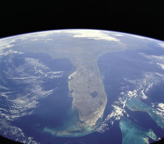
As they were only studying the trends for Florida, their study only involved 22 Historical Climatology Network stations. So, they were cautious about drawing definitive conclusions on the effects of poor station quality on temperature trends.
Nonetheless, they found the linear trends were different for the subsets of the worst rated (4 & 5) and best rated (1 & 2) over the two periods they considered, i.e., 1895-2009 and 1970-2009. From this they concluded that station quality does influence temperature trends. However, they were unclear as to the sign of this influence. For the 1895-2009 period, the poor quality stations showed a greater warming trend in the mean monthly temperatures than the good quality stations, while for the 1970-2009 period, the reverse applied.
Fall et al., 2011 agreed with Menne et al., 2010 that the National Climatic Data Center’s homogenization adjustments reduced much (although not all) of the difference between the good quality and poor quality subsets in the Fully adjusted datasets. But, they argued that a substantial bias could be found in the Unadjusted and Partially adjusted datasets.
Watts et al., 2012 argued that the original rating system used by Watts, 2009 was not rigorous enough, and they re-evaluated the station exposures using the recommendations of Leroy, 2010.
When they applied this new rating system to the stations, they found a greater difference between the poor quality and good quality stations than before (for the Unadjusted dataset), with the poorly sited stations showing more warming. They questioned the reliability of the National Climatic Data Center’s homogenization adjustments, and suggested that a combination of poor station exposure, urbanization bias and unreliable homogenization adjustments had led to a spurious doubling of U.S. mean temperature trends over the period 1979-2008.
Summary of previous studies
Two studies (Menne et al., 2010 and Muller et al., 2011) found that the poor station siting in the U.S. Historical Climatology Network didn’t really matter; one study (Watts et al., 2012) found that it has led to a strong warming bias; one study (Fall et al., 2011) found that it led to a substantial warming bias in the Unadjusted and Partially adjusted datasets, but not in the Fully adjusted datasets; while another study (Martinez et al., 2012) found that it had led to substantial biases, but was unsure what the net sign of those biases were.
Obviously, there is still considerable confusion over what effect (if any) the poor station siting problem has had on estimates of U.S. temperature trends. With this in mind, we decided to carry out our own estimates, which we discuss in the next section…
Our reanalysis
For our analysis of the siting biases, we downloaded the station ratings from the Surface Stations website, on 8th March 2012.
Ratings were available for 1007 of the stations (82.7%). We then divided those stations with ratings into four subsets, i.e., good quality, intermediate quality, poor quality and bad quality. For each of these subsets, we calculated the gridded mean temperature trends using the three different versions of the U.S. Historical Climatology Network dataset, i.e., the Unadjusted, the Partially adjusted and Fully adjusted versions. That gave us 12 different estimates for the U.S. temperature trends since 1895.
To calculate the gridded mean trends we first divided all stations into their corresponding subset based on their Surface Stations rating. We then converted all the station records into temperature anomalies relative to the 1895-1924 mean temperature for each station. For a station to be included, we required that it have at least 5 years of data in this 1895-1924 period.
Stations were then assigned to 5° x 5° grid boxes, and for each year, the mean temperature anomalies for the boxes were calculated as the simple mean of all stations in that box with data for that year. The mean U.S. temperature anomaly for each year was calculated as the area-weighted mean of all the grid box means.
Error bars correspond to twice the standard errors of the gridded means.
In our paper, we discuss in detail all 12 estimates, but for now let us consider the difference between the best-sited (“Good quality”) subset and the worst-sited (“Bad quality”) subset.
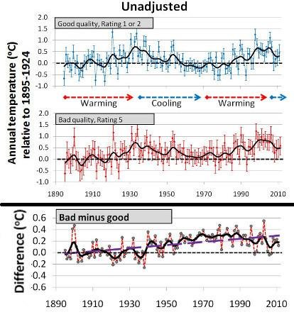
Figure 12 shows the trends for the Unadjusted dataset. At first glance, both subsets show fairly similar trends:
- 1890s-1930s: warming
- 1930s-1970s: cooling
- 1970s-2000s: warming
However, a closer inspection reveals that there are subtle, yet important differences.
As you can see from the bottom panel of Figure 12, there is a warming bias in the Bad quality subset, relative to the Good subset. This bias works out at about +0.27°C/century.
The effect of this bias is to make the recent decade seem to be the hottest decade on record for the U.S. in the Bad quality subset. In contrast, for the Good quality subset, the 1930s were just as warm as the 2000s.
Both subsets show a “warming” trend from the 1970s-2000s, but it is only in the Bad quality subset that this recent warming seems in anyway unusual. In the Good quality subset, the 1970s-2000s warming just seems to be part of a cyclical variation between periods of warming and periods of cooling. This suggests to us that the recent warming is just a natural phenomenon.
Perhaps if the temperature records were longer we might have also seen evidence of similar variations in earlier centuries…

In Figure 13, we show the linear trends over the period 1895-2011 of each of the subsets for all three datasets.
We also calculated the weighted mean linear trends. The weighted mean is simply the average trend of all the stations.
We must stress that linear trends are a very poor way of describing U.S. temperature trends, because as we saw for Figure 12, the actual trends are distinctly non-linear, i.e., they vary between warming and cooling periods!
If we calculate the linear trend for the Good subset over the entire 1895-2011 period, we would get a net “warming” trend. But, if we picked a different period, then we could get a different trend. For example, if we started in the 1930s, and finished in the 1970s, we would get a net “cooling” trend. Because the data goes through ups and downs, picking any period over the other can completely change the trend.
So, calculating linear trends is not appropriate for analysing non-linear data. Nonetheless, it does offer us a crude, but simple, way of comparing the different estimates.
In general, for the Unadjusted subsets, the linear trends increase as the station quality decreases, i.e., as we go from left to right.
This shows that poor siting does introduce a noticeable warming bias into the Unadjusted station records, as Watts had suggested when he started the Surface Stations project.
The time-of-observation adjustments that are used to make the Partially adjusted dataset increase the linear trends of all subsets. But, the siting bias still exists in the Partially adjusted dataset.
For the Fully adjusted dataset, there is very little difference between the linear trends of all subsets.
Menne et al., 2010 had also found that there was not much difference between the subsets in the Fully adjusted dataset. They claimed that this was because the step-change adjustments had “removed” the siting biases. However, as we will discuss in Section 5, we disagree with that claim.
Below we list the linear trends in number form (in °C/century).
Table. Linear trends of each of the subsets in °C/century:
| Subset | Unadjusted | Partially adjusted | Fully adjusted |
|---|---|---|---|
| Good (8%) | +0.21 | +0.42 | +0.64 |
| Intermediate (22%) | +0.17 | +0.37 | +0.68 |
| Poor (64%) | +0.36 | +0.54 | +0.69 |
| Bad (6%) | +0.48 | +0.83 | +0.57 |
| Weighted mean (100%) | +0.31 | +0.51 | +0.67 |
If we assume that the Good quality subsets are unaffected by siting biases, but the worse quality subsets are, then this table can give us a way of estimating the siting biases of each of the subsets. We can approximate the siting bias for a given subset as the difference in its linear trend from the good quality subset.
For the Unadjusted dataset, the average linear trend for all stations (“Weighted mean”) is +0.31°C/century, but is only +0.21°C/century for the Good subset. If the Good subset is the most reliable, then this implies that the average trend for the U.S. has been biased warm by about +0.10°C/century, or nearly 50% of the actual trend! For the Bad subset, the trend is +0.48°C/century, indicating that siting bias has more than doubled the trend for the Bad quality stations.
For the Partially adjusted datasets, the magnitude of the biases are still about the same as for the Unadjusted dataset, i.e., +0.13°C/century for the poor quality subset, +0.41°C/century for the bad quality subset and +0.09°C/century for the weighted mean.
So, we can see that both the Unadjusted and the Partially adjusted datasets show a substantial warming bias due to poor station sitings.
What about the Fully adjusted dataset? There is not much difference between the different subsets. Are Menne et al., 2010 correct in claiming that this is because the biases have been removed by their “homogenization” adjustments? In Section 5, we argue that Menne et al. are wrong, and that their adjustments have not removed the siting biases, but merely spread them evenly amongst all records.
Do NOAA’s homogenization adjustments work?
NOAA’s National Climatic Data Center have developed an automated set of adjustments which they apply to all of the station records in the Fully adjusted dataset. They claim that these adjustments reduce the extent of both urbanization bias – see Menne et al., 2009 (Open access) and the poor siting bias problem:
Adjustments applied to [the Fully adjusted dataset] largely account for the impact of instrument and siting changes… In summary, we find no evidence that the [U.S.] average temperature trends are inflated due to poor station siting – Menne et al., 2010 (Abstract; Google Scholar access)
On this basis, they claim that the Fully adjusted dataset is the most reliable version for calculating U.S. temperature trends. These step-change adjustments introduce a warming trend to the estimated temperature trends. This makes the recent warm period seem warmer than the 1930s warm period in the Fully adjusted dataset. This has led people to conclude that, in recent years, U.S. temperatures have become the hottest on record. These claims of allegedly unusual warmth have then been blamed on “man-made global warming”, e.g., here, here or here.
We strongly disagree with the National Climatic Data Center about the reliability of their step-change adjustments. In our Urbanization bias III paper, we show that their adjustments are seriously inappropriate for dealing with urbanization bias, and actually end up spreading the urbanization bias into the rural station records! See our Urbanization bias essay for a summary of why this happens.
We also find that the adjustments are inappropriate for dealing with siting biases. We discuss this in some detail in our “Has poor station quality biased U.S. temperature trend estimates?” paper, but we will also briefly summarise the problem here.
Essentially, their technique “homogenizes” station records by adjusting each record to better match those of its neighbours. After homogenization, all of the station records have fairly similar trends, i.e., the station records are fairly “homogeneous”.
Since all of the station records have fairly similar trends after homogenization, this means that the differences between neighbouring stations are very small. This is to be expected. Unfortunately, Menne et al. seem to have mistakenly thought this means that homogenization has “removed” all the non-climatic biases from the records.
Why would they have thought this? Well, one way to estimate the bias in a record is to compare it to a neighbouring station’s record that you think is non-biased. After all, if the neighbouring station’s record is non-biased, then one of the main differences between the two records is the bias in the biased station.
When Menne et al., 2010 compared the homogenized stations with good Surface Stations ratings to the ones with bad ratings, they found that they were nearly identical – in fact, the good stations showed a slightly larger warming trend. This is indeed what we found in Section 4. So, Menne et al. seem to have thought, “oh, the biases are gone – hurrah!”
Unfortunately, their excitement was misplaced. The problem is that, once they applied their homogenization adjustments to the station records, the Surface Stations ratings were no longer valid!
We saw in the pie-chart in Figure 10 that only 8% of the U.S. stations are of a Good quality, and that most of the stations (64%) are of a Poor quality. This means that, on average:
- For good quality stations they are adjusting a record which is not affected by siting biases to better match the records of neighbours which are affected by siting biases. In other words, they are introducing siting biases into those stations which had actually been ok before homogenization.
- For poor quality stations, most of the neighbours will be similarly affected by siting biases. So, the adjustments will not remove the biases.
- Bad quality stations were relatively rare (6%). So, homogenization should remove some of the siting biases… but only enough to better match the records of the neighbouring stations, which are mostly of a poor quality. In other words, the siting biases will only be reduced from those of a bad quality station to those of a poor quality station!
Instead of removing the siting biases from the Fully adjusted dataset, the homogenization adjustments have merely spread the biases evenly amongst all of the stations!

It is kind of like putting strawberries and bananas into a blender. After you have blended the fruit together, you get a nice, uniform, “homogeneous”, smoothie (like the one in Figure 14). If you want a smoothie, then that’s a good thing, but if you don’t like bananas and just wanted some strawberries, you’d have been better off just eating the strawberries, as they were!
Menne et al. seem to have thought that if you put “strawberries” (non-biased stations) and “bananas” (biased stations) into a blender (“homogenization adjustments”) that they could get a glass of pure strawberries, i.e., that they could have removed the biases from all the stations. Sadly, that doesn’t work…
We note that Anthony Watts has also noted this problem on a blog post here.
For these reasons, we argue that the step-change adjustments applied by the National Climatic Data Center actually reduce the reliability of the U.S. Historical Climatology Network. We recommend that the Fully adjusted dataset be discarded as unreliable.
Is the U.S. warmer now than it was during the Dust Bowl era?
In Figure 12 we saw that the 1930s were a period of relative warmth in the U.S.
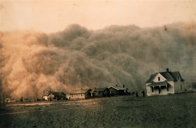
This was also a period during which much of middle America was affected by a serious of widespread droughts, and extreme weather conditions. Combined with the poor farming practices adopted in the previous decades, these harsh weather conditions destroyed the agricultural economy of the area. Farms failed to produce decent crops, and much of the farmland was turned to dust. This dust was then carried by the winds throughout the area, creating more havoc, and giving the 1930s the name “the Dust Bowl era”:
“…as the droughts of the early 1930s deepened, the farmers kept plowing and planting and nothing would grow. The ground cover that held the soil in place was gone. The Plains winds whipped across the fields raising billowing clouds of dust to the skys. The skys could darken for days, and even the most well sealed homes could have a thick layer of dust on furniture. In some places the dust would drift like snow, covering farmsteads.” – taken from Modern American Poetry’s webpage on the Dust Bowl
The great American folk singer, Woody Guthrie, wrote many songs inspired by the hardships of the time, e.g.,
By the way, in the late 1800s it was commonly believed in the Great Plains that human activities, such as reforestation, were “changing the climate”. Settlers were actively encouraged to plant trees in the belief it would encourage rainfall. However, there was no evidence to show that this worked, and it was eventually abandoned:
“The idea that the climate of the Great Plains was changing, particularly in response to human settlement, was popularly accepted in the last half of the 19th century. It was reflected in legislative acts such as the Timber Culture Act of 1873, which was based on the belief that if settlers planted trees they would be encouraging rainfall, and it was not until the 1890s that this idea was finally abandoned (White, 1991)” – taken from National Drought Mitigation Center’s website
In hindsight, it appears that the area was just coincidentally going through a wet period. In the 1930s that wet period ended and was followed by a period of severe droughts, i.e., the Dust Bowl era. It seems that the early 20th century farmers had not in fact caused “man-made climate change” as they had hoped. Instead, they were experiencing natural climate change. This should remind us not to be so quick to assume that unexpected changes in the climate are “man-made”.
In any case, regardless of the causes of the Dust Bowl era, the effects were devastating for the people living in the area, and badly affected the U.S. economy, which was already struggling to recover from the Great Depression which had begun a few years earlier with the 1929 Wall Street crash.
See here, here, here and here for more on the Dust Bowl era in the U.S.
Obviously, the droughts of the 1930s in middle America were severe. But what were the temperatures like, and how do they compare to current US temperatures? While droughts are often associated with high temperatures, they are not synonymous. Also, the droughts did not affect the entire continent, so perhaps it was only a localized pattern.
Presumably, our best estimates of U.S. temperature trends comes from the Good quality subset, since these are unlikely to be affected by siting bias. However, in Section 4, we discussed how there are three different datasets for the U.S. Historical Climatology Network – Unadjusted, Partially adjusted and Fully adjusted. Each of these datasets suggest slightly different temperature trends. So, which dataset is the most appropriate?
In Section 5, we discussed how the homogenization adjustments which are applied to the Fully adjusted dataset spread siting biases amongst all stations, making the temperature estimates unreliable. Therefore, we will discard the Fully adjusted dataset.
That leaves us with a choice between the Unadjusted and Partially adjusted datasets.

We saw earlier that there was a quite pronounced warm period in the 1930s for the Good quality, Unadjusted subset. To remind us, we have replotted the trends for this subset in Figure 17. We have also included the trend in atmospheric carbon dioxide (CO2) concentrations, for comparison.
If we treat the Good quality, Unadjusted trends as being the most reliable, then it seems that the 1930s were at least as hot as recent decades in the U.S. In other words, the Dust Bowl era was not just a period of drought, but also a period of relatively warm temperatures for the U.S.
We note that CO2 atmospheric concentrations were not much greater than pre-Industrial concentrations during this period. This suggests that the 1930s warm period was not due to “man-made global warming”, but was presumably a naturally occurring phenomenon.
So, if the Unadjusted dataset of the U.S. Historical Climatology Network is reliable, then it would seem that the Dust Bowl era in the U.S. was just as warm as the recent warm period.

What about the Partially adjusted dataset? We saw in the Table in Section 4, that the time-of-observation adjustments introduce a warming trend into the Partially adjusted dataset, doubling the linear trend for the Good quality subset from +0.21°C/century to +0.42°C/century. We can see in Figure 18 that this warming trend has “cooled” the 1930s warm period and “warmed” the recent 2000s warm period.
As a result, in the Partially adjusted Good quality subset, the U.S. seems to be slightly warmer now than it was during the Dust Bowl era.

However, there are still problems with that conclusion.
In our “Urbanization bias III” paper we showed that there is a noticeable warming bias in the Partially adjusted dataset due to urbanization bias (Figure 19).
In particular, we found that the subset of urban stations showed about 0.52°C/century more warming than the subset of rural stations. So, the relative warmth of the recent warm period should probably be reduced somewhat, to account for urbanization bias. So, again, it seems that the 1930s warm period was at the very least comparable to the recent warm period.
Urbanization bias is also a problem for the Unadjusted dataset – in fact it is even more pronounced than in the Partially adjusted dataset. So, the relative warmth of the recent warm period should also be reduced for the Unadjusted trends in Figure 17. This raises the possibility that the 1930s were actually quite a bit warmer than the 2000s in the U.S.
At any rate, we conclude that U.S. temperatures during the 1930s were at least as warm as recent years. We disagree with the various claims that recent temperatures are unprecedented in the U.S. – see here, here or here, for example.
What about the rest of the world?
The Surface Stations project was confined to the stations in the U.S. Historical Climatology Network, and so they do not tell us whether the problem is as bad (or worse) in other parts of the world, or whether it is just a problem for the U.S.
Now that it has been shown that 70% of the stations in the U.S. component are of a Poor or Bad quality, people who are defending the reliability of the global temperature estimates might say, “oh, well, the U.S. part is bad, but I’m sure the rest is ok“. However, we should realise that before Watts and the Surface Stations team carried out their systematic investigation of the U.S. component, it was widely assumed that the U.S. component was among the most reliable parts of the global dataset, if not the most reliable. So, it is quite likely that similar problems exist for other parts of the world!
Indeed, Prof. Roger Pielke, Sr. has posted on his blog some photographic assessments of stations outside of the U.S. While some stations seem to be of a reasonable quality, a lot of them seem to be of as poor a quality as the U.S. Historical Climatology Network stations – see the posts dated 2011-08-11, 2011-08-16, 2011-08-17, 2011-08-23, 2011-08-29, 2011-09-08, 2011-09-16, 2011-09-27 and 2011-09-28.
Some volunteers have recently begun a similar project for stations in the U.K. on Tallbloke’s TalkShop blog (see here for a list of all the posts tagged with “surfacestations”). Again, there is a mixture of stations of different qualities, but a substantial fraction of the currently studied stations seem to be of a poor or bad rating.

There have also been a couple of posts highlighting problems with the Sydney, Australia station on the Watts Up With That blog – see here and here.
With all this in mind, it seems very likely that poor station exposures are also a problem for the rest of the world. For some parts of the world, the problem might be less severe than in the U.S., but for other parts of the world, it might be more severe.
Until a systematic assessment like the Surface Stations project is carried out for the Global Historical Climatology Network, we can’t know for sure. However, it seems reasonable to take it as a working assumption that the magnitude of the biases are at least comparable to those in the U.S. network.
In other words, it is likely that siting biases from poor station quality have introduced a warming bias into current “global warming” estimates.
Summary and conclusions
The results of the volunteer-run Surface Stations project have revealed that about 70% of the stations in the U.S. Historical Climatology Network are poorly or badly sited.
We found that this poor siting introduced a warming bias into U.S. temperature trends. This warming bias artificially increased the apparent temperature trends of the U.S. by about half for the Unadjusted version of the dataset, with the trend for the subset of the worst-sited stations more than doubling, relative to the best-sited stations.
When we analysed the mean temperature trends for the Unadjusted, Good quality stations, we found that U.S. temperatures were just as warm in the 1930s as they are now. In other words, siting biases have contributed to making recent temperatures seem more “unusual” than they actually are!
When the National Climatic Data Center apply their Time-of-observation adjustments to their Partially adjusted dataset, this introduces an extra warming trend into the data. This makes recent U.S. temperatures seem slightly warmer than they were during the 1930s, even for the Good quality stations.
However, in our “Urbanization bias” papers (Summary here), we show that urbanization in the U.S. has also introduced a significant warming trend bias into the U.S. temperature estimates. So, it is still likely that U.S. temperatures in the 1930s were at least as warm as they are today.
The National Climatic Data Center also apply a series of step-change homogenization adjustments to their Fully adjusted dataset. These adjustments dramatically reduce the apparent differences in trends between the well-sited stations and the badly-sited stations.
Menne et al., 2010 (Abstract; Google Scholar access) claim that this is because the step-change adjustments have removed the siting biases from the station records. However, we disagree! We found that these adjustments had merely spread the biases amongst the records, rather than actually removing the biases. In other words, the adjustments reduced the reliability of the station records.
Preliminary analysis of the siting quality of stations in the rest of the world suggests that other parts of the world are also affected by siting biases. This suggests that the claims there has been unusual global warming since the Industrial Revolution have probably been exaggerated by poor station siting.
A couple of questions :-
1. Have you been in contact with Menne et al regarding their 2010 paper, and your objections to their conclusions ?
2. How do you classify which stations are ‘urban’ or ‘rural’ and which have started out as ‘rural’ and become ‘urban’ over time ?
[…] Summary: “Has poor station quality biased U.S. temperature trend estimates?. […]