Summary
Hollywood and the media have helped created a popular perception that humans are causing dramatic sea level rises by man-made global warming. This perception comes from an exaggeration of more modest, though still dramatic, computer model predictions of 1-2 metre rises by the end of the 21st century. However, the actual experimental data shows, at most, a slow and modest increase in sea levels, which seems completely unrelated to CO2 concentrations.
The main estimates of long-term sea level changes are based on data from various tidal gauges located across the globe. These estimates apparently suggest a sea level rise of about 1 to 3mm a year since records began. This works out at about 10-30cm (4-12 inch) per century, or about a 1 foot rise every 100-300 years, hardly the scary rates implied by science fiction films like The Day After Tomorrow (2004) or Waterworld (1995).
Importantly, the rate still seems to be about the same as it was at the end of the 19th century, even though carbon dioxide emissions are much higher now than they were during the 19th century.
Moreover, there are a number of problems in using the tidal gauge data which have not been resolved yet. So, despite claims to the contrary, it is still unclear if there has actually been any long term trend! In this essay, we will summarise what is actually known about current sea level trends.

Introduction
Under conditions of global warming, sea levels are expected to rise for two main reasons:
- In general, when liquids warm, they tend to expand. Therefore, if the oceans warm up, their volume should also increase, leading to a rise in the global sea level.
- If global warming causes glaciers or ice sheets (i.e., ice on land) to melt, then the meltwater should increase the ocean volume.
Note that sea ice melting or forming shouldn’t alter ocean volumes, as the ice is already floating on the oceans. Due to Archimedes’ principle, if floating ice melts, it doesn’t increase the volume of water. You can test this for yourself by placing a few ice cubes in a glass of water. If the ice cubes are floating (i.e., not stacked), then when the ice melts, the water line will remain at the same point.
For the same reasons, global cooling should similarly lead to falling sea levels. So, if global temperatures have been changing dramatically over the centuries, then we might expect this to have also caused substantial changes in global sea levels.
As we discuss on this website, many people believe that global temperature trends have been dominated by “man-made global warming”, and that this man-made global warming will become increasingly dramatic over the next century. For this reason, there is a widespread belief that increasing concentrations of CO2 are leading to unusual rises in sea level.
A number of the man-made global warming computer models have tried to simulate how much “sea level rise” to expect from man-made global warming, e.g., Meehl et al., 20015 (Abstract; Google Scholar access); Jevrejeva et al., 2010 (Abstract; Google Scholar access); Jevrejeva et al., 2012 (Abstract; Google Scholar access).
Vermeer & Rahmstorf, 2009 (Open access) believe that the computer models underestimate future sea level changes. So, they didn’t actually simulate sea level changes, but instead estimated how much sea level rise they would expect from man-made global warming, and then used computer model predictions of temperature changes, to predict that sea levels will have risen by 0.8-2 metres by 2100. (The blogger Tom Moriarty has heavily criticised the Vermeer & Rahmstorf, 2009 study on his Climate Sanity blog)
Other researchers, such as Dr. James Hansen of NASA GISS, have hypothesised that man-made global warming will be so strong that it could cause the large ice sheets on Greenland, East Antarctica or West Antarctica to suddenly melt, leading to sudden and dramatic sea level rises of several metres, e.g., Hansen, 2005 (Abstract; .pdf available on NASA GISS website). Hansen and others have been promoting these scary scenarios since the early 1980s (e.g., see this New York Times article from August, 1981), and it is from such sources that the Hollywood stories seem to originate (e.g., Hansen was the main scientific advisor for Al Gore’s An Inconvenient Truth film and book).
So, are these scary model predictions reliable, and should we be worried?
Well, in this post, we will forget about the models, and look at what the actual data says. We will find that the data suggests that at most sea levels have risen by 15-20cm since the end of the 19th century. That’s not particularly dramatic. But, if you believe in man-made global warming theory, then you might say “aha, that’s due to CO2, and it will get worse”.
However, the apparent sea level rise seems to have been relatively constant over the last century. If it was due to CO2, we would expect to see a dramatic acceleration since the 1950s, as CO2 concentrations increased. Since this doesn’t seem to have occurred (despite some claims to the contrary – see Section 5), it suggests that the apparent sea level rise is a naturally-occurring phenomenon (perhaps due to natural global warming).
We will also find that there are a number of serious problems with the available sea level data. As a result, much (perhaps all) of the apparent sea level rise might be due to problems with the data. In other words, we do not actually know if there has been any significant sea level trends over the last century!
Astute readers will object and complain that there must have been some sea level trends over the last century. This is because, from the discussion above, we would expect to see sea level changes, since global temperatures do seem to have changed over the last century (whether the temperature trends are man-made or natural in origin). However, as we will discuss in the next section, this is not necessarily the case.
We might expect “global warming” (i.e., an increase in average surface air temperatures over a few decades) to lead to a rise in global mean sea levels. But, for the reasons we will discuss in Section 2, it is also theoretically possible that it could have no detectable net effect on global mean sea levels, or even lead to a net fall! Hence, when we look at the actual sea level records in Sections 3, 4 & 5, we should avoid biasing our analysis with our own views of what we think “should happen”:
“If a man will begin with certainties, he shall end in doubts. But, if he will be content to begin with doubts, he shall end in certainties” – Francis Bacon, Sr. (1561-1626)
Problems predicting global sea level changes
The density problem
The density of a liquid tells you the volume that a given mass of that liquid occupies. If the total mass of a liquid in a container (e.g., an ocean basin!) remains constant, but its density increases, then the volume of that liquid will decrease. Hence, the maximum height of the container that is reached by the liquid will decrease. In our case where the “container” is an ocean basin, this would mean a fall in the “global mean sea level”. Similarly, if the liquid density decreases, the maximum height reached will increase. This is the basis for the first theoretical prediction for the effects of global warming mentioned in Section 1 – if global warming causes the oceans to heat up, this should (in theory) cause sea levels to rise, from “thermal expansion”.

One problem with the thermal expansion theory is that the relationship between temperature and density is different for water than for most liquids. Like most liquids, when you cool pure liquid water from high temperatures, its density steadily decreases. However, unlike most liquids, water actually reaches its maximum liquid density several degrees above its freezing point, i.e., at 4°C instead of 0°C. Between 0°C and 4°C, water actually expands as it cools.
This is why ice (frozen water at 0°C or less) floats! It is also why fish that can survive at 4°C can overwinter in a garden pond that has ice on the top, by staying near the bottom of the pond (see Figure 2). This means that if global warming uniformly warmed up all of the oceans by 0.5°C (for example), some parts would certainly expand (water above 4°C), but other parts would actually contract (water above 0°C, but less than 4°C).
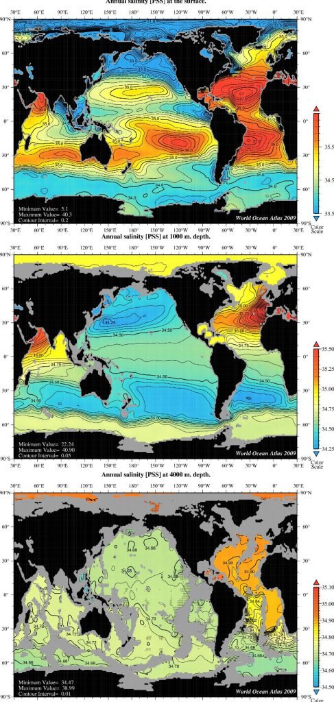
Another problem is that the oceans are not pure freshwater. As anyone who has swam in the sea knows, seawater is salty. The amount of salt in seawater (known as its “salinity”) affects both its density and its freezing point.
Salty water freezes at lower temperatures than pure water – that’s why we grit roads with salt if we’re expecting icy conditions. Salty water is also more dense than pure water. For this reason, the density of seawater depends not only on its temperature, but also its salinity. As can be seen from the maps in Figure 3, the salinity of the oceans varies across the world, e.g., the Atlantic Oceans are slightly saltier than the Pacific Oceans. This regional variability also varies with depth.
Indeed, this complex dependence of ocean density on both temperature and salinity is believed to be one of the main drivers of the ocean circulation, as redistribution of more dense and less dense sea water leads to various different “thermohaline circulations” patterns. [The name “thermohaline” is derived from “thermo” for temperature and “haline” for salinity].
As a result, the effects of global warming or global cooling on ocean densities are complex, and still poorly understood. For instance, suppose the oceans were to uniformly heat up or cool down by 0.5°C (for instance). If that were to occur, then the density changes at a particular spot would depend on not just the temperature change, but also the absolute temperature and salinity at that spot. In reality, global warming or cooling (whether man-made or natural in origin) is unlikely to occur uniformly throughout the oceans, e.g., temperature changes usually vary with latitude and depth, and depend on ocean circulations.
Effects of human activity on water storage
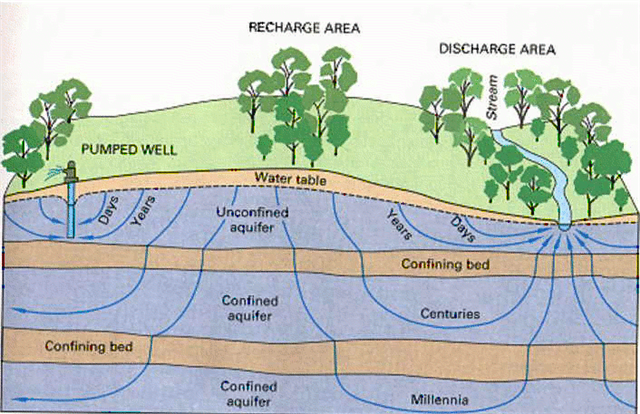
Another complexity is that the actual amount of water involved in the “water cycle” may have changed over the years. Rapid expansion in groundwater exploitation (e.g., using well water) occurred during 1950–1975 in many industrialized nations and during 1970–1990 in most parts of the developing world – see Foster & Chilton, 2003 (Open access), for a discussion. After this groundwater has been extracted from the ground, it is used and recycled. Eventually, much of it will end up in the oceans. In this way, humans could be significantly raising sea levels by taking groundwater that had until recently been trapped underground, and putting it back into the water cycle.
If this phenomenon is significant, it would mean that the sea level rise which had been specifically attributed to global warming has been overestimated, e.g., see Sahagian et al., 1994 (Abstract).
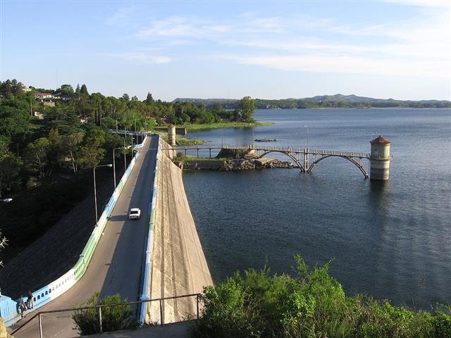
On the other hand, humans have also built a lot of dams to store water, particularly during the 20th century. Perhaps by doing so, we are reducing sea levels by preventing water from returning to the oceans. If this phenomenon is significant, then it would mean that the sea level rise which had been attributed to global warming may have been underestimated, e.g., see Gornitz et al., 1997 (Abstract; Google Scholar access).
Other types of human activity, such as deforestation/reforestation, could also be having significant effects on global sea levels (either increases or decreases). So, since the 1990s, a number of groups have tried to calculate these various contributions to changes in sea levels, although typically most studies have concentrated on just one contribution at a time.
The relative contributions of these different factors has been a subject of much debate, and seems to be ongoing. For example, studies such as Chao et al., 2008 (Abstract; Google Scholar access) claim human dam building has led to an underestimate of sea level rises due to global warming, while other studies, such as Wada et al., 2010 (Abstract; Google Scholar access) argue that ground water extraction has led to an overestimate of sea level rises due to global warming.
Effects of climate change on water storage
The above discussion of the effect of changes in water storage on land from human activity on global sea-levels, should not be confused with possible changes in water storage on land from climate change (whether man-made or natural).
Climate change could involve changes in the water cycle, thereby altering how much and how long water stays on land instead of in the sea, i.e., the amount of ground water and soil water. It could also affect the amount of snowfall. In addition, global warming or cooling (the most commonly thought of examples of climate change) could decrease or increase the length of time snow remains un-melted (and thereby keeping water “trapped” on land).
These climate-related land storage effects could be significant for global sea-levels, though unfortunately there seem to be very few direct experimental measurements of the factors involved, and so the only studies of these effects seem to have been from computer modelling of data from weather data “reanalysis” models (e.g., ERA-40).
These studies often yield contradictory results. For instance, Milly et al., 2003 (Open access) used computer simulations and results from the CMAP reanalysis of precipitation levels to calculate that climate-related changes in water storage on land were causing a sea-level rise of about 0.12 mm/year in the period 1981-1998 (although, they admitted they couldn’t calculate an error bar for that estimate). But, Ngo-Duc et al., 2005 (Abstract; Google Scholar access) obtained a much smaller value of 0.08 mm/year for the same period. They also found that if they looked over the longer period of 1948-2000, there was no significant trend in sea-level rise or fall, and that the 0.08 mm/year sea-level rise they calculated in the period 1981-1998 was probably due to natural variability.
What else?
In this section, we discussed several mechanisms whereby the expected sea level rises (or falls) from global warming (or cooling) might not actually occur. There may be other mechanisms which we haven’t mentioned, too. For instance, if global warming were to increase the volume of water in the oceans by causing glaciers or other ice bodies to melt, this would cause the weight of water in the oceans to increase. But, in doing so, this could in turn cause the ocean floors to sink, and thereby slightly reduce the expected sea level rise.
Before considering all the complexities mentioned above, it might have seemed a relatively easy problem to calculate how much sea level rise (or fall) to expect for a given global warming (or cooling) of, e.g., 0.5°C. This seems to be the popular assumption, even amongst climate scientists. But, in reality, it is a very complex problem. Readers should remember the American satirist, H. L. Mencken (1880-1956), who observed that:
There is always an easy solution to every human problem – neat, plausible, and wrong. – Henry Louis Mencken, 1917
We appreciate that many people like to have an easy answer to what they consider a simple question. But, unfortunately, if a simple answer is too simplistic, it is often wrong. With this in mind, rather than trying to make simplistic models to understand sea level changes, perhaps a better approach is to look at what the experimental data actually says. This is what we will attempt to do in the next sections.
Tidal gauge estimates
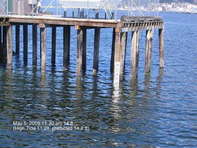
The main data sources available for estimating sea level changes are records from tidal gauges, such as the one in Figure 6. The Permanent Service for Measuring Sea Level or PSMSL, based in Liverpool, UK (est. 1933), maintains a database of monthly and annual tidal gauge records from around the world. Most tidal gauge-based sea level studies use this PSMSL archive.
Unfortunately, tidal gauges do not actually record “global sea levels”. Instead, they only tell us about local, relative sea level changes. As we will discuss in this section, this makes it extremely difficult to reliably estimate what global, absolute sea level changes have been.
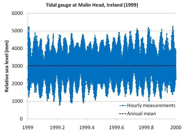
Anybody who has lived near the coast will know that tides can rise and fall by several metres in a given day. For instance, for the Malin Head, Ireland data in Figure 7, the average daily range for 1999 varied from 1 to 4 metres, with a mean of 2.5 metres. However, the sea level rises which have been proposed by man-made global warming theory supporters are measured in millimetres/year (mm/yr). To investigate these small changes, researchers typically calculate the mean sea level, averaged over the year for a given station (3018mm in 1999 for the Malin Head station). These annual means are then studied to see if there are any long term trends from year to year (or more importantly decade to decade).
The PSMSL have calculated linear trends for 524 of their tidal gauge stations (available here). They stress that they have not applied any correction for vertical land movement or assessed the validity of any individual fit.
Moreover, we also have argued elsewhere that linear trends should be treated cautiously when the data shows non-linear trends, as many tidal gauges do. Nonetheless, the linear trends do offer us a crude method of seeing how global the apparent “global” sea level rise is.
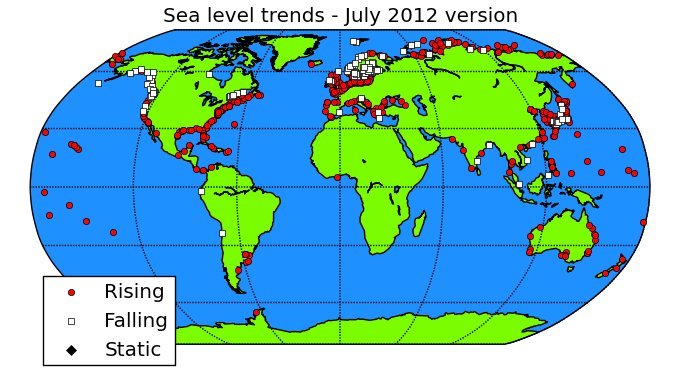
In the map in Figure 8, the gauges are sorted into those with negative trends (i.e., suggesting falling sea levels) and positive trends (i.e., suggesting rising sea levels). Although, most of the gauges show positive trends (396 out of 524, i.e., 76%), nearly a quarter show negative trends (128 out of 524, i.e., 24%). Also, we can see that much of the globe has no data. The so-called “global” sea level rise is not as global as you might think.
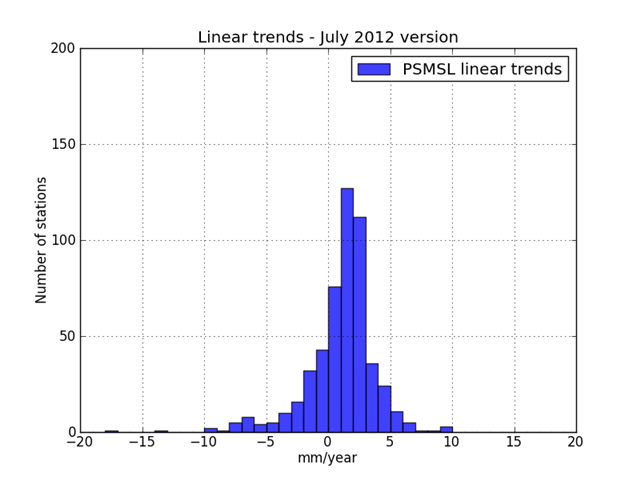
We also can see from the histogram in Figure 9 that it isn’t just a case of dividing stations into “rising” or “falling” sea levels – there is actually quite a broad distribution of trends.
The mean average of all the linear trends is slightly positive (+1.0 mm/yr, with a standard error of 0.1 mm/yr), but there are a large number of gauges with substantially lower or higher trends.
So, there is a major problem in calculating what the overall global (called “eustatic”) sea level trend is – different tidal gauges suggest linear trends ranging from as much as -10mm/year to +10mm/yr. In other words, there is no single “global” value.
Readers who found the Hollywood stories of films such as The Day After Tomorrow, Waterworld or An Inconvenient Truth scary, might like to note that the mean average value of +1.0mm/yr is not quite as dramatic. To put it in context, +1.0mm/year would mean an average rise of 10cm per century. At that rate, it would take a thousand years to rise 1 metre!
Nonetheless, what if we forget about linear trends and instead average together the annual trends from year to year. This data is again available from the PSMSL’s website – see Woodworth & Player, 2003 (Abstract).
We calculated the annual deviations of each PSMSL gauge from its 1961-1990 average (the 30 year period which most stations have data for). Then, we simply averaged together the deviations of all gauges with data for each year, starting with 1807 (when the Brest, France records began). Note that we didn’t bother calculating a gridded average – this is just the simple arithmetic mean of the deviations.
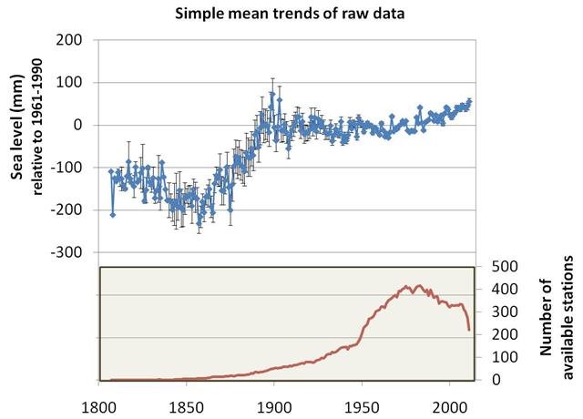
See Woodworth & Player, 2003 (Abstract). Bottom panel shows the number of stations with data for each year. Click to enlarge.
The results are shown in Figure 10 (along with the number of stations available in each year). If the trends at all tidal gauges were entirely due to changes in global sea levels, then the graph should tell us what the long term trends since the 19th century have been.
The graph does seem to suggest that there has been a significant sea level rise since the 19th century, as had been claimed. However, it doesn’t seem to be related to CO2 concentrations, because most of the rise occurred in the mid-19th century, yet the rise in CO2 concentrations only started to become significant around the mid-20th century. Also, it suggests that the highest sea levels occurred in 1899, i.e., at the end of the 19th century!
Astute readers will complain that the number of stations with data for the mid-19th century was very low (bottom panel in Figure 10). It was only around the 1950s that the number of stations started to reach modern levels. So, the estimates from before then are not particularly reliable. We totally agree.
However, that means that the estimates which have been claiming there has been a significant sea level rise “since the 19th century” are also unreliable. In other words, the data for before the second half of the 20th century is very limited. This means we can’t really use the tidal gauge data for comparing sea levels during the recent 1980s-2000s warm period to those during the earlier 1920s-1940s warm period, for instance.
Moreover, there are other problems with the tidal gauge data…
You might have noticed from Figure 8 that some parts of the world showed a lot of “falling” stations, while other parts showed a lot of “rising” stations. This suggests that much of the apparent sea level changes are localised, and therefore not an indication of global sea level changes. The biggest difficulty in using tidal gauges to study global sea level trends is separating local changes from global changes.
To properly appreciate the problem, it is worth thinking in more detail about what exactly a trend on a tidal gauge indicates.
Suppose a particular tidal gauge shows an apparent trend of +3mm/yr. What does that mean? Your first guess might be that sea levels are rising. But, tidal gauges are located on land, so if the land (where the gauge is located) moves up or down over time, this would cause an apparent change in the relative sea level, without the sea level actually changing.
So, an apparent “rising” (or “falling”) trend in a tidal gauge record might actually be due to any one of several factors:
- The land is sinking (or rising).
- Local sea levels have changed
- There is an instrumental error or change, e.g., the gauge or dock itself has moved, or been moved.
- Global sea levels have changed.
- A combination of the above.
In the next section, we will discuss why the first factor can seriously bias estimates of global sea level trends.
Is the sea rising or is the land falling?
Tectonic activity
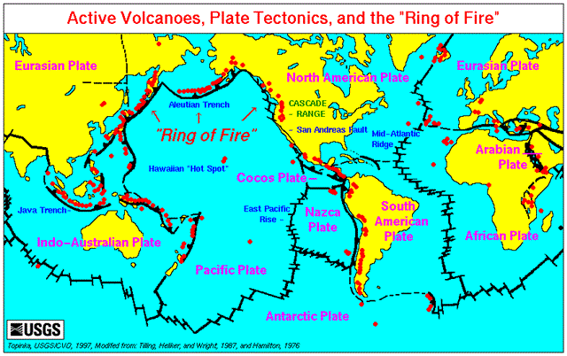
Why would the land move? There are actually many reasons. For instance, many coastlines are in tectonically active areas, particularly those on the Pacific coast. Indeed, as can be seen from Figure 11, the edges of the Pacific Oceans are so active that they are often referred to as the “Pacific Ring of Fire”. Tectonic activity tends to be quite slow, i.e., of the order of a few mm/year. But, remember that is a similar rate to the tidal gauge trends.
When the tidal gauges in Figure 8 are compared to the tectonic map in Figure 11, it becomes apparent that a surprisingly high percentage of the tidal gauges are near plate boundaries. Many readers will be familiar with the tragedies caused by recent earthquakes in Christchurch, New Zealand (2010,2011), Haiti (2010), or the 2011 earthquake near Japan, whose ensuing tsunami caused the Fukushima nuclear plant to breakdown. Tidal gauge records which have been subjected to such an event are unlikely to be reliable.
Fortunately, earthquakes and other dramatic tectonic land movements might be detectable in once-off jumps in tidal records. So, a close inspection of the records could overcome most of that problem.
A far more insidious problem is identifying the gradual movements (a few mm/yr) which are continuously occurring wherever tectonic plates are colliding. Earthquakes are relatively rare, but in between such events the plates continue to move – just very slowly. If a coastline is gradually rising or falling due to plates colliding, it would cause the tidal gauges to show an artificial “sea level” trend.
Only a few areas with tidal gauges seem to be far enough away from plate boundaries for it not to be a possible factor, e.g., northern Europe, eastern North America, central Pacific islands. Some of these areas are tectonically active anyway, e.g., the central Pacific islands of Hawaii (US) are volcanic in origin. And even regions which are not traditionally associated with tectonic activity, can also show geological movement at relatively high rates, e.g., using a GPS study, Dokka et al., 2006 (Abstract; Google Scholar access) found that the land at southeast Louisiana (USA), including New Orleans and the larger Mississippi Delta, is naturally subsiding at a rate of -5.2 ± 0.9 mm/yr.
Unless the tectonic land movement at each station is accurately calculated, it is very difficult to estimate what the real sea level changes have been at these stations. Some work has been done in recent years to try and do this. One approach has been to place GPS detectors near tidal gauges, e.g., Wöppelmann et al., 2007 (Abstract; pre-print version). Another approach is to compare tidal gauge-based estimates to satellite-based estimates, e.g., Ostanciaux et al., 2012 (Abstract; Google Scholar access). However, it turns out that most of the sea-level studies have simply neglected the problem, often making the excuse that it is too hard to properly solve.
Some researchers try to remove stations which are in specifically earthquake-prone areas, but generally ignore the fact that non-earthquake prone areas in tectonically active areas may also be slowly moving. For example, Holgate, 2007 (Abstract; Google Scholar access) chose 9 long records, and excluded earthquake prone stations, but two of his nine stations were San Diego, California (US) and Honolulu, Hawaii (US), both tectonically active areas.
Recovery from the peak of the ice age
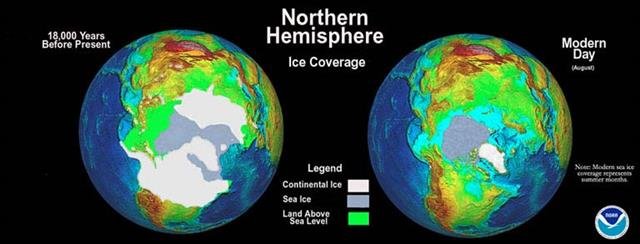
20,000 years ago, the Earth was at the height of a glacial period, and glaciers are believed to have stretched as far south as France and the British Isles in Europe and New York in US (see model estimates in Figure 12). It is believed that as these glaciers grew, their increasing weight slowly pushed the tectonic plates down into the Earth’s crust at rates of a few mm or cm a year.
When these glaciers melted at the start of the Holocene, about 10,000-15,000 years ago, that weight was no longer there, and the plates would have started to “rebound”. A number of researchers have argued that this “post glacial rebound” is relatively slow, and is still taking place today.
The last glacial period is popularly referred to as “the ice age”, as in the popular children’s movie series “Ice Age“. However, in glaciological terms “ice age” refers to a geological period where there are extensive ice sheets in both the southern and northern hemispheres. Since there are currently ice sheets on Greenland (northern hemisphere) and Antarctica (southern hemisphere), as well as a number of mountain glaciers in both hemispheres, we technically are still in “an ice age”!
The current ice age is thought to have begun about 2.5 million years ago, and has alternated between periods of extensive glaciation, known as “glacial periods”, and periods of more modest glaciation, like we have today, known as “interglacial periods”, roughly every 100,000 years or so. The current interglacial period (known as the “Holocene”) started 10,000-15,000 years ago, and the previous interglacial (known as the “Eemian”) occurred about 115,000-130,000 years ago. The height of the last glacial period occurred about 20,000 years ago, and is known as the “Last Glacial Maximum”.

As can be seen from the schematic in Figure 13, the rebound could still be causing some areas to rise (making sea levels seem to “fall”) and other areas subside (making sea levels seem to “rise”), depending on where they lie on the moving plates.
Indeed, if we closely look back at the map of the “rising”/”falling” tide gauges in Figure 8, we can see that some areas which would have been under or near the ice sheets during the glacial era show mostly “falling” trends (e.g., Fennoscandia in northern Europe, Alaska in US), while neighbouring areas show mostly “rising” trends (e.g., the parts of northern Europe south of Fennoscandia, northeastern North America).
Some groups have tried to develop models of the rebounding land, so that sea level researchers can apply “Glacial Isostatic Adjustments” (GIA) to their data to correct for the effects. [An “isostatic” sea level change is a local change, as opposed to “eustatic” or global sea level changes]. The most popular one is that developed by Richard Peltier et al., and the current version is called ICE-5G – see Peltier, 2004 (Abstract; Google Scholar access) and Peltier’s website or the PMIP-2 website. However, the problem is that these models are just that – models. We might know roughly what is happening, but establishing exactly which areas are rising and falling, and by how much, is tricky. We can get some idea of this from the fact that Peltier’s model has gone through several different versions before the current one.
As a result, it is still unclear how accurate the models are, e.g., which parts (if any) of the British Isles are rising or falling, and is the Mediterranean Sea too far south to be affected or not? A number of groups have suggested that there are substantial inaccuracies in the current models, e.g., see the Ostanciaux et al., 2012 paper mentioned earlier. This means that the model adjustments which have been applied in sea level studies may have been inadequate (i.e., failed to remove all of the post glacial rebound effects), or even inappropriate (i.e., removed a “falling” trend from a region which was actually “rising”, or vice versa).
Coastal subsidence
Another systemic problem in tidal gauge analysis of sea levels, is that of coastal subsidence. Coastlines have always been dynamic, and over the millennia, coastlines can subside or rise. In itself, these natural trends could be sufficient to bias tidal gauge estimates of sea levels. But, human activity can also substantially aid or abet these natural trends, e.g., land reclamation, groundwater extraction, etc.
Syvitski et al., 2009 (Abstract; Google Scholar access) recently carried out a study of 33 delta regions associated with large metropolitan regions around the world. They concluded that urban development was causing many of these areas to subside.
Syvitski et al., pointed out that trends at tidal gauges in delta regions depend on several factors:
- The rate at which land is building up in delta regions, due to sedimentation (a process known as “aggradation“). They found this rate typically varies from +1 to +50 mm/yr.
- Rates of natural compaction of the land in the region. When soil first forms or is deposited in an area, it is often loosely packed. But, over the years, it can settle, causing the land to compact. Syvitski et al. suggested that this rate is typically less than -3 mm/yr.
- Rates of accelerated compaction. If humans are extracting water, oil or gas from the area (“subsurface mining”), are altering soil drainage (e.g., irrigation or drainage of land), or just generally altering the local land use, this could dramatically speed up the natural compaction rate. Syvitski et al. mentioned that the Chao Phraya Delta has shown compaction of -50 to -150 mm/yr from groundwater withdrawal, while the Po Delta has subsided 3.7m in the 20th century, 81% of which has been attributed to methane mining in the area.
- Rates of vertical movement of the land surface. In addition to the tectonic activity and post-glacial rebound factors mentioned above, Syvitski et al. also noted other factors, such as long-term (millennial) geological subsidence of the land. They argued these rates were typically about 0 to -5 mm/yr.
- And, finally, global mean sea level trends, i.e, the bit we’re trying to calculate!
Syvitski et al. assumed that the last component had been reliably determined by the IPCC, and so for their study they used the IPCC’s estimate of a global sea level rise of +1.8 to +3.0 mm/yr. However, as we have seen throughout this section, the tidal gauge estimates the IPCC used to estimate global sea level trends are contaminated by local trends, such as tectonic activity, post-glacial rebound… and the coastal subsidence that Syvitski et al. identified!
The factors Syvitski et al. considered include natural processes which have been occurring independently of human activity. For instance, Törnqvist et al., 2008 (Abstract; Google Scholar access) calculate that the natural compaction of Holocene sediments which reached the Mississippi Delta (USA) after the melting of glaciers at the end of the Last Glacial Maximum has been resulting in subsidence of up to -5 mm/yr over the last 1200-1600 years.
They also include processes related to nearby human development. Syvitski et al. found that human engineering (e.g., construction of levees, redirection of rivers and the construction of modern dams) has made the rivers less muddy for many of the deltas they studied. While this might have positive aesthetic effects, it has reduced the rate of aggradation, meaning that the natural build-up of sediments in delta regions has been artificially reduced.
In many delta areas, there has been a lot of groundwater extraction to meet the water demands of the expanding populations who live there. This has led to considerable subsidence of the land, e.g., Holzer & Gabrysch, 1987 (Abstract; Google Scholar access). More purely commercial activities, such as oil or gas drilling can also cause subsidence, e.g., Morton et al., 2002.
In other words, many delta regions have been steadily subsiding from both natural and human activity-related processes. This will have introduced an artificial “sea level rise” trend into the tidal gauge records for those areas, which is actually due to the local land subsiding. As these processes are occurring in areas across the world, it will mistakenly introduce a “global sea level rise” bias into estimates constructed from tidal gauges.
Changes in local sea levels
One factor which can significantly influence local sea levels is the weather. Therefore, if weather patterns change, this could also influence local sea levels.
Changes in wind patterns can be particularly influential. For instance, Ryan & Noble, 2006 (Open access) found a strong correlation between wind and sea level changes over an 18 year period at three tidal gauges on the west coast of USA.
Another major factor is the atmospheric pressure at sea level (sometimes called “sea level pressure” or “barometric pressure”). The weight of the atmosphere pushing down on the oceans varies with the atmospheric pressure at sea level. So, we might expect that when this pressure increases, sea levels slightly fall, and vice versa. Indeed, Heyen et al., 1996 (Open access) found a strong correlation between atmospheric pressure and winter sea levels in the Baltic Sea, and Bergant et al., 2005 (Open access) found strong correlations between monthly sea levels and atmospheric pressures along the Adriatic coast, particularly in the winter. The exact relationship between sea levels and atmospheric pressures is still being debated, e.g., Mather et al., 2009 (Abstract; Google Scholar access), but it may be significant.
In addition to atmospheric circulation affecting sea levels, changes in ocean circulation can also have effects. We saw in Section 2 that water densities (and hence volume) are quite variable throughout the oceans. This leads to thermohaline circulation patterns. But, the flipside of this is that changes in the thermohaline circulation patterns can alter local water densities, and hence local water volumes, i.e., local sea levels.
Ocean and atmospheric circulations are often strongly interconnected, most famously during the so-called El Niño events. Using satellite data (see Section 5), Nerem et al., 1999 (Abstract) found that during the 1997–1998 El Niño, global mean sea levels rose by 20 mm, and then fell by as much! But, regionally, these large sea level changes varied by different amounts. So, the effects of such events on local trends would vary from tidal gauge to tidal gauge.

The interaction between the Earth’s rotation and gravitational pull from the moon (and also the sun) are the main drivers of the tides, and hence the heights of the tides (i.e., the “sea level”) recorded at the tidal gauges.
Most of the variability in this gravitational pull occurs over time scales of less than a year. For example, at most places, high and low tides generally occur twice a day, and the main lunar cycle (“full moon” to “no moon”) only takes about a month (roughly 29.5 days). In fact, the word “month” is derived from the word “moon”. So, you might suppose that this wouldn’t affect annual trends. However, there do also seem to be lunar and solar cycles which take place over longer timescales, e.g., the 18.6 year lunar cycle. It is possible that such changes could significantly influence decadal tidal gauge trends, e.g., see Gratiot et al., 2008 (Abstract; Google Scholar access) or Currie, 1987(Abstract).
Update (26th March 2015):
Indeed, a recent paper by Jens Morten Hansen et al. has suggested that, after accounting for the post-glacial rebound effects discussed above, the 18.6 year lunar cycle (and multiples of it) can explain most of the non-linear trends in the sea level data for the North Sea and Baltic Sea – see Hansen et al., 2015 (Abstract). In other words, they found that once post-glacial rebound effects and lunar cycle effects had been accounted for, the sea level rise had essentially been constant (1.18mm/year) since at least the start of the tidal gauge records (1849).
By the way, in an earlier paper, Hansen et al., 2011 (Abstract) had used geological measurements from coastlines to calculate sea level trends back to the 12th century for the same region. They found that sea levels had been rising since at least 1300 A.D. (long before the Industrial Revolution). Moreover they found that the rate of sea level rise between 1700 and 1790 was actually much faster than present.
Summary of tidal gauge data
Tidal gauge records are still the main data source for researchers analysing global sea level changes. Unfortunately, while they do offer relatively long records, they are severely limited by the fact that tidal gauges measure the relative height of the land to the local sea levels in the area.
In order to use tidal gauges to reliably estimate global sea level changes, researchers have to successfully separate the components of shifting land heights and local sea level variability from any global trends. These are not trivial problems, and attempts to solve them have usually involved making questionable assumptions.
Researchers have known of all of the above problems for decades, and the PSMSL even warn users of their data of most of the problems here. But, it seems in a race to find evidence of the global sea level rises predicted by man-made global warming models, a number of researchers have underestimated how problematic the data is. Prof. Robert W. Stewart had even warned against this tendency in the late 1980s:
“The prospects of a forthcoming climate change induced by the effects of [increasing greenhouse gas concentrations] is receiving increasing attention, both in the scientific literature and in the popular media. It is now commonplace to learn from the media about “the future sea-level rise” without any expressed scepticism and often with considerable alarm. Much of the technical literature also takes future sea-level rise as established fact.
…
However, what are we to say if most sea-level changes are not associated with any very recent climate change, but are, in fact, the result of crustal movements? We had better get it right!” – Stewart, 1989 (Open access)
Unfortunately, his warning seems to have been largely ignored.
Despite the various problems with the tidal gauge data, it is possible that the various estimates of global sea level trends of 1-2 or maybe 2-3 mm/year might coincidentally be correct. But, it is likely that these estimates are strongly biased by local effects, and that actual global trends have been overestimated or underestimated. It is even possible that all (or most) of the apparent trends are local effects, and there have been no significant long term global trends in recent decades.
Whatever the case, until the above issues have been adequately resolved, tidal gauge-based estimates of “global mean sea level” trends should be treated with extreme caution.
Satellite estimates
From Sections 3 & 4, it should be clear that attempting to extract genuine “global mean sea level trends” from the local trends of tidal gauges is highly problematic, and generally requires making a number of subjective assumptions and/or approximations. Satellite measurements, on the other hand, are not limited to local, coastal trends – they provide data from the entire oceans (well, almost – individual satellites generally have a “blind spot” they can’t measure due to their orbit path, e.g., near the poles). So, there has been considerable optimism that the results of various satellite missions since the early 1990s will provide more reliable estimates of global trends, e.g., see this 1990 report by UNESCO.
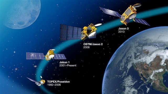
In August 1992, a US-French collaboration launched the TOPEX/Poseidon satellite altimeter. This satellite ran until 2006, but in 2001, a second satellite (“Jason-1”) was launched, which is still running. Several other satellite altimeters have also been launched, and the data from these have been used to estimate global mean sea level trends since 1993. Various different estimates from these different satellites are available from the AVISO website.
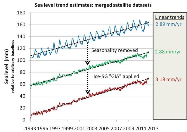
Composite estimates constructed by combining data from all of the satellites (see Figure 17) suggest there has been a global mean sea level trend of about +2.9 mm/yr (or +3.2 mm/yr, depending on the adjustments applied) over the entire satellite period (1993-present).
These trends are larger than the 20th century trends calculated from the tidal gauge estimates which we discussed in the previous sections, because the tidal gauge trends were mostly in the range +1.0 to +2.0 mm/yr. Some researchers have argued that the higher trends from the satellite measurements proves that there has been an “acceleration” in sea level rise, e.g., Church & White, 2006 (Abstract; Google Scholar access) or Cazenabe & Nerem, 2004 (Abstract; Google Scholar access).
Some of these researchers had been predicting an acceleration on the basis of their man-made global warming models, e.g., one of the authors of Church & White, 2006 had already been predicting an acceleration in Church et al., 1991 (Open access). So, they seem to believe that their predictions have been vindicated. This has also been used as another “proof” of man-made global warming.
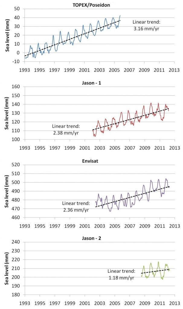
Remarkably, however, as newer satellites have been introduced to replace the TOPEX/Poseidon estimates, they have shown less and less sea level rise, each time (see Figure 18). This is the opposite of the claim that the alleged sea level rise is “accelerating” due to man-made global warming. Indeed, when Church & White, 2011 (Open access) attempted to update the Church & White, 2006 paper mentioned above, their reported “acceleration” had slightly decreased.
So, are the satellite estimates reliable? Well, in order to answer that, we have to learn a little bit about how they were actually constructed.
Unfortunately, satellite altimeters don’t actually measure sea levels directly. Instead, they measure the length of time it takes light signals sent from the satellite to bounce back. In general, the longer the signal takes, the further the satellite is from the sea surface. So, in theory, this measurement could be converted into a measure of the sea surface height, i.e., the mean sea level.
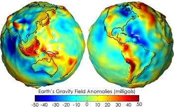
However, the conversion is complicated, and a number of other factors need to be estimated and then taken into account. For instance, the distance of the satellite from the Earth’s surface varies slightly as it travels along its orbit, because the gravitational pull of the Earth is not exactly uniform – see the Wikipedia page on “geoid”, and the maps in Figure 19.
So, in order to convert a particular “satellite-sea surface distance” into a sea level measurement, the “satellite-Earth’s surface distance” also needs to be independently measured, e.g., using the DORIS system.
Another complexity is that light takes slightly longer to travel when travelling through water vapour than dry air. So, the water vapour concentrations associated with a given satellite reading also need to be estimated, and accounted for.
As a result, satellite estimates of sea levels involve the use of complex models, approximations, other measurements and calculations. Unfortunately, this means that if there are problems in any of those stages, it could introduce artificial biases into the estimates, possibly making them unreliable… or even worse, wrong.
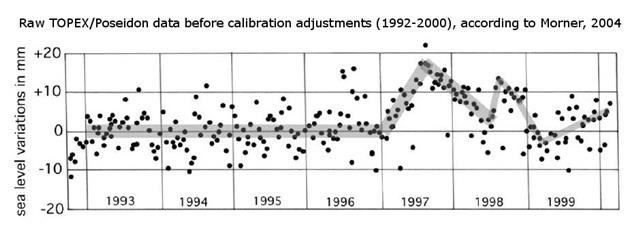
Mörner, 2004 (Abstract; Google Scholar access) managed to track down a graph of the raw satellite trends from the TOPEX/Poseidon satellite up to 2000. When he looked at this graph (Figure 20), he didn’t see much of a “sea level rise”. Instead of the +2.8 or +3.1 mm/yr trends commonly reported, it appeared to him that sea levels had been essentially constant from 1993 to 1996. He agreed that from 1997 to 1999, there were considerable sea level changes. But, they comprised falls as well as rises, and were probably related to the unusual 1997-98 El Niño event.
Mörner, 2004 was a controversial paper, and several of the researchers involved with the TOPEX/Poseidon analysis objected to Mörner’s analysis, e.g., Nerem et al., 2007 (Abstract). However, surprisingly, these objections were not over his claim that the raw satellite data showed little trend. They agreed with Mörner that the original satellite data didn’t show much of a sea level rise. Instead, their objection was that he should have used their adjusted data. They felt the raw data was unreliable, and had developed a series of adjustments which they believed made the trends more realistic.
For example, Keihm et al., 2000 (Abstract; Google Scholar access) had decided that the TOPEX satellite was showing an instrumental negative drift of 1.0-1.5 mm/yr between October 1992 and December 1996. So, they adjusted the data by adding a positive trend of 1.0-1.5 mm/yr to that period. Chambers et al., 2003 (Abstract; Google Scholar access) decided that even more negative biases were introduced when the TOPEX satellite switched to its backup instrument in February 1999. So, they introduced more adjustments. This set of adjustments increased the apparent sea level rise from +1.7 mm/yr to +2.8 mm/yr. Neither set of adjustments affected the period January 1997-January 1999, but as Mörner had noted the raw data already showed significant variability for that period due to the 1997-98 El Niño event. Finally, they believe that an adjustment of +0.3 mm/yr is necessary to account for Peltier’s Glacial Isostatic Adjustments (see Section 4).
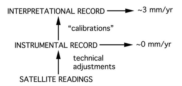
It turns out that almost all of the +2.8 mm/yr (or +3.1 mm/yr if Peltier’s post-glacial rebound adjustments are applied) sea level rise in the 1993-present satellite estimates are due to adjustments! The raw data (which no longer seems to be in the public domain) doesn’t show much of a trend, after all.
Mörner, 2008 (Abstract) responded to his critics by pointing out that these adjustments were too subjective. For this reason, he recommended that we should stick to the unadjusted trends.
It is plausible that the unadjusted trends are unreliable, as Nerem et al., 2007 claimed. However, that doesn’t automatically mean that Nerem et al.’s adjustments are valid! If the adjustments are either inappropriate or inadequate, then the adjusted trends may be the unreliable ones. Or perhaps, both the adjusted and the unadjusted trends are unreliable…
If we are to rely on Nerem et al.’s claim that the adjustments are an improvement, we should look at their justification. Remarkably, it seems that their main justification for applying the adjustments has been that they make their estimates better match the tidal gauge estimates, even though the reason why the satellite measurements were being carried out was because the tidal gauge estimates were unreliable!
For instance, Mitchum, 1998 (Open access), and later Mitchum, 2000 (Abstract) found that the tidal gauges were showing a sea level rise of 1.0-1.5 mm/yr more than the TOPEX satellite. But, rather than taking that as evidence that the tidal gauge estimates were unreliable (as we discussed in Section 3 & 4), he concluded that the satellite was at fault! He decided there must be some sort of drift bias in the satellite estimates.
Motivated primarily by Mitchum’s conclusion, Keihm et al., 2000 (Abstract; Google Scholar access) actively tried to come up with something that could cause a “drift” in the satellites, and eventually decided that a temporary problem in the “TOPEX Microwave Radiometer path delay measurements”, which stopped in December 1996 could do that. So, they adjusted the data by adding a positive trend of 1.0-1.5 mm/yr for that period.
Chambers et al., 2003 (Abstract; Google Scholar access) decided that there could be a negative 7.3mm bias in February 1999, when the TOPEX satellite switched to its backup instrument. Again, to justify applying another positive adjustment (this time, nearly doubling the trend from +1.7 mm/yr to +2.8 mm/yr), they relied on a comparison with tidal gauge trends!
One of the main motivations for developing a satellite-based estimate of sea level trends was that it would be an independent estimate which wouldn’t be affected by the problems affecting the tidal gauge estimates. Indeed, Ostanciaux et al., 2012 (Abstract; Google Scholar access), explicitly assumed that the satellite estimates were independent of the tidal gauge estimates, for identifying problems in the tidal gauge estimates!
But, it turns out that the only satellite estimates which are actually independent of the problematic tidal gauge records are the raw, unadjusted estimates. As Mörner had pointed out, these estimates don’t show much of a sea level rise.
This effectively leaves us with two choices:
- We can choose to accept the unadjusted estimates as reliable (as Mörner recommended). In this case, global sea levels don’t seem to have shown much of a trend since 1993, after all.
- We can accept Nerem et al., 2007’s claim that the unadjusted estimates are unreliable. But, since we know from Section 3 & 4 that the tidal gauge estimates Nerem et al. used for justifying their adjustments are problematic, we can’t rely on the adjusted estimates either. In other words, we then don’t have any reliable satellite estimates of sea level trends!
Final remarks
Should people living by the coast worry about sea levels? Well, there is no evidence that increasing CO2 concentrations are causing anything unusual with regards to sea levels. But, there are still the natural hazards which have been around since long before the Industrial Revolution, e.g., tsunamis and storm surges.

Tsunamis are relatively rare, but their effects can be utterly devastating, as we witnessed after the tragic 2004 Indian Ocean tsunami. The devastation of tsunamis is likely to become an even greater problem in the future, as the world’s population increases, and more and more people live and vacation by coastal areas.
While most tsunamis occur in the Pacific ocean (a tectonically active region), they can also occur in other oceans. For instance, Haslett and Bryant have suggested that the devastating floods in Wales, UK in 1607, illustrated in Figure 22, were due to a tsunami, e.g., see Haslett & Bryant, 2002.
As we discuss in our “Is man-made global warming causing more hurricanes?” essay, storm surges from hurricanes and other tropical cyclones have always been a serious problem for coastal-dwellers, and as populations increase, the problem will only become greater in the future.
So, we should be investing in improved storm protection for coastal dwellers, and more research into developing better tsunami detection and communication networks. But, this has nothing to do with CO2 or man-made global warming theory – tsunamis and storm surges are naturally occurring hazards.
Also, as we discussed in Section 4, the land in many urban areas near delta regions has been steadily subsiding, often due to human activity, e.g., groundwater extraction, irrigation. Unfortunately, this subsidence seems to be particularly pronounced in heavily urbanized delta regions, i.e., places where a lot of people live – see Syvitski et al., 2009 (Abstract; Google Scholar access).
So, we should also be concerned about the harmful effects of land subsidence, and ideally we should try to minimise them. But, we should remember that land subsidence has nothing to do with “man-made global warming”. People who believe we can somehow help stop land subsidence in at-risk areas by reducing our “carbon footprint” are mistaken.
[…] http://92.222.7.6/2013/11/what-is-happening-to-sea-levels/ […]
Thanks, Dr. Ronan Connolly. This is an excellent article.
I have updated my climate pages with the summary and a link.
Observatorio ARVAL – Climate Change; The cyclic nature of Earth’s climate, at http://www.oarval.org/ClimateChangeBW.htm
Observatorio ARVAL – Cambio Climático; La naturaleza cíclica del clima Terrestre, at http://www.oarval.org/CambioClimaBW.htm (Spanish).
Cheers,
Andres Valencia
Observatorio ARVAL
http://www.oarval.org
[…] claims that sea level is not rising more than about 1.1 mm/year, that the satellite data has been wrongly calibrated, and uplift and subsidence errors have contaminated the tide gauge records. In my research on sea […]
Dear Drs Connoly
I have found your site only an hour ago, and I am most impressed by both the writing and subject matter. It happens that I a non-believer in AGW and its associated ideas. This because of my own investigations of available data sets, not because of what I have read, heard or watched. My opinions are self made!
My work, over the period 1992 to the present, has led to my belief that much of climate change (by whatever parameter or measure one uses) tends to occur very largely as step (or at least very rapid) changes, often over short time periods, like a few months or less. These changes frequently occur after periods of comparative stability. The timescales of the occurrence of “events” and the intervening stable regimes seem to me to vary enormously, and it could be that they are in the eye of the beholder! However, by plotting monthly data that has been adjusted for possible systematic changes, such as the temperature “sine wave” by simply subtracting the long term average for each month from each individual datum – which I call “monthly differences” – as its cumulative sum rather than in its original form, the cusum pattern that emerges is often quite striking. Applying this technique to Central England Monthly Temperatures (the CET data) is particularly instructive. I have examined this data set in great detail over the years, at widely varying time scales and for many different sub-sections, and can show and date the “known” events, and can speculate on others that seem not to have been noticed. Unfortunately I have not been able to publish these on blogs since I do not have a web site. They can readily be sent as GIFs via email, though.
Several years ago I obtained the data that Dr M Mann used to create (literally!) his famous Hockey Stick plot. I found after just a few hours that I could see no merit whatsoever in his conclusions, and despite many further attempts lasting much longer my opinion has not changed. Using his data there is no hockey stick. My “skepticism”, as Americans would write began at that time.
If you are interested in this I would be happy to email you with a few examples. Sea level is interesting when plotted in this way, though generally is less spectacular than temperature or “index” data.
I hope to hear from you in due course.
Yours, G Robin Edwards Bromsgrove
Hi Robin,
Thanks for your supportive comment!
Yes, calculating the cumulative sums of a data series (somewhat akin to “integration”) can be a useful technique for looking for underlying patterns.
In terms of not having a website, have you considered setting up a free blog with WordPress.com or Google Blogger? They are actually surprisingly quick and simple to set up.
You basically just need an e-mail address! Here’s a guide to getting set up with WordPress.com. It really doesn’t take much to get it set up… and if you change your mind, you can delete it again before anybody knows about it.
If you decide to give it a go, feel free to post the link here!
In terms of the Mann et al., 1998/1999 “hockey stick plot”, have you read our Global temperature changes of the last millennium review?
In that paper, we discussed all 19 of the proxy-based global temperature reconstructions of the last millennium, including the Mann “hockey stick”. And, in Section 4, we provide a detailed review of the many documented flaws and problems with the Mann “hockey stick”. It’s quite a long and technical review, but I think you might find it interesting…
Hi the Connolly’s,
I am Sean Kelly from Switzerland.
I have done a lot of work on sea level rise.
And the sea levels are so close “not rising”, that we can barely declare them rising.
Can you contact me directly ?
sean.65.kelly@gmail.com
Sean