Summary
In this essay, we summarise the main points of our three “Urbanization bias” papers, which we have submitted for peer review at the Open Peer Review Journal. It has been known since at least the 19th century that urban areas are warmer than rural areas. This is known as the “urban heat island” effect.
This is a serious problem for estimating global temperature trends because many weather stations are now showing warming from an urban heat island, which wouldn’t have been there 100 years ago. That is, gradual urbanization has introduced an artificial warming bias into their weather records. This bias is called “urbanization bias”.
Since the 19th century, and particularly in the last few decades, the world has become increasingly urbanized. Urban areas still only comprise about 1%. So, this doesn’t really have much impact on actual global temperature trends. But, about half of the weather stations used for analysing global temperatures are in urban areas. As a result, the estimated global temperature trends are seriously affected by this bias.
These estimated global temperature trends are the main basis for the claims that there has been “unusual global warming” since the Industrial Revolution. This means that much of the “global warming” that people are worried about is probably just urbanization bias!
Despite that, several studies have claimed that urbanization bias isn’t a problem. So, in Paper 1, we carefully analysed these studies to see if their claims were justified. In all cases, we found that they weren’t! It turns out that the authors of those studies had each made basic errors and/or hadn’t looked at their data carefully enough.
One of the groups using weather records to calculate global temperature trends has developed a computer program which they believe has removed the urbanization biases from their data. However, in Paper 2, we analysed this program in detail and found that it didn’t work. It actually introduced as many biases as it removed!
In Paper 3, we studied the main weather station archives used for calculating global temperature trends, i.e., the Historical Climatology Network datasets.
The U.S. component of the datasets was the most reliable component and most of the U.S. stations were fairly rural. However, we found that urbanization bias had introduced an artificial warming trend of about 0.7°C/century into the urban stations. To put this in context, the “unusual global warming” that has allegedly occurred since the Industrial Revolution is supposedly about 0.8°C/century.
For the rest of the world, the Historical Climatology Network datasets didn’t actually have enough rural stations with sufficiently long records to estimate global temperature trends. Only EIGHT of the rural stations had data for at least 95 of the last 100 years!
This means that the claims that there has been “unusual global warming since the Industrial Revolution” are mostly based on data from urban stations, and much of it is probably an artefact of urbanization bias.

Introduction
The main basis for the claim that there has been “unusual” global warming since the Industrial Revolution arises from the various global temperature estimates constructed from weather station records. Currently there are 5 groups publishing such estimates:
- NASA Goddard Institute for Space Studies (New York City, USA)
- Climate Research Unit, University of East Anglia (East Anglia, UK).
- NOAA National Climatic Data Center (North Carolina, USA)
- Tokyo Climate Center, Japan Meteorological Agency (Tokyo, Japan)
- Berkeley Earth (California, USA)
A sixth group (originally based in Russia, but now based in USA) also updated their analysis in 2006 – see Lugina et al., 2006, Carbon Dioxide Information Analysis Center (Tennessee, USA).
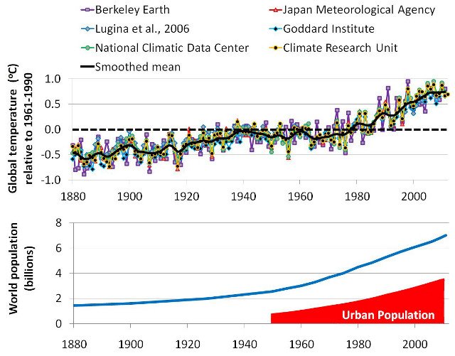
All estimates imply that there has been an almost continuous ‘global warming’ since 1880. Many people have blamed this on the increase in CO2 concentrations since the Industrial Revolution. However, this period has also seen a dramatic increase in urban population (bottom panel). So, much of the apparent ‘global warming’ might just be urbanization bias. Click on image to enlarge.
As can be seen from Figure 1, all of these global temperature estimates give pretty much the same result. Since the start of each estimate (usually 1880), they all suggest that global temperatures have been fairly steadily increasing by about 0.8°C/century.
Atmospheric carbon dioxide (CO2) concentrations have also been steadily rising since the late 19th century, and man-made global warming theory predicts that increasing carbon dioxide should cause “man-made global warming”. For this reason, many supporters of the theory assume that this apparent “global warming” is the “man-made global warming” their theory had predicted.
This has convinced many people that:
- The man-made global warming theory must be correct
- The weather station-based global warming estimates must be accurate
However, as we will discuss in this essay, many of the weather station records used for these estimates of global warming contain artificial warming biases, which are not representative of actual global temperatures.
The problem is that most weather station records are not kept for monitoring long term temperature trends. Instead, they are usually used for making more accurate weather forecasts, making farming decisions, helping air traffic control, and other similar short-term decisions.
A consequence of this is that the long-term records contain a lot of “non-climatic biases”. These are temperature changes which are not climatic, but are due to local changes in the station and its environment over the decades and centuries.
For example, if a station is re-located, a new type of thermometer is introduced, or new buildings are built to accommodate the staff, this could alter the temperature of the air in the immediate vicinity of the thermometer. If these local changes are not taken into account when the long-term temperature record is being analysed, this would mistakenly leave the impression that the climate itself had changed. In reality, it is only a change in the measured temperature, not a change in the actual climatic temperature.
This means that the temperature trends in any weather station record are a combination of:
- Actual climatic trends for the region
- Non-climatic biases
One of the biggest problems in accurately calculating “global temperature” trends from weather records is in separating the two, and only including the actual climatic trends.
This is not easy. In fact, it is very challenging, e.g., see Mitchell, 1953 (Open access).
Our analysis shows that the 6 groups we mentioned above that have being calculating the “global warming” trends didn’t do a good enough job in accounting for these biases. They seem to have severely underestimated just how tricky a job it actually is.
Chief amongst these non-climatic biases is urbanization bias, and this is the focus of this essay.
On this website, we usually use the U.K. spelling for most words instead of the U.S. spelling, but most of the literature on urban heat islands uses the U.S. spelling, e.g., “urbanization” instead of “urbanisation”. So, in our papers and in this essay, we use the U.S. spelling for urbanization.
In general, urban areas tend to be warmer than rural areas. If you are a car owner and have a thermometer in your car, you may have noticed this, i.e., the temperature generally rises when you drive into an urban area and decreases when you leave an urban area.
As a result of this extra urban warmth, if a weather station becomes urbanized, this introduces an artificial warming bias into the station’s record, i.e., urbanization bias.
If a substantial fraction of all the weather stations from around the world have been affected by urbanization bias, then this could have introduced an artificial warming trend into the “global temperature trend” estimates. That would mean that some (or even all!) of the alleged “unusual global warming” since the Industrial Revolution is just an artefact of urbanization bias!
With this in mind, we decided it was to important to carefully investigate the urbanization bias problem, and check if it had been adequately dealt with. We have written a series of three companion papers describing the results of our investigation, and have submitted them for peer review on the Open Peer Review Journal forum we founded:
- Urbanization bias I. Is it a negligible problem for global temperature estimates? – Ronan Connolly & Michael Connolly, 2014a
- Urbanization bias II. An assessment of the NASA GISS urbanization adjustment method – Ronan Connolly & Michael Connolly, 2014b
- Urbanization bias III. Estimating the extent of bias in the Historical Climatology Network datasets – Ronan Connolly & Michael Connolly, 2014c
Interested readers are welcome to read our three papers for a detailed assessment of the urbanization bias problem. However, each of the papers is quite long and technical, and so we have written this essay to provide a general overview of our main findings and conclusions.
In a nutshell, we found that urbanization bias has seriously affected the various global temperature trend estimates. It seems that most of the “unusual global warming” that we have heard so much about had absolutely nothing to do with our carbon footprint, but was just a consequence of urbanization bias!
The various attempts that have so far been made to deal with the urbanization bias problem have been woefully inadequate. In many cases, they actually seem to have made the problem even worse. The popular belief that the problem has been “dealt with” (e.g., here, here, here, here, here, or here) just seems to be down to wishful thinking…
However, before we can discuss our findings, let us first consider in a bit more detail exactly what the urbanization bias problem is…
What is the urban heat island problem?
Even in the early 19th century, it was already noticed that city temperatures were artificially warmer than the surrounding countryside:
…the temperature of the city is not to be considered as that of the climate; it partakes too much of an artificial warmth, induced by its structure, by a crowded population, and the consumption of great quantities of fuel in fires – Luke Howard, p. 2, Climate of London, 2nd Ed. (1833)
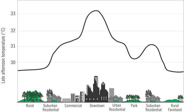
This phenomenon is known as the “Urban Heat Island” effect (often abbreviated to “UHI effect”). The word “island” is used because it is a localised effect which decreases as you leave the urbanized areas. This is schematically illustrated in Figure 2.
The exact amount of this extra urban warmth varies from town to town, from day to night, and from season to season. However, in general, the more urbanized the town is, the more warmth there tends to be.
Below is a 1 minute summary of the phenomenon by The Weather Channel:
Urban heat islands can cause serious problems for city dwellers during the summer, particularly in tropical and subtropical countries, e.g., India, since they increase the frequency and strength of heatwaves in the city. This is likely to become an even greater problem in the future as urban areas continue to expand and the number of people living in cities increases.
As a result, there is a lot of ongoing research into developing new construction techniques and urban planning schemes to try and reduce the rate at which these urban heat islands grow (“urban heat island mitigation”), e.g., see Rizwan et al., 2008 (Abstract; Google Scholar access) for a review.
For instance, in the following 2 minute clip, two researchers from the Heat Island Group at the Lawrence Berkeley National Laboratory (California, USA) discuss different types of materials which could be used for making pavements and car parks:
Aside from the problems urban heat islands can cause for city-dwellers, they also create an insidious problem for researchers who want to use weather station records to estimate global temperature trends.
This is because many of the world’s weather stations are currently in urbanized areas, but in the late 19th/early 20th centuries, these areas were rural (or at least less urbanized). As the areas around the weather stations became urbanized, this would have introduced an urban heat island at the station.

As the urbanization continued, the size of this heat island would have increased. This would have introduced an artificial warming trend into the weather station’s record, i.e., it would introduce an “urbanization bias”.
We illustrate this schematically in Figure 3. Let us consider a hypothetical weather station which has stayed in the same location since 1950, but has gradually become surrounded by urban sprawl. As the nearby city expanded over the decades, its urban heat island would have become bigger.
Initially, our hypothetical station might have been too far away to be affected (1950). However, as the urban sprawl expands, eventually the weather station begins to be affected by the expanding urban heat island (1950-1980). Soon, the weather station itself becomes urbanized (1980-2010).

Over the last century or so, urban areas have been dramatically growing across the world. Not only have previously rural areas been turned into urban areas (e.g., Figures 4), but smaller cities have grown into major urban metropolises (e.g., Figures 5).
At the moment, only about 1% of the world’s land surface is urbanized. So, this urbanization has probably not had much effect on actual global temperatures, e.g., Jacobsen & Ten Hoeve, 2012 (Abstract; Google Scholar access). However, as we will discuss in this essay, a surprisingly large number of the weather stations used for calculating global temperature trends are in these urbanized areas.

This means that the calculated global temperature trends are showing a lot more warming than the actual global temperature trends.
In effect, urbanization bias has introduced an artificial “global warming” bias into the calculated global temperature trends. This has nothing to do with our carbon footprint. Indeed, there are some suggestions that urban areas actually have a lower carbon footprint than rural areas, e.g., Glaeser & Kahn, 2010 (Abstract; Google Scholar access), although the data is quite ambiguous, e.g., Heinonen & Junnila, 2011 (Open access).
So, the people who have been blaming the recent “unusual global warming” on man-made global warming from increased carbon dioxide concentrations could easily have been mistaken.
Urbanization bias in urban stations
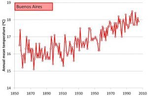
We can see from Figure 6, that the Buenos Aires station record implies that there has been a very strong warming trend since the early 20th century. The annual mean temperature was only 16°C at the start of the 20th century, but 18°C at the end. That’s an increase of about 2°C/century!
However, Buenos Aires (Argentina) is currently one of the most urbanized cities in the world. It underwent a rapid population growth over the 20th century, e.g., in 1914, the metropolitan area already had a population of 1.7 million, but by 2001 this had increased to 12.7 million! See here. So, it is quite likely to have been affected by urbanization bias. Indeed, Figuerola & Mazzeo, 1998 (Open access) have shown that Buenos Aires currently has a strong urban heat island, and presumably this was much smaller at the start of the 20th century.
Therefore, much of the strong “warming” trend implied by the Buenos Aires record is probably just urbanization bias. But, how much? Is it half of the trend? Is it all of the trend?
It’s actually really tricky to know for certain, because we don’t know exactly how the urban heat island at the station has developed over the century. We know it was there in 1998, because of Figuerola & Mazzeo, 1998’s study. But, when did it start affecting the station? Was there already an urban heat island at the station when it was set up in the 19th century, or did it only start developing in the 20th century?
What we can say for certain is that including the Buenos Aires record in the global temperature estimates will introduce at least some urbanization bias into the temperature estimates for Argentina.

You’re probably wondering, “Why don’t we just look at those stations that are rural?”
The nearest rural station to the Buenos Aires station is Punta Indio (ID=30187596000). This station is located at the Base Aeronaval Punta Indio, which is in a rural part of Argentina (35°21’S, 57°18’W), 140km from the Buenos Aires weather station.
From looking at the location using Google Earth, this does seem to be a fairly rural location (Figure 7). The nearest town, Verónica is nearly 5km away, and is quite a small town (pop. 5,772 according to Wikipedia).
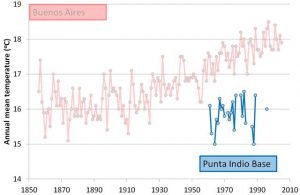
So, this seems like a perfect station to compare to the Buenos Aires station, except for one problem… It only has 23 years of data (Figure 8), spread over a fairly short period, i.e., the 1950s-1990s.
While the Buenos Aires station record continued to show warming during those 23 years, the Punta Indio station record didn’t! This suggests that the “warming” in the Buenos Aires record during those years was just urbanization bias.
Interestingly, the average temperature at the Punta Indio station was only about 16°C, i.e., the 19th century temperatures for Buenos Aires! Could that mean that all of the warming trend in the Buenos Aires record was urbanization bias? Maybe… or maybe not… Maybe the Punta Indio station is just located in a much colder spot.
We really can’t say for sure, because the Punta Indio record is too short. The only stations in the area with relatively long records are urban.
This is one of the main challenges with the urban heat island problem – it is harder to keep enough staff to maintain a continuous temperature record at an isolated rural location for a century (or longer) than in the heart of a thriving metropolis.
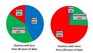
This means that most of the available rural records are fairly short (a few decades), and most of the stations with records of a century or longer are in urban areas. We can see from Figure 9 that quite a large fraction of the stations with records with less than 30 years are rural (43%), but only 4% of the stations with more than 120 years are.
Most of the stations that are being used for calculating the long-term temperature trends are urban!
Not just a problem for urban areas

Even in relatively isolated places, such as Barrow, Alaska (USA), urbanization bias is a problem. Barrow is at the northern tip of Alaska, high up in the Arctic. It is so isolated and far north that it was used as the setting for the 2007 vampire horror movie, 30 Days of Night. However, although the NOAA ESRL Global Monitoring Division maintain a weather station that is located out in the open tundra, 7.5 km northeast from the town (at 71.3230°N, 156.6114°W), this weather station was only established in 1973.
For Barrow’s long term weather record, we have to instead rely on the National Weather Service (NWS) weather station which is located in the middle of the town. It was originally at the NWS office on 1018 Kiogak St. (at 71.3230°N, 156.6114°W), although it recently seems to have been moved to the nearby Wiley Post-Will Rogers Memorial Airport.
This NWS weather record for Barrow has data stretching back to 1901, making it one of the longest weather records available for the Arctic. However, the village of Barrow has also expanded a bit since 1901. In 1900, it had a population of 300, but this had increased to 4,600 by 2000. While this might not seem like much compared to a major metropolis like Buenos Aires, the heavy energy usage of the residents during the bitter Arctic winter has been shown to cause a relatively strong urban heat island in the town.
Hinkel et al., 2003 (Open access) have shown that during the winter, the town is on average 2.2°C warmer than out on the tundra. This urban heat island has benefits for the residents, e.g., it has led to a 9% reduction in the number of freezing degree days and earlier snowmelt in the town. But, the development of the urban heat island would have also introduced a gradual warming bias into the NWS weather record.
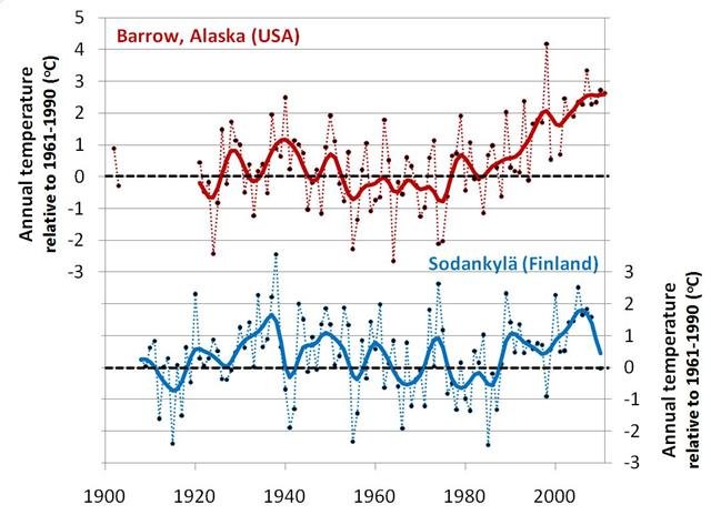
In other words, urbanization bias is even a problem in the Arctic. Figure 11 compares the Barrow weather record to another Arctic station, Sodankylä, Finland. [If you have read our essay on Arctic sea ice, you might recognise this figure from there].
Although Finland is on the European side of the Arctic, it is one of only six Arctic stations with data for more than 75 of the last 80 years, and it is the only one of those six stations that is not associated with some form of urbanization.
Both stations show:
- Warming in the early 20th century, up to the 1930s
- Cooling from the 1930s to the 1970s
- Warming from the 1970s to the 2000s
However, in the rural Sodankylä record, the recent 1970s-2000s warming is much less pronounced than in the Barrow record, and it was just as warm in the 1930s as it is today. This suggests that urbanization bias in the Barrow record has made the 1970s-2000s warming seem much more unusual than it actually was.
The effects of urbanization bias on global temperature estimates
One rare region which has a large number of rural stations with relatively long and complete records is the U.S.
In 1890, the U.S. National Weather Service created a Cooperative Observer Program (COOP) which encouraged volunteer weather enthusiasts to keep weather records at stations (rural and urban) across all of the United States. By using the data from this program, the National Climatic Data Center were able to create a high density dataset containing a large number of fairly long and complete records from all across the “contiguous United States” (i.e., all the states except Hawaii and Alaska). This dataset is called the U.S. Historical Climatology Network (USHCN) and contains a large number of rural records with a century or more of data.
We discuss this U.S. dataset in more detail in Paper 3. However, for now, it is sufficient to note that almost all of the station records in this dataset are fairly long and complete (urban and rural). Also, there are several rural and urban stations located in each of the U.S. states.

Of the 1218 stations in the U.S. Historical Climatology Network, about 23% of them are very rural and about 9% of them are highly urbanized. This gives us a relatively large set of stations which are similar enough that we can compare the temperature trends of rural and urban stations.
Figure 12 compares the average U.S. temperature trends when calculated using just the most rural stations to the trends calculated using the most urban stations.
Like the two Arctic stations in Figure 11, both subsets show similar trends:
- Warming from the 1890s up to the 1930s
- Cooling from the 1930s to the 1970s
- Warming from the 1970s to the 2000s
However, again, the urban stations also show an underlying warming trend, which substantially changes the context of the trends.
For the rural subset, the cooling periods are of roughly the same magnitude as the warming periods. In other words, they imply an almost cyclical “warming/cooling” pattern. The recent warm period doesn’t seem at all unusual. If anything, it seems to have been warmer in the 1930s! Indeed, the 1930s was a period of severe drought for the U.S., known as the “Dust Bowl era”.
For the urban subset, there was less cooling during the 1930s-1970s cooling period… and more warming during the 1970s-2000s warming period. This makes the recent warm period seem much hotter than the earlier warm period. Indeed, in early 2013, there were a number of claims that 2012 was the “hottest year on record for continental U.S.” (National Geographic).
The plots in Figure 12 are slightly smoothed (using 11-point binomial smoothing) to highlight the differences between the two subsets, but if you’re interested, the non-smoothed plots can be seen in Figure 8 of Paper 3.We used the unadjusted version of the USHCN dataset for generating these plots. The National Climatic Data Center also provide versions which have been adjusted (“homogenized”) in an attempt to account for various non-climatic biases. We will briefly discuss some of these adjustments in Section 6, but for a detailed discussion, we recommend you read Paper 3.

Figure 13 shows the difference between the two subsets. We can see that the temperature trends for the two subsets have been steadily diverging at a rate of about 0.7°C/century. This divergence seems to correlate fairly well with the urban population growth for the U.S. (bottom panel). This suggests that the divergence is mostly due to urbanization bias.
It seems that urbanization bias has introduced a regional warming of about 0.7°C/century into the urban stations of the U.S. Historical Climatology Network. To put this in context, the “unusual global warming” implied by the global temperature trends in Figure 1 has been about 0.8°C/century.
Isn’t there other evidence for global warming?
At this stage, you are probably thinking “…but, it’s not just the weather record analysis – there’s loads of other evidence for global warming – the Arctic sea ice is melting, the oceans are heating up, sea levels are rising, etc.” You’re right – there is plenty of evidence that there has been some global warming in recent decades. But, is this the same as evidence of man-made global warming, or even evidence of unusual global warming?
We saw from Figures 11 and 12 that both urban and rural stations agree that there was warming during the 1980s-2000s period. However, this followed an earlier period of cooling during the 1940s-1970s.
If the rural trends of Figures 11 and 12 are representative of global trends, then this indicates that the 1980s-2000s “global warming” was balanced by a similar period of “global cooling” in the decades before that. In other words, it was at least as warm in the 1930s and 1940s as it is today!
If the 1980s-2000s global warming was due to man-made global warming from our fossil fuel usage, then it should be much warmer today than it was in the 1930s, because carbon dioxide concentrations were much lower then. However, this didn’t occur for the rural stations in Figures 13 and 14! It is only for the urban stations that the recent warm period seems “unusually warm”.
Obviously, there is less and less data the further back in time we consider. But, the limited rural station data that is available suggests that the 1940s-1970s global cooling and 1980s-2000s global warming are not at all unusual. There seems to have been a period of global warming during the 1910s-1940s, and before that, a period of global cooling during the late 19th century.
As we will discuss later, most of the weather stations with records stretching back to the late-19th century (or earlier) are urban stations. So, we can’t use them for directly comparing 19th century temperatures to current temperatures. In addition, the longest station records are mostly confined to Europe (and North America), so they don’t tell us about “global” temperature trends.
Nonetheless, the longer records suggest that similar periods of cooling and periods of warming also occurred in the 18th and 19th centuries.

It seems that the Earth’s climate varies between periods of natural global warming and natural global cooling, regardless of what us humans are doing…
For this reason, before we can claim that a particular “global warming” period is “unusual” or “man-made”, we need to have enough data to compare it to other periods.
We are being continually told that there are lots of different indicators which provide evidence for “global warming” or “climate change”, and scientists aren’t just relying on the weather stations, e.g., here, here, here, or here. However, when you look carefully at each of these indicators individually, you find that none of them actually prove that this “global warming” is either “unusual” or “man-made”!
You probably are finding this hard to believe, so let’s look at this so-called evidence…
Most of the “global warming indicators” cover too short a time period
The first problem is that most of the indicators have records that are too short to compare the recent warm period to the earlier warm periods, i.e., they don’t start until after the 1930s-1940s warm period.
The various measurements described in the table below have all been used to claim that there has been unusual global warming. However, if you check the column showing when these measurements start you can see that none of them are long enough to actually justify such a claim:
| “Global warming indicator” | Typical study | Start of analysis |
|---|---|---|
| Satellite measurements of Greenland and Antarctic ice sheets | Velicogna, 2009 (Abstract; Google Scholar access) | 2003 |
| Northern Hemisphere permafrost | Romanovsky et al., 2010 (Open access) | 1999 |
| Satellite estimates of upper air temperature trends | Christy et al., 2010 (Open access) | 1979 |
| Satellite estimates of Arctic sea ice extent | Comiso et al., 2008 (Abstract; Google Scholar access) | 1979 |
| Onset of “spring” inferred from plant and animal life cycles (“phenological studies”) | Rosenzweig et al., 2008 (Abstract; Google Scholar access) | 1970s/1980s |
| Northern Hemisphere snow cover | Déry & Brown, 2007 (Abstract; Google Scholar access) | 1967 |
| Weather balloon estimates of upper air temperature trends | Thorne et al., 2005 (Abstract; Google Scholar access) | 1958 |
| Mass balance records for glaciers | Dyurgerov & Meier, 2000 (Open access) | 1950s/1960s |
| Ocean heat content | Palmer et al., 2010 (Open access) | 1955 |
It is certainly true that all of the above studies agree that there has been some global warming in the past few decades (1980s-2000s). But, none of them actually covered a long enough time period to compare the recent warm period to the earlier warm periods, such as the 1930s-1940s warm period. Basically, all they tell us is that the 1990s/2000s were warmer than the 1950s/1960s. That doesn’t tell us whether the recent warm period is “unusual” or not, does it? Sure, you could just as easily say that the 1950s/1960s were “unusually cold”!
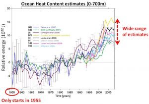
Not only that, but most of these indicators are only useful for making a qualitative comparison. We can use them to say that one decade is roughly warmer or cooler than another decade, but we don’t know by exactly how much. Indeed, the data is often quite ambiguous, and different researchers will disagree on the exact magnitude of the trends.
For instance, Figure 15 compares the various different estimates of ocean heat content trends. All of the estimates agree that the 1990s-2000s were warmer than the 1960s-1970s, but they disagree on how much.
This is relevant for the urban heat island problem, because we have the same problem when comparing the urban stations to rural stations. As we discussed above, the rural stations also agree with the urban stations that the 1990s-2000s were warmer than the 1960s-1970s, but disagree over how much. The urban stations imply that the 1990s-2000s were the warmest decades on record, but the rural stations imply that it was just as warm in the 1930s!
So, a global warming indicator which only tells us that there has been some global warming since the 1950s isn’t good enough! Unfortunately, that rules out almost all of the indicators we’ve heard so much about.
The remaining global warming indicators have their own problems
At this stage, you’re probably thinking, “That can’t be right! Surely, there’s got to be some other global warming indicator that shows a long-term global warming trend…” Remarkably, aside from the weather station record estimates, almost all of the so-called “global warming indicators” are short-term estimates…

While this is initially surprising, it does make sense when we realise that it is only in the last few decades that scientists have begun building up a proper climate monitoring network. Many of the climate monitoring programmes only began during the International Geophysical Year in 1957/58. Other programmes didn’t begin until the advent of the “satellite era” (1960s/70s).
Advances in technology have continued since then, and as a result many of our most reliable climate monitoring networks have only been in place since the 1990s and 2000s. Indeed, most of the improvements in our climate monitoring abilities occurred after the public interest in “global warming” began in the late 1980s, i.e., when governments began increasing funding for climate research with multi-billion dollar research programmes such as the U.S. Global Change Research Program.
Having said that, there are some other studies and datasets which have been used to argue that there has a long-term global warming trend since the Industrial Revolution. Unfortunately, all of these studies and datasets have their own problems, and so the claims that these “prove” there has been unusual global warming need to be taken with a pinch of salt.
The problems with most of these studies/datasets have been discussed elsewhere on this website:
- Some long tidal gauge records suggest that sea levels have been steadily rising since at least the 19th century. Some researchers claim that this is proof of “unusual global warming”. We disagree with this claim, as we discuss in our “What is happening to sea levels?” essay.
- Some researchers claim that there has been an unusual increase since the early 20th century in the frequency and intensity of hurricanes, typhoons and other tropical storms. We dispute this claim in our “Is man-made global warming causing more hurricanes?” essay.
- Some studies claim to have shown that the 20th century was the warmest in at least 1000 years, by combining together various different “temperature proxies” (tree rings, ice cores, lake sediments, etc.), e.g., Mann et al., 2008 (Open access). We discuss some of the problems with these “hockey stick studies” in our “Global temperature changes of the last millennium” paper, which we summarise here.
One other group of datasets which are worth some extra discussion are the Sea Surface Temperature (SST) estimates. Clearly, the ocean temperature measurements are unaffected by urbanization bias. Also, researchers started measuring ocean temperatures around the same time that they started setting up weather stations. So, initially, these estimates might seem to provide a useful comparison for the weather station records.
Indeed, many of the groups using weather station records for estimating global temperature trends, also combine their estimates with the sea surface temperature records to construct “land-and-sea” global temperature estimates.
What do we know about ocean temperature trends?
In the mid-18th century, some researchers began recording measurements of the water temperature at the ocean’s surface while on scientific oceanic voyages. For instance, between 1769 and 1770, Benjamin Franklin measured the water temperatures during several Atlantic crossings, and used these measurements to publish the first map of the Gulf Stream.
These measurements are referred to as “Sea Surface Temperatures” (SST). Unlike the temperature record for a weather station, the ships on these voyages were continuously moving and the voyages only lasted a few weeks or months each. So, these early Sea Surface Temperature measurements didn’t provide a continuous record for any individual location.
However, ocean temperatures tend to be much more uniform than land temperatures. For this reason, a number of researchers have suggested that it should be possible to estimate the long term Sea Surface Temperature trends for a given area by averaging together all the available measurements from different voyages that went through that area in a given month.
For example, the Hadley Centre have done this for their HadSST3 dataset. By doing this, they claim to have found a long-term global warming trend since the mid-19th century that is similar to the weather-station based estimates. The apparent similarity between these two different estimates has convinced many people that both estimates are accurate and reliable.

Unfortunately, there are major inconsistencies in the data sources used for constructing these Sea Surface Temperature estimates:
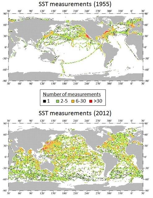
- We can see from Figure 17 that the data coverage in 1955 was actually quite limited, especially for the southern hemisphere. This coverage was even worse in earlier years.
- The exact shipping routes which contributed measurements varied from year to year, depending on a) which nations were involved; b) which ships (and captains) were involved; c) weather conditions; d) national and international territory agreements; etc.
- As can be seen from Figure 18, the actual types of measurements have undergone major changes over the decades. For instance, in the 1960s, all measurements were ship-based, while since the 1990s, most measurements have been made by weather buoys. Several groups incorporate satellite measurements into their Sea Surface Temperature estimates, but again these are only available from 1978 onwards.
As a result, directly comparing the Sea Surface Temperature data from the early 20th century to the current Sea Surface Temperature data is like “comparing apples and oranges” – there have been too many changes in the data sources for such comparisons to have much meaning.
So, while it is true that there is some Sea Surface Temperature data which goes back to the 19th century, there are a lot of uncertainties about how to compare the earlier data to the modern data.
In the 1980s and 1990s, it was well known that the data sources up to about 1960 were far too different from the modern data sources for a direct comparison. Most researchers recognised that if you had to make such comparisons, you would have to apply adjustments to the data to account for these changes, and that it was very unclear what those adjustments should be:
In summary, the historical [Sea Surface Temperature] record … may well contain instrumental bias effects that render the data of questionable value in determining long period trends in ocean surface temperatures… Investigators that use the data [to try this] bear a heavy, perhaps impossible, responsibility for ensuring that the potential instrument bias has not contaminated their results. – Barnett, 1984 (Open access)
Nonetheless, some researchers tried to come up with adjustments to apply to the data to allow some sort of estimates of the long term trends. Two approaches were taken:
- Develop some theoretical corrections to apply whenever it was known exactly what changes in data sources had occurred.
- Develop adjustments to the Sea Surface Temperature data, so that it better matched the land-based weather records
There are major problems with the first approach. Most of the changes in data sources are unknown, because they were either undocumented, or the documentation is lost/unavailable. But, in addition, it is unclear what the theoretical corrections should be.
As a result, the second approach has been quite popular. Many researchers seem to have assumed that the weather station-based estimates are much more reliable and consistent than the Sea Surface Temperature estimates.
Of course, if the Sea Surface Temperature data was adjusted specifically so that it better matched the land station data, then you can’t then use that adjusted data to claim the land station data is reliable!!!
So, neither approach can be used for claiming that the land station data is “reliable”.
See Farmer et al., 1989 for a review at the time of the two approaches. Farmer et al., 1989 was a Technical Report called “Documenting and explaining recent global mean temperature changes” and is available on the Climate Research Unit’s website.
The Sea Surface Temperature data is undoubtedly an important data source. In recent years, the observation network has undergone significant improvements. For instance, in 2000, the Argo network of weather buoys began deployment.
However, the data for the earlier parts of the 20th century (or earlier) has to be treated very cautiously. It is probably even less reliable than the land station data, even when we consider that the land station data is affected by the urbanization bias problem.
Paper 1. Is urbanization bias a negligible problem?
Summary of Paper 1: Several different studies have claimed that urbanization bias hasn’t significantly affected the global temperature estimates, and that the “unusual global warming” suggested by those estimates is man-made global warming due to our carbon footprint. In Paper 1, we carefully revisited each of those studies, to check if their claims were justified. In all cases, we found that they weren’t! It turns out that the authors of those studies had made basic errors in their analysis and/or hadn’t checked the data carefully enough.
The main justification offered by the groups who assume urbanization bias is negligible is that there have been a number of studies which have claimed to have proved that to be the case.
There have been 9 sets of studies which claim to have proved that urbanization bias is a negligible (or very minor) problem:
- Hansen & Lebedeff, 1987 (Abstract; Google Scholar access)
- Wigley & Jones, 1988 (Abstract; scanned version on Warwick Hughes’ blog)
- Jones et al., 1990 (Abstract; Google Scholar access)
- Easterling et al., 1997 (Abstract; Google Scholar access)
- Peterson et al., 1999 (Abstract; .pdf downloadable from DigitalCommons@UNL)
- Peterson, 2003 (Abstract; Google Scholar access); Parker, 2006 (Open access)
- Wickham et al., 2013 (Open access)
- Hansen et al., 1999 (Abstract; Google Scholar access); Hansen et al., 2001 (Abstract; Google Scholar access); Hansen et al., 2010 (Abstract; Google Scholar access)
So, in our first “Urbanization bias” paper, we decided to check how these studies came to that conclusion.
Surprisingly, when we closely examined each of the studies in turn we found that none of them were justified in making their conclusion!
In many cases, we found that the authors of these studies had made basic logical, statistical or scientific errors in their analysis. In other cases, they failed to properly check if their analysis was even capable of identifying urbanization bias. Several of the studies made all of these mistakes.
A detailed discussion of the flaws in all 9 sets of studies would probably be too much for this essay, but we provide such a discussion in Paper 1. So, if you’re interested in these studies, we recommend you read Paper 1.
However, many of the studies suffered from the similar flaws, so it might be helpful to briefly discuss some of the flaws common to more than one study:
Use of overly simplistic “rural”/”urban” thresholds
Most of the studies relied on just one threshold for distinguishing “urban” and “rural” stations. They then arbitrarily divided their stations into two groups on this basis.
For instance, Hansen & Lebedeff, 1987 defined a station as being “urban” if it was associated with a town with a 1970s population of at least 100,000. Otherwise, it was considered “rural”. On the other hand, Peterson, 2003 assumed that a station was “urban” once the nightlight brightness in the area reached a certain value.
This is a very limited approach to studying urbanization bias. Urbanization bias is a gradual process, and varies from country to country, and region to region.
As a result, this “single threshold” approach is seriously flawed:
- A weather station doesn’t suddenly switch from being “rural” to “urban” when the population increases from 99,999 to 100,000! Nor does having an extra few street lights on at night cause a sudden “rural”/”urban” transition! So, picking a single “threshold” value as the difference between an urban and rural station is too subjective and arbitrary.
- Urbanization bias isn’t just a once-off bias that simply appears once a threshold has been reached. Urbanization bias is a continual process that gradually becomes greater as a rural village becomes a small town, then a large town, then a small city, then a thriving metropolis.
- The factors that contribute to urban heat islands vary from one urban area to another. We saw in Section 2 that Barrow, Alaska (USA) already has a pronounced urban heat island even though it has a population of less than 5,000. If you were only relying on population as a threshold for urbanness, you would probably assume Barrow was unaffected.Similarly, the per capita electricity usage in some countries is much greater than in others. As we discuss in Paper 2, India has roughly 4 times the population of the U.S., but only uses one eight as much electricity. So, if you only relied on night-light brightness as your threshold for urbanness, you would seriously underestimate the number of urban stations in India.
If you want to seriously study the effects of urbanization bias, you can’t just use a simplistic “either/or” approach to distinguishing stations, e.g., see Stewart & Oke, 2012 (Open access).
By taking this simplistic approach, most of the studies failed to properly distinguish between the true climatic trends and urbanization bias.
Mistakenly assuming rural station records are just as long and complete as the urban station records
Many of the studies seem to have mistakenly assumed that if you could divide all the stations into two subsets – one “rural” and one “urban” that this would be sufficient to quantify the amount of urbanization bias in the data. While it would be nice if that was all that were required, it is unfortunately just wishful thinking.
As we discussed in Section 2, the problem is that there just aren’t that many rural stations with long, reasonably complete records.
Until a few decades ago, automated weather stations simply didn’t exist. If you wanted to maintain a weather station record you needed to have staff living near by who could take each day’s measurements. This was relatively easy to do in places that were in, or even near, civilisation. But, understandably, most weather observers didn’t want to live in isolated, remote locations. If you did convince an observer to take daily measurements at a remote location for several years, when that observer retired, or perhaps died, you would need to find a replacement, or else the station record would finish.
As a result, most of the truly rural stations have very short records – often with large data gaps. This means that they are not much use for studying long-term temperature trends.
As we explained in Section 1, overcoming the urbanization bias problem is not easy. The authors of the nine sets of studies don’t seem to have realised just how tricky a problem it is.
Overuse of “linear trend” analysis
Most of the authors of these 9 sets of studies do not seem to have had much experience in statistics. This is understandable. Statistics can be a tricky subject which requires a quite mathematical frame of mind, and many scientists have never studied it.
However, unfortunately, the analysis that was involved in these 9 studies was quite statistical in nature. It seems that several of the authors involved were simply out of their depth when they were deciding on an appropriate statistical analysis for their study. As a result, they often used very inappropriate techniques which gave them widely misleading results.
A common statistical mistake in the different studies was to use “linear trends” to describe their station data.
Calculating the linear trend for a data series is a relatively simple statistical procedure, and can even be carried out using standard spreadsheet packages, such as
Microsoft Excel. For this reason, it seems to be one of the most popular statistical techniques used in climate science.
Seven of the nine sets of studies considered linear trends as part of their analysis (all except Hansen & Lebedeff, 1987 and Peterson, 2003). For two of the groups (Jones et al., 1990 and Wickham et al., 2013), linear trend analysis made up a major part of their study.
However, weather station records are often highly non-linear…
When your data is very non-linear, then using a linear trend to describe the data is very risky. Unless you’re very careful, your conclusions will most likely be meaningless!
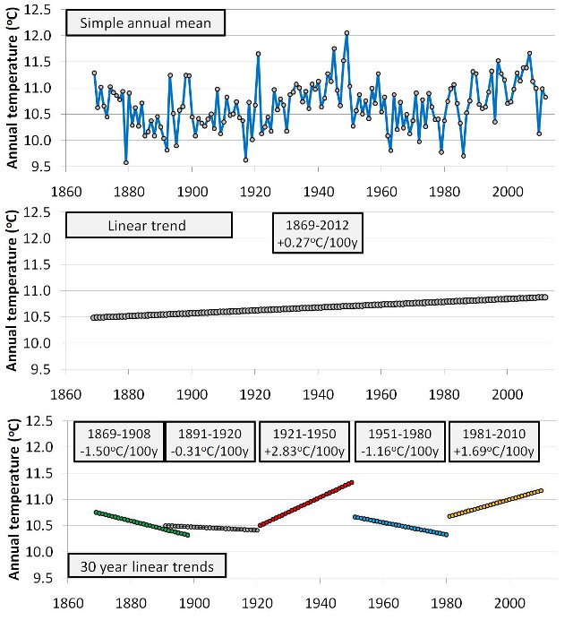
Take for instance, the Valentia Observatory (Ireland) weather station. This is one of the longest and most complete rural station records. The top panel of Figure 19 shows the annual trends. Does it have a simple “linear” trend? No.
At various stages throughout the record, the station switched between periods of cooling (e.g., 1860s-1880s or 1950s-1970s) and periods of warming (e.g., 1920s-1940s or 1980s-2000s). The trends are very non-linear.
It is true that you can calculate a “linear trend” for the data (middle panel), but it is basically meaningless. If you calculate the linear trend over the entire Valentia Observatory record, you nominally obtain a slight “warming” trend. But, that is just because the start of the record occurred during the middle of a cooling period, and the end of the record occurred at the end of a warming period!
If you used a shorter length of data to calculate the linear trend, then you can get either a “warming trend” or a “cooling trend”, simply depending on when you start and end your analysis. This is illustrated in the bottom panel, where we show five completely different “linear trends” – all using the same 30 year length, but just using different start and end years.
If you only use linear trends for analysing the temperature record for Valentia Observatory, you might mistakenly conclude, “it shows a ‘warming trend’, and it’s rural, so even the rural stations show ‘unusual global warming'”. In reality, the hottest year on record for Valentia Observatory was 1949, and the recent warm period doesn’t seem at all “unusual”.
Overall results
In all cases we found that their conclusion that urbanization bias is negligible to be false. The reasons why they mistakenly made that conclusion varied from an inadequate analysis of their data to making logical and/or statistical errors in their reasoning. We have a mentioned of these errors above, but for a more detailed analysis see Paper 1.
Paper 2. An assessment of the NASA GISS urbanization adjustment method
Summary of Paper 2. The NASA Goddard Institute for Space Studies (NASA GISS) is the only group using weather records to construct global temperature estimates that explicitly adjusts their data to correct for urbanization bias.In Paper 2, we carefully studied and analysed their adjustment method to see if it works. We found that it doesn’t! We identified several serious flaws in their adjustment method which make their adjustments unreliable, inadequate and inappropriate. We found that their adjustments actually introduced about as many biases, as they removed. In our paper we offer several recommendations which might help overcome some of these flaws. However, for now, the NASA GISS global temperature estimates are just as unreliable after adjustments, as before.
The NASA Goddard Institute for Space Studies

The NASA Goddard Institute for Space Studies (NASA GISS) is one of the five groups that currently publish global temperature trend estimates from weather station records, i.e., they produce one of the curves we showed you at the start of this essay in Figure 1.
They are located in New York City (NY, USA) in one of the Columbia University buildings (Figure 20).
Their offices are located over the iconic New York diner, “Tom’s Restaurant” which featured prominently in the popular TV sitcom, “Seinfeld”, and was the inspiration for Suzanne Vega’s 1987 a capella song, Tom’s Diner, which was in turn used by the inventor of the MP3 digital music format when he was developing the MP3 (see here):
The Goddard Institute has played a very prominent role on both sides of the debate over man-made global warming theory. The founding director of the institute, Dr. Robert Jastrow, who ran the institute from 1961-1981, was a major critic of man-made global warming theory until his death in 2008, e.g., see this 2001 essay.
However, Jastrow’s successor, Dr. James Hansen, who ran the institute from 1981-2013, was (and still is) a very vocal supporter of man-made global warming theory. Indeed, in his 1988 testimony to U.S. Congress he claimed:
It is time to stop waffling so much and say that the evidence is pretty strong that the greenhouse effect is here. – NASA GISS director, Dr. James Hansen, in testimony to U.S. Congress, 23rd June 1988
This 1988 testimony is believed to have been very influential in making man-made global warming theory a public concern, e.g., see here. In addition, he was one of the main scientific advisors to Al Gore for the popular 2006 An Inconvenient Truth film.
When Hansen and his colleagues first started publishing their global temperature trend estimates in the early 1980s, they did not seem to have considered urbanization bias, e.g., Hansen et al., 1981 (Abstract; Google Scholar access). Later, they recognised that it was a problem that needed to be considered, but on the basis of their Hansen & Lebedeff, 1987 (Abstract; Google Scholar access) study, concluded that it was a fairly minor problem. This was one of the 9 sets of studies we mentioned in Section 4, i.e., one of the papers we reanalysed in Paper 1.
However, by the late 1990s, they seem to have decided that it was probably a problem they should take more seriously. They decided to develop a computer program which would automatically search through the weather station records and apply adjustments to remove any urbanization bias.
Since 1999, they have been running this program on their data before they construct their global temperature trend estimates – see Hansen et al., 1999 (Abstract; Google Scholar access).
In the years since Hansen et al., 1999, they have made some modifications to their computer program which they describe in Hansen et al., 2001 (Abstract; Google Scholar access) and Hansen et al., 2010 (Abstract; Google Scholar access), and on their “GISTEMP” website.We discuss these modifications and their significance in Paper 2.
When the Goddard Institute ran their program on the roughly 6,000 station records that they use, they found that the program made quite a lot of adjustments. However, the net effect of the adjustments on their global temperature trend estimates was very small (roughly -0.05°C/century). As a result, their “urbanization bias-corrected” global temperature trend estimates was pretty much the same as the estimates of the other groups who didn’t apply any urbanization bias corrections (you can see this by looking back at Figure 1, at the start of the essay).
This seems to have convinced many people that the urbanization bias problem is fairly negligible.
In Paper 2, we decided to carefully analyse this computer program, and check to see if it actually worked. We found that it doesn’t, and actually introduces as many biases as it removes! But, before we discuss our analysis, it will probably be helpful to outline exactly what their computer program does.
The basic idea of NASA’s approach
The basic idea behind the Goddard Institute’s adjustments is as follows:
- Divide all of their weather stations into two groups: “urban stations” and “rural stations”. Since 2010, they have been doing this on the basis of the night-light intensity in the location of the station (using satellite data).
- For every station that the computer identifies as “urban”, the computer works out an individual urbanization bias adjustment, using the following method:
- A “rural average” is calculated for the urban station by averaging together the trends of all of the rural neighbours in a 500 km radius (or 1000 km, if there aren’t enough within 500 km).
- The difference between the urban station record and the rural average is then calculated, and assumed to be “the urbanization bias”.
- The urbanization adjustment is calculated by approximating the difference using a linear fit. However, because urbanization is not a simple linear process, they use a two-part adjustment. In other words, they calculate two linear fits (see the middle panel of Figure 21) – “Leg 1” is the linear fit for the first part of the record, and “Leg 2” is the linear fit for the second part of the record. The point marking the transition between Leg 1 and Leg 2 is adjusted by the program in order to optimise the fits.
- This adjustment is added to the urban station’s record (Figure 21), and the record is then assumed to have been adequately corrected.
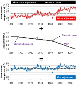
Currently, the Goddard Institute use about 6,000 stations, of which they identify about half as being “urban” and apply adjustments to. For about 200 of the urban stations, they do not have enough rural neighbours for their computer program to work, and so these unadjusted urban stations are not included in their global temperature estimates.
A surprising decision that the Goddard Institute made when they were writing their program was that they add their adjustments in reverse to their urban station records, rather than simply subtracting them.
To understand what we mean by this, have a careful look at the adjustments in Figure 21. At the start of the unadjusted Phoenix record, the average annual temperature was roughly 20-21°C. At the end of the record, this had risen to 24-25°C. The Goddard Institute’s computer program calculated that about 3°C of this warming was urbanization bias.
However, rather than subtracting this 3°C from the modern biased temperatures, their program adds 3°C to the early unbiased temperatures. In effect, the program is “rewriting history”, and pretending that Phoenix has always been 3°C warmer.
Now, you might argue that this doesn’t really matter. After all, they’re not interested in the actual temperature is at Phoenix, they’re just interested in what the trend is, i.e., is it getting warmer or colder. However, it is an unnecessarily confusing approach.
In addition, because urbanization bias continues to increase from year to year, this means that they have to keep on increasing their adjustments every year, meaning that “history is continuously being rewritten”. There doesn’t really seem to be any good reason for taking this approach. On the contrary, it seems to have led to a lot of unnecessary suspicion and cynicism amongst the public, e.g., here.
At any rate, the most important thing is figuring out how successful NASA’s adjustments are. You might have assumed that this would have been one of the first things that they would have tested. However, surprisingly, they don’t seem to have ever checked if their adjustments were actually removing the urbanization biases from their data!
Instead, it seems that once they had written their computer program, they assumed that it would work. As we will see below, this was an unwise assumption, because their method doesn’t work.
Most of NASA’s adjustments are nonsensical
Do you remember how each of NASA’s adjustments consists of two parts, and that each of the parts is a linear adjustment? We can define each of these parts in terms of its “slope”, which tells us whether the line goes “up” as we go from left to right (“positive slope”) or “down” as we go from left to right (“negative slope”).
If you are unfamiliar with the difference between negative and positive slopes, here is a 2 minute explanation:
According to NASA’s computer program, the more negative the slope is, the more urbanization bias there is. So, for a typical urban heat island we would expect the first part of the adjustment to be slightly negative, and then the second part to be even more negative.
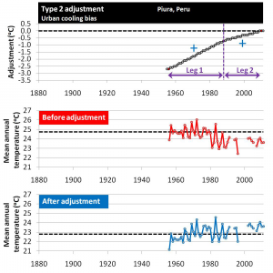
However, bizarrely, about half of the linear adjustments their computer program calculates have positive slopes, e.g., Figure 22. In other words, the program is calculating the “urbanization bias” to be due to “urban cooling“, and not “urban warming”!!!
We decided to group all of NASA’s urbanization adjustments into four different types, depending on the slope of each part:
- Type 1: The slopes for both parts are negative, e.g., Figure 21. This is the normal expected adjustment, because it would remove urban warming bias. However only about 15% of the adjustments were of this type!
- Type 2: The slopes for both parts are positive, e.g., Figure 22. This is the opposite of what should be occurring! About 9% of the adjustments were of this type.
- Type 3: The slope for the first part is negative, but the second part has a positive slope, e.g. Figure 23. About 39% of the adjustments were of this type.
- Type 4: The slope for the first part is positive, but the second part has a negative slope. About 37% of the adjustments were of this type.
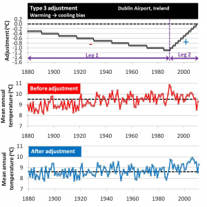
Figure 23 shows a typical Type 3 adjustment. The first part of the adjustment removes a warming trend from the urban record, as we would expect. However, the second part introduces a warming trend, i.e., the opposite of what we should expect.
Type 4 adjustments are similar, but just the other way round, i.e., the first slope is positive and the second slope is negative. The vast majority of NASA’s adjustments (76%) are either Type 3 or 4. Since both types include a “cooling bias” adjustment, that means that only 15% of NASA’s adjustments are the expected adjustments to remove urbanization bias.
Hansen et al. point out that urbanization can sometimes lead to an artificial “cooling” bias, e.g.,
Anthropogenic effects can also cause a non-climatic cooling, for example, as a result of irrigation and planting of vegetation, but these effects are usually outweighed by urban warming. – Hansen et al., 1999 (Abstract; Google Scholar access)
On this basis, they seem to have decided that it doesn’t matter whether their computer program removes a warming trend from the data or introduces one! It seems they reckon if their program decides there is a “cooling bias”, then it must be right.
However, as we discuss in Paper 2, while it is true that there are some types of urban development which can introduce cooling under certain conditions, these “urban cooling” trends are very limited and rare. Urbanization bias is almost entirely a warming bias – that’s why we get Urban Heat Islands.
At any rate, they certainly shouldn’t be occurring for 85% of the urban stations, which is what NASA’s adjustment program calculates. Indeed, it contradicts Hansen et al., 1999’s own (correct) claim quoted above that “[urban cooling] effects are usually outweighed by urban warming.”!
NASA’s net adjustments are physically unrealistic
As we discussed above, for almost all of NASA’s adjustments to remove an urban warming trend there is an equivalent adjustment to remove an “urban cooling” trend from another station.
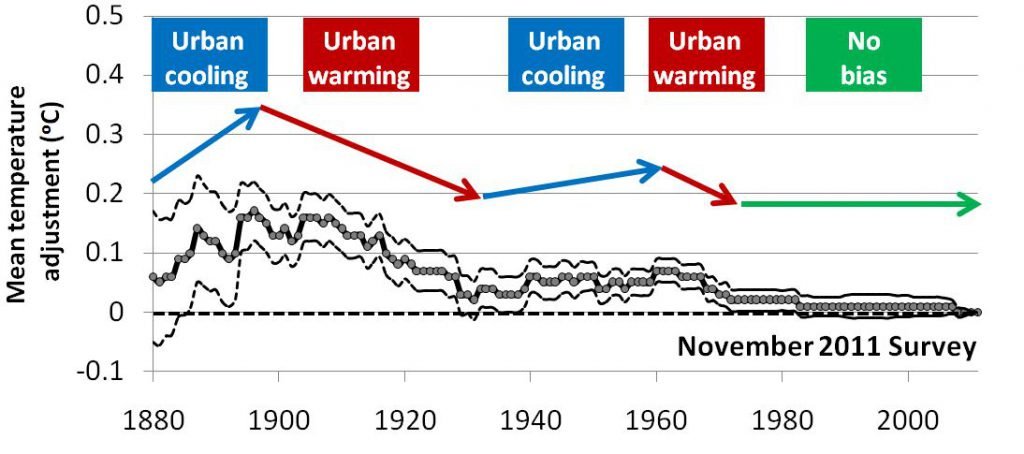
As a result, the net effect of all the adjustments was very small, i.e., about -0.1°C/century (Figure 24). Since NASA only identified about half of the stations as being urban, the overall effect on their global temperature estimates was only half of that, i.e., about -0.05°C/century.
We can see why this result helped convince the other groups that they didn’t really need to worry about urbanization bias. They probably thought that if NASA had developed a program to explicitly correct for urbanization bias, but it only removes about 0.05°C/century, then it’s not a big deal.
Of course, the reason why the net adjustments were so small is that the individual adjustments were mostly nonsensical, as we saw above!
At any rate, even if their computer program were right about the net magnitude of the adjustments being small, the actual year-to-year variations of the net adjustments are physically unrealistic. For instance, we can see from Figure 24 that their program calculated that urbanization led to a net “cooling” during two periods – 1880s-1890s and 1930s-1960s. This is in itself nonsense.
However, worse still, there is almost no net adjustment for the period from the 1970s to present. This is arguably the period which has seen the most urban development of all. So, the fact that NASA’s adjustments peter out to nothing during this period beggars belief.
NASA’s adjustments don’t even work on the most heavily urbanized metropolises
As a simple test to see how reliable NASA’s adjustments are, we selected a sample of stations from the largest urban areas in the world today. On average, these stations should be strongly affected by urbanization bias. So, if NASA’s computer program is at all effective, then it should be removing a lot of warming from these stations.
We identified the most highly urbanized stations in terms of associated population and night-light brightness. We only selected stations with an associated population greater than 2 million, and had a very high night-light brightness according to two different satellite estimates. This gave us 116 stations from a total of 47 urban metropolises (a lot of the metropolises had more than one station).
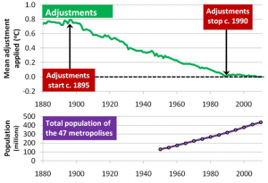
The average adjustments NASA’s computer program applied to this sample are shown in Figure 25.
We can see that, as expected, the program applied quite heavy adjustments to the early part of the records, removing about 0.8°C/century of a warming trend from the period from 1895-1980.
So far so good, … however, instead of these adjustments increasing for the 1980s, 1990s and 2000s, the adjustments actually dramatically decreased for the post-1980 period!!! By the 1990s, the net adjustments were essentially zero.
The bottom panel of Figure 25 shows the total population growth of the 47 metropolises. Although population isn’t an exact measure of urbanization, there is no justification in the population data for NASA’s sudden 1980 decrease in adjustments.
Their computer program failed the test.
Some of the flaws in NASA’s computer program
In our paper, we identified several major flaws in NASA’s adjustment methods:
- Their rural identification is unreliable, and a lot of the stations they identify as “rural” are actually urban
- If the rural records end before the urban records, NASA’s program stops adjusting the urban records. But, rather than deleting the bits of the record it couldn’t adjust, it keeps the rest of the record unadjusted! As we mentioned in Section 2, there is a severe shortage of long rural records (we will elaborate on this in Section 6). So, this is a very frequent problem.This is a doubling insidious problem. Not only are the urban records included unadjusted for those periods, but because there aren’t enough rural stations to carry out the adjustments, that also means that they aren’t being included in the regional trends for that area. That is, there are no non-urban stations in the area to in any way dilute the urbanization bias for the region.
- NASA explicitly assume that the rural records have no non-climatic biases. This is a serious problem. For instance, if a rural station underwent a station move which accidentally increased the temperature, then this would increase the trend of the “rural average”, and would fool the computer program into thinking the urbanization bias at that station was less than it actually was. It could even fool the program into thinking the urbanization bias was a cooling bias.
We discuss the significance of these (and other flaws) in Paper 2, but the bottom line is that the adjustment method they programmed into their computer program is seriously flawed.
Conclusion: NASA’s adjustments don’t work.
The “urbanization bias” corrections their computer program calculates are unrealistic, unreliable, inadequate, and often just plain inappropriate!
Their program introduces at least as many biases as it removes.
The main problem seems to be that they once they developed their computer program, they seem to have just assumed it would work, and started using it, without proper testing.
If their computer program was a commercial software package for a proper software company (e.g., Microsoft or Adobe), this would never have happened. As soon as customers started noticing that the program doesn’t actually work, they would have been inundated with complaints. However, because the developers of the computer program (the Goddard Institute) are the only “customer”, it seems they simply never noticed that it doesn’t work.
The urbanization bias problem is a very challenging one. NASA seem to have severely underestimated just how challenging it is.
Paper 3. How heavily urbanized are the stations used in the global temperature estimates?
Summary of Paper 3. In Paper 3, we carried out a detailed assessment of the extent of urbanization bias in the Historical Climatology Network datasets. These are the main weather station archives used for the current global temperature trend estimates. We found that the U.S. components included a relatively high number of rural stations with long records, making them somewhat reliable. However, we found that urbanization bias is still a problem for the dataset, and the subset of U.S. stations that were urban showed an average urbanization bias of about 0.7°C/century. In the rural subset of U.S. stations, the recent warm temperatures aren’t actually that unusual, and it seems that it was at least as warm in the 1930s. As for the rest of the world, almost all of the rural stations in the dataset have records which are too short and/or are missing large periods of data. Only eight of the rural stations have data for at least 95 of the last 100 years! This is simply not good enough for estimating “global temperature trends”. The National Climatic Data Center who compile and maintain the Historical Climatology Network datasets have developed a series of “homogenization” adjustments, which they believe remove any non-climatic biases from the data. They have claimed that these adjustments have substantially reduced the urbanization bias problem. We show that this claim is wrong. Their homogenization algorithm is woefully inappropriate. Instead of removing urbanization biases, it merely spreads the biases amongst all stations – urban and rural!
In Paper 3, we attempted to estimate how badly affected by urbanization bias the data is. To do this, we studied the main weather station dataset used by the five different groups, i.e., the Historical Climatology Network datasets.
How widely used are the Historical Climatology Network datasets?
NOAA’s National Climatic Data Center compile and maintain the main weather station datasets used by the five groups currently publishing global temperature trend estimates, i.e., the ones we mentioned at the start of the essay in Figure 1. The main dataset is known as the Global Historical Climatology Network (GHCN), but a large component of this dataset is also available as a separate dataset called the U.S. Historical Climatology Network (USHCN). Collectively, we refer to these datasets as the Historical Climatology Network.
Some of the groups rely almost exclusively on the Historical Climatology Network:
- The National Climatic Data Center uses it for all 7280 of their station records.
- NASA’s Goddard Institute for Space Studies uses it for 6280 out of their 6322 stations, i.e., 99.3%.
- The Japan Meteorological Agency uses it for 3883 out of their 3900 stations, i.e., 99.6%.
At first glance, it appears that the other two groups (Climate Research Unit and Berkeley Earth) are using fairly independent datasets. The Climate Research Unit only directly obtains less than one third of its station records from the Historical Climatology Network (1617 out of 5583), and the Berkeley Earth group gets less than one fifth of its records from them (7280 out of 39028).
However, a closer inspection of these other datasets reveals that they actually overlap very heavily with the Historical Climatology Network datasets.
The Climate Research Unit was one of the first groups to construct a weather station record dataset in the 1980s, e.g., see Jones et al., 1986 (Open access). So, when the Global Historical Climatology Network was first released in the 1990s, the Climate Research Unit only started using it for the station records they didn’t have.
But, when the National Climatic Data Center were constructing the Global Historical Climatology Network, they were mostly using the same data sources that the Climate Research Unit had used – see Peterson & Vose, 1997 (Open access). In fact, one of their main data sources was the Climate Research Unit’s datasets!
For this reason, it has been estimated that more than 98% of the station data used by the Climate Research Unit either comes from the Historical Climatology Network, or else is derived from one of the data sources used for constructing the Historical Climatology Network, e.g., see McKitrick, 2010 (Open access).
The Berkeley Earth group use the Global Historical Climatology Network dataset, but they have combined it with several other datasets to create a much larger dataset than any of the others. The Berkeley Earth dataset contains records for nearly 40,000 stations, i.e., more than 5 times the number of stations in the Global Historical Climatology Network.
However, more than half of these stations in the Berkeley Earth dataset have very short records (less than 30 years of data). So, when the Berkeley Earth group are using their dataset for studing long-term trends, they are predominantly relying on the Global Historical Climatology Network component of their dataset.
Indeed, in one of the Berkeley Earth groups main studies, they just used the Global Historical Climatology Network, i.e., Rohde et al., 2013 (Open access).
In other words, all of the groups rely very heavily on the Historical Climatology Network datasets. This means that to assess the extent of urbanization bias in each of the groups’ estimates, we can safely limit our analysis to the Historical Climatology Network…
How badly affected by urbanization bias are the datasets?
The U.S. component
As we mentioned in Section 2, when the National Climatic Data Center were constructing the U.S. Historical Climatology Network, they were able to take advantage of a very large collection of U.S. station records from the Cooperative Observer Program (COOP) dataset. Many of these stations were rural, and so they were able to construct a relatively rural dataset, with relatively long and complete station records – see Karl et al., 1988 (Open access).
In total, the U.S. Historical Climatology Network contains 1218 station records. The average length of the station records is 93 years, which is relatively long, and more than a fifth of them (277) are still rural today. In addition, only 99 of the stations are highly urbanized (in terms of population and average night-light intensity).
So, the U.S. component of the Historical Climatology Network is reasonably rural. Having said that, we saw in Section 2 (Figures 12 & 13) that the highly urbanized stations are significantly affected by urbanization bias, with the bias introducing a warming bias of roughly 0.7°C/century.
Some of that bias seemed to be due to different ratios in the various observation practices made at different stations, because, when we applied adjustments to correct for changes in “Time of Observation”, the difference between the urban and rural stations was reduced by about 0.2°C/century.However, as we discussed in our “Has poor station quality biased U.S. temperature trend estimates?” paper (summarised here), the Time of Observation adjustments also seem to make the poor station exposure biases more pronounced, i.e., the total amount of non-climatic biases is about the same.
The rest of the dataset
Unfortunately, the rest of the Global Historical Climatology Network is nowhere near as useful.
It is true that nearly one third of the stations in the dataset are still rural (1987 out of the 6051 non-U.S. stations). However, almost all of these rural stations have very short records. Most of the station records only have data in the 1950-1990 period, which as we discussed in Section 3, is not long enough to study long-term temperature trends.
Only eight of the rural stations actually have data for at least 95 out of the last 100 years:
- The Pas, Manitoba (Canada)
- Angmagssalik (Greenland)
- Lord Howe Island (New Zealand)
- Sodankylä (Finland)
- Hohenpeißenberg (Germany)
- Valentia Observatory (Ireland)
- Sulina (Romania)
- Säntis (Switzerland)
The Säntis weather station was set up in 1882, and has been in operation almost continously since then. Because it is located at the top of a tall mountain in the Swiss Alps (i.e., Mount Säntis), when it was first set up, it was quite difficult to get to. There was no cable car at the time, and especially during the winter, the weather station observers would have to stay up there for months on their own. Despite that, it was quite a lot of competition for the job, as it was well paid. Plus, the views are spectacular!
So, there was no shortage of candidates for the position. Indeed, in 1922, Gregor Kreuzpointner, a failed candidate for the job climbed up to the station and murdered the station observer and his wife who had the job (Josef & Maria Haas). The murders were discovered a few days later when people wondered why the weather reports had stopped. See here for a description (in German).
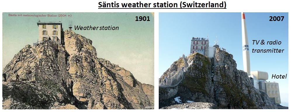
It is still definitely a rural location, and so is unlikely to be affected by urbanization bias.
However, it is important to remember that does not meant that it is unaffected by other non-climatic biases. There have been a lot of changes associated with the station.
For instance, in 1955, a 123.5m high TV and radio transmitter was built beside it, and it is now the location of a large hotel (Figure 26), that is a popular tourist destination, e.g., CZ Tan has some nice photographs of her visit there on her blog. In addition, the Swiss meteorological agency replaced the instruments used for weather measurements in the late 1970s to automated instruments, so that manual observations were no longer needed – see Begert et al., 2005 (Open access).

Similarly, there have been quite a few changes at the Hohenpeißenberg (Germany) station, since it first was set up in 1781. For instance, in the 18th and 19th centuries, temperatures were measured indoors, while now they are measured outdoors (Figure 27).
By using Google Earth, we were able to locate the current location for the Sulina weather station – on a concrete platform a few metres from the River Danube (Figure 28). However, the weather station has been relocated several times over the course of its record. For example, during World War 2, it was moved 140 kilometres south to the town of Constanta. Also, the official co-ordinates for the station are for a different spot, near the town centre, 5 kilometres to the west of its current spot. This suggests that the Sulina station has only recently moved to its current location.

It is possible that any of these changes (or others) could have altered the local microclimate at these stations (a problem we discuss in this essay), or introduced some instrumental biases.
If there are non-urban-related biases in these records, then we cannot solely rely on them for working out what the long-term global temperature trends are.
Of course, this is a problem for all weather records. It has been estimated that station changes which could potentially introduce a non-climatic bias occur on average about once every 20 years, e.g., Karl & Williams, 1987 (Open access). However, the problem is that there are so few rural stations with long records that the only neighbouring stations that you can compare their records with are either potentially affected by urbanization bias, or else don’t have enough data!
Outside of the U.S., there are only EIGHT station records in the Historical Climatology Network that are fully rural, and have data for at least 95 of the last 100 years. This is not enough for working out long-term “global” temperature trends!
This is an insidious problem. Frankly, we do not believe it is possible to extract a meaningful estimate for the 20th century “global” temperature trends from the data that is currently available.
There does seem to be enough rural stations with long records to be reasonably confident about the U.S. temperature trends for the 20th century, but not for the rest of the world.
Having said that, we think it should be possible to collect a lot more data which could allow some sort of reasonable analysis.
For instance, when the National Climatic Data Center were compiling the Global Historical Climatology Network, they were doing this effectively from the office, e.g., see Peterson & Vose, 1997 (Open access). They don’t seem to have actually visited any of the stations, or tried to find out any “station history” information about the stations. Many meteorological organisations keep quite detailed station history files, and keep track of any reported station relocations, modifications to the surroundings or changes in instrumentation or measuring techniques.
If these history files were publically archived and the stations were individually inspected then maybe we would be able to identify some of the more serious non-climatic biases. It might also be possible to find longer and more complete records for some of the other rural stations.
Then, it might be possible to make some meaningful estimates of long-term global temperature trends from the weather records. However, until then, it is foolish to attempt it.
Does NOAA’s homogenization remove the problem?
Like NASA Goddard Institute for Space Studies, the National Climatic Data Center have also written a computer program which they believe removes non-climatic biases from their weather station dataset. This program is described by Menne & Williams, 2009 (Open access) and adjusts each of the weather station records in their dataset so that it better matches those of its neighbours.
This process is called “homogenization”, because after adjustment, all of the stations show pretty much the same trends, in the same way that homogenized milk has a uniform texture throughout the milk.
The National Climatic Data Center have run this computer program on their Historical Climatology Network datasets, and provide the users of their data the choice to use the original datasets or their homogenized versions.
Many people believe that the homogenization process is somehow able to remove the urbanization biases from the data, and that they don’t need to worry about urbanization bias as long as they use the homogenized versions of the datasets, e.g., Menne et al., 2009 (Open access).
For this reason, in Paper 3, we also checked to see if this belief was valid, i.e., does NOAA’s homogenization remove the problem?
The answer is no.
Essentially, all their homogenization program does is to spread the non-climatic biases evenly amongst the different stations, whether the stations were originally biased or not.
It is the same problem we discussed in our essay on the problem of poor station quality in the U.S. dataset.
Before homogenization, many of the urban stations are affected by urbanization bias, but the rural stations aren’t.
The homogenization process adjusts all of the records so that each record better matches its neighbours. If an urban station is much more affected by urbanization than its neighbours, then this process will reduce the bias to better match the neighbours… So far, so good.
However, what happens if a rural weather station is surrounded by urban stations? The rural station is not biased by urbanization, but all of its neighbours are. Therefore, NOAA’s computer program introduces biases into the rural station’s record so that it “better matches its neighbours”. That’s not good!

Sadly, as we saw throughout this essay, the rural stations are in the minority, particularly amongst stations with relatively long records. So, NOAA’s computer program introduces urbanization bias into the rural records more often than it removes it from the urban records.
We discuss the flaws with NOAA’s computer program in more detail in Paper 3, but we can illustrate the consequences simply by looking at the homogenization adjustments the computer program works out for two example stations:
- A weather station which we know is highly affected by urbanization bias, the Buenos Aires station we discussed in Section 2
- A weather station which is not affected by urbanization bias, the rural Valentia Observatory station which we discussed in Section 4

Figure 30 shows the Buenos Aires weather station at Observatorio Central de Buenos Aires. This is the station whose record we discussed earlier (in Section 2).
The station is located in Agronomía, which is a district right in the centre of Buenos Aires, Argentina.
Although the station itself is located in a park (34°35’24″S, 58°29’01″W), the park is in a very heavily populated area (population density = 6,600/km2), and the station is only 85m from the edge of the park (Figure 32).

Indeed, if we use NASA’s satellite measurements of the average night-time city lights as an estimate of the amount of urbanization in the area, then we can see from Figure 31 that the station is right in the middle of a very heavily urbanized area.
Now, if NOAA’s computer program is indeed able to remove the non-climatic biases from the station records, it surely must remove a substantial warming trend from the Buenos Aires record to get rid of the urbanization bias. Right?
So, what adjustments does it calculate for Buenos Aires?
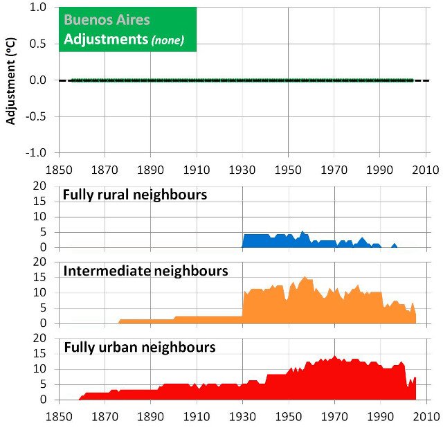
Figure 32 shows the adjustments that NOAA’s homogenization program applies to the Buenos Aires record. Nothing!
As we discussed in Section 2, we know that the Buenos Aires record is affected by urbanization bias. Figuerola & Mazzeo, 1998 (Open access) even went out and measured the urban heat island in Buenos Aires. But, NOAA’s computer program did nothing about it!
Why?
Well, if you look at the bottom panels of Figure 32, you can see that most of the neighbours the program used are urban stations, i.e., the neighbours are also affected by urbanization bias. The few rural neighbours that are around only have fairly short records (remember the Punta Indio station from Section 2?).

What about our second example station, Valentia Observatory?
As can be seen from Figures 33 and 34, the Valentia Observatory weather station in Co. Kerry, Ireland is very rural.
There is a nearby town, Cahirsiveen, but the station is about 0.5km outside of the town, and the town is relatively small (pop. 1,294 in 2006). In other words, it is unlikely to be badly affected by urbanization bias.
Valentia Observatory also happens to be one of the longest and most complete rural station records in the dataset.

As we mentioned earlier, Valentia Observatory is one of only eight rural stations with data for at least 95 of the last 100 years (aside from the U.S. dataset, that is).
In other words, it is one of our only rural station records that we can use for studying long-term temperature trends.
So, what does NOAA’s computer program reckon should be done to it?
Figure 35 shows the adjustments NOAA’s program applies to the Valentia Observatory record.
Unlike the Buenos Aires record, which it reckoned was perfect as it was, it decides that it needs to introduce a warming trend of roughly 0.4°C/century into the Valentia Observatory record.

Did the program figure this out by comparing it to rural stations?
No, because there are no nearby rural stations that would have a long enough record to compare it to.
Instead, the program introduces the warming so that the Valentia Observatory record better matches the records of its urban neighbours!
Figure 36 shows the effect of these adjustments. Before homogenization (top panel), the Valentia Observatory record varies between periods of cooling and periods of warming.
As we discussed in Section 4, for the Valentia Observatory record, the recent 1980s-2000s warming doesn’t seem particularly unusual, and the hottest year on record occurred in 1949.
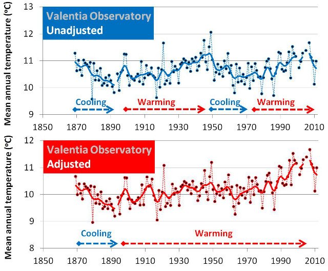
However, after homogenization (bottom panel), most of the cooling periods have been eradicated, and the record shows an almost continuous warming trend since the end of the 19th century.
As a result, it makes the last decade or so seem “unusually warm”. In other words, it looks pretty much like the “global temperature trends” we saw at the start of the essay in Figure 1.
Essentially, NOAA’s computer program leaves urbanization bias in the urban stations and adds extra warming into those rare rural stations which didn’t have urbanization bias beforehand.
Conclusions
The main basis for the claim that there has been “unusual” global warming since the late 19th century is that the global temperature estimates constructed from weather station records suggest a warming trend of about 0.8-1.0°C since about 1880. Man-made global warming theory predicts that the increases in the atmospheric concentration of carbon dioxide since the Industrial Revolution should have caused some “man-made global warming”. So, this has led many people to conclude that the “unusual” global warming implied by the weather station records is man-made global warming from our fossil fuel usage.
Unfortunately, many of the weather station records used for these estimates are affected by urbanization bias. Urban areas are generally warmer than surrounding rural areas. As a result, the urbanization which has been occurring since at least the 19th century across the world has introduced an artificial warming bias into the records of most of the weather stations with long records. In other words, much of the “unusual global warming” is simply an artefact of urbanization bias in the weather station records, i.e., not man-made global warming!
Urban heat islands cause genuine warming in urban areas, and can contribute to serious health problems during the summer, as they can make heatwaves more severe. However, they are a localised phenomenon, i.e., they do not affect global temperatures. They certainly have nothing to do with the atmospheric concentration of carbon dioxide!
So, treating urbanization bias as evidence of “unusual global warming” was a serious mistake.
It has been widely-claimed that urbanization bias isn’t a problem for the global temperature estimates. Several justifications for this claim have been made. In all cases, we found the claim to be unjustified:
- Several studies have claimed to have proven that urbanization bias is only a negligible problem.However, when we revisited each of these studies we found that the authors had made basic mistakes and/or had not completely analysed their data.
- Some groups have developed data adjustment procedures (“homogenization techniques”) which were assumed to have “removed” the urbanization bias from the weather station records.We identified serious flaws in these adjustment procedures, and discovered that they had not succeeded in removing the urbanization biases, and had actually introduced new biases!
- Several researchers have pointed to various other indicators as evidence of “global warming”, e.g., Arctic sea ice records, ocean heat content measurements, or animal and plant migration patterns.However, all of these indicators are either too short to compare recent temperatures to temperatures before the 1950s, or else are affected by non-climatic biases.
When we study those rare records which are still definitively rural, and have data for at least 95 of the last 100 years, we find that there has been some “global warming” during the 1980s-2000s. However, it follows an equivalent amount of “global cooling” during the 1940s-1970s. In other words, it seems to have been just as warm in the 1930s and 1940s as it is now!
Looking further back, we find some evidence that this alternation between “cooling” and “warming” periods also occurred in the 19th and 18th centuries. This suggests that it is a naturally-occurring cycle which has nothing to do with “man-made global warming”.
It seems that the 1980s-2000s “global warming” was just a natural phenomenon, that was mistakenly exaggerated by some researchers who had failed to properly deal with the non-climatic biases in their data. In the words of the Welsh singer, Tom Jones, “it’s not unusual”:

In your first urbanization bias paper you write:
This is wrong. Goddard Institute of Space Studies does not perform relative statistical homogenization and consequently need a special method to remove the urbanization bias.
All the other datasets use statistical homogenization and compare one stations with its neighbors to detect and remove non-climatic changes. Homogenization does not only removes break inhomogeneities (non-climatic changes in the data), but also gradual inhomogeneities.
Homogenization will reduce these problems, it will typically not fully remove them, but to claim that the other datasets do not remove the bias due to urbanization at all is simply wrong.
Hi Victor,
Thanks for spotting that. It should read “none of the groups except for the Goddard Institute of Space studies explicitly attempt to…”.
We discuss the statistical homogenization methods used by the other groups in Section 4 of our Paper 3. By the way, we briefly mention your “Benchmarking homogenization algorithms for monthly data” paper on page 30 of Paper 3.
P.S. Sorry about the brief delay in approving your comments. We have moderation turned off (unless it becomes a problem), but for some reason your comments went through to the spam folder.
Thank you for finding the comment. A few percent of my comments somehow have a tendency to end up in spam folders, that is why I send you an email.
I had seen you dismissed the results of my benchmarking paper, have not found the part yet where it is motivated why your results are more convincing. It is weekend. 🙂
“It is weekend. 🙂 “ No problem, I know what you mean!
We weren’t dismissive of it at all. That’s why we mentioned it after all!
We felt your benchmarking paper was a much-needed assessment of the ability of the different models to detect step change biases. But, for our purposes, we were more interested in how good they are at removing both step and trend change biases.
As far as I recall, in your paper, you included both types of biases in your simulations, but only studied the models’ ability to remove the former. I got the impression that in a later study, you were planning to look at trend biases, but that you chose to limit Venema et al., 2012 to step change biases. Is that correct?
That is exactly what we did. We looked at the combined effect of abrupt and gradual inhomogeneities. That is what we need to estimate how well homogenization methods work in practice.
You are right in that we did not look separately into how well either of these categories are adjusted. With some colleagues I am now working on a study focused on gradual inhomogeneities. Such studies are important for understanding the homogenization methods, which will hopefully lead to futures improvements.
That’s good to hear, Victor! I look forward to hearing the results of your study.
In the meantime, if you get a chance to read the paper in detail, I’d be very interested to hear your comments. You’re more than welcome to post a review (whether negative, positive, or both!) on the Open Peer Review Journal forum for it. [Instructions are available on the website].
[…] The paper are long and complex. The full details are HERE. […]
[…] Summary: “Urbanization bias” – Papers 1-3 […]