This essay was originally published on Medium.com on 23rd September, 2019. Link here.
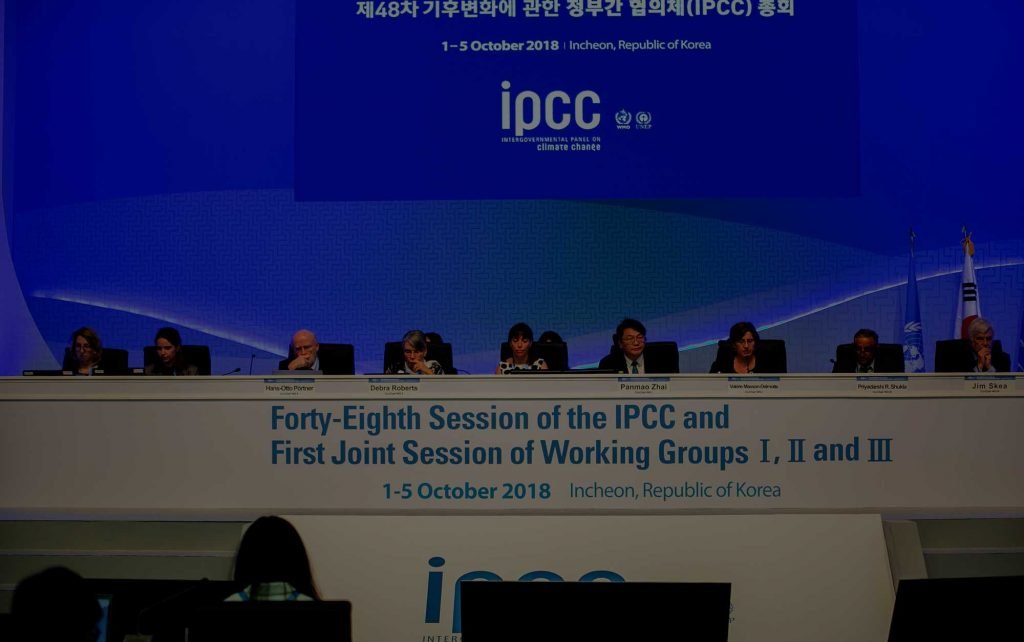
Featured image photo source: UN IPCC, 20th September, 2018.
Summary
The UN’s Intergovernmental Panel on Climate Change (IPCC)’s highly influential Assessment Reports are widely regarded by the scientific community, policymakers and the general public as representing “the scientific consensus on climate change”.
We have written elsewhere about how the hierarchical system used by the IPCC gives a relatively small number of scientists the power to dismiss the views of other IPCC contributors, if they disagree with them. So, even though thousands of scientists have some involvement in the writing of the IPCC reports, the final views expressed by the reports are dominated by the views of a few dozen scientists. Therefore, the IPCC reports are not as representative of “the scientific consensus” as most people assume.
However, in this post, we will focus on the IPCC’s justifications for one specific claim that has received most attention, i.e., their claim that most of the climate changes since at least the mid-20th century are human-caused in origin. Although this claim is perhaps their most famous and widely-quoted, we will show that their basis for making it is remarkably flimsy and unscientific.
The UN’s Intergovernmental Panel on Climate Change (IPCC for short) is a highly influential organisation that has heavily shaped public and scientific opinion on climate change. In their most recent Assessment Report — published in 2013/2014 — they concluded that most of the climate change since at least the 1950s was human-caused.

The IPCC reports have been used to justify international efforts to try and reduce carbon dioxide emissions, such as the Kyoto Protocol (1997) and the more recent Paris Treaty (2015). They also are heavily relied on by scientists studying climate change. Many scientists treat the IPCC reports as “the Climate Bible” and they are assumed to reflect “the scientific consensus” on global warming.
For that reason, it might surprise many people to know that their 1st Assessment Report (1990) was unsure whether global warming was human-caused or natural.
So, in this post, we look at the changes in the IPCC’s views on whether recent climate change is human-caused or natural. Why did the IPCC decide in their 1990 Assessment Report that the recent climate change could be either human-caused, natural or both? And, why did they change their mind for the most recent 5th Assessment Report (2013) and conclude that it was mostly human-caused (from greenhouse gas emissions)?
This is a very long post, and you may find yourselves puzzled and alarmed by the various unscientific machinations involved in each successive report. But, this is such an important subject that it is worth “looking under the bonnet” to understand exactly how the IPCC’s “scientific consensus” on climate change was created.
Note on IPCC nomenclature
For this post, we will use the acronym “ARn” to refer to each of the IPCC’s Assessment Reports, where “n” is the number of the report:
- 1990: AR1 = 1st Assessment Report (sometimes called FAR, First Assessment Report)
- 1995: AR2 = 2nd Assessment Report (sometimes called SAR, Second Assessment Report)
- 2001: AR3 = 3rd Assessment Report (sometimes called TAR, Third Assessment Report)
- 2007: AR4 = 4th Assessment Report
- 2013: AR5 = 5th Assessment Report
- Due in 2021–2022: AR6 = 6th Assessment Report
Note on references
Many of the references discussed in this post are open access, but some are paywalled articles. For the open access articles, we have linked directly to the abstract. In the case of the paywalled articles, we have included a link to the abstract (indicated with “$ abstract”) as well as a link to a free online pdf if we could find one.
A Tale of Two Definitions: what do we mean by “climate change”?
Since the early 1990s, the UN has been actively encouraging international political negotiations to prevent human-caused (“anthropogenic”) climate change from greenhouse gas emissions — chiefly carbon dioxide (CO2). Specifically, the aim of the UN Framework Convention on Climate Change (or FCCC for short) has been (since 1992) to try to “stabilize greenhouse gas concentrations in the atmosphere at a level that would prevent dangerous anthropogenic interference with the climate system”. Under the FCCC, the UN have organised many intergovernmental meetings to try and negotiate international treaties to reduce greenhouse gases. In particular, since 1995, the FCCC have been organising annual Conference of the Parties (COP) meetings. At the third of these meetings in 1997 (COP 3, Kyoto, Japan), the famous “Kyoto Protocol” was signed. More recently, at the 2015 COP 21 meeting in Paris, France, the so-called “Paris Agreement” was decided on.
While the FCCC branch of the UN has been working non-stop since the early 1990s on political negotiations to prevent climate change by reducing greenhouse gases, a separate UN organisation, the Intergovernmental Panel on Climate Change (or IPCC for short) was charged with looking at the latest scientific research into climate change.
The IPCC’s main role is to produce Assessment Reports which are supposed to provide scientific support for the political negotiations the FCCC was carrying out. However, a major problem quickly became apparent with this dual-pronged approach. As Prof. Roger Pielke Jr. pointed out in his important 2005 paper ($ abstract; online pdf), it turns out that the FCCC and IPCC have both been using different definitions of “climate change”.
According to the IPCC, “climate change” is defined as,
“[A]ny change in climate over time whether due to natural variability or as a result of human activity.”
However, according to the FCCC, “climate change” is something much more specific. It is defined as:
“[A] change of climate which is attributed directly or indirectly to human activity that alters the composition of the global atmosphere and which is in addition to natural climate variability over comparable time periods.”
The FCCC treat “climate change” as being — by definition — human-caused (and mainly due to greenhouse gases). But, according to the IPCC, climate change is simply “any change in the climate” — it could be human-caused (e.g., greenhouse gases, urban development, land use change, etc.) or it could be natural (e.g., due to solar variability, changes in oceanic or atmospheric circulation patterns, etc.), or perhaps some combination of them all.
The problems started to occur when the IPCC’s 1st Assessment Report (AR1) was published in 1990. The report provided plenty of evidence that the climate was changing, but it also explained that the climate had always been changing. The IPCC were unable to say whether the recent climate change was human-caused, natural or both. This became known as the “attribution” problem, and the IPCC’s first attempt at it was very inconvenient for the FCCC.
This fundamental conflict between the FCCC and the IPCC put a lot of pressure on the scientific community. If the IPCC couldn’t find evidence that “climate change” was at least partially human-caused (and mainly due to greenhouse gas emissions), then the entire basis for all of the FCCC’s challenging international political negotiations would be undermined. Fortunately for the FCCC, later IPCC reports gradually began to come on board with the FCCC agenda.
Critically, in the most recent IPCC report, 2013’s AR5, it was confidently claimed that it was “extremely likely” that most of the observed global warming since the mid-20th century was human-caused, and mainly due to greenhouse gases. At last, the conflict between the IPCC and FCCC definitions of “climate change” identified by Prof. Pielke Jr. seemed to have been resolved. The IPCC was continuing to use the more general definition of “climate change”, but they were now claiming that most of the recent “climate change” was human-caused, and due mainly to greenhouse gas emissions. So, even if the FCCC definition was not scientifically suitable, from a political perspective, it now had apparent scientific support from the IPCC.
How did this happen? How did the politically-focused FCCC come to essentially the same scientific conclusion in 1992 that the IPCC scientists couldn’t reach until 2013? Were the people who wrote the FCCC definition simply better at science than the IPCC? Or were they just lucky? Or did the IPCC instead gradually cave to the political pressure to adopt the same view the FCCC had been taking all along?
In this post, we will review how the IPCC gradually managed to resolve the thorny conflict between the different definitions of “climate change”. Specifically, we will look in turn at the “attribution” statements of each of the five Assessment Reports and discuss the scientific rationales offered for each statement. We will argue that the IPCC’s transition towards the FCCC definition arose mainly from the repeated pattern of selectively promoting studies that were “on message”, and dismissing those which were “off message”.
The IPCC’s approach to forming a scientific “consensus”
Most scientists who are actively researching in any field will tell you that, within their field, there are some papers whose results agree with their own research, some papers which disagree with their research and others which are ambivalent. This makes sense because if all of the papers on a given subject end up saying the same thing, then that subject rapidly ceases to become worthy of publication. Journals won’t be interested in publishing papers which are just repeating the findings of previous papers.
In their Assessment Reports, the IPCC is supposed to be assessing all of the relevant scientific literature on climate change. However, their reports are also supposed to provide scientific support for the COP policymakers who are using the FCCC definition of “climate change”. Fortunately for the IPCC, there are plenty of papers out there making that case. But, what should the IPCC do about the many papers which disagree with the FCCC position?
One approach would be to present the evidence for and against each point and let the readers decide. But, that wouldn’t help the policymakers using the FCCC definition. They would find it difficult to justify their policies on the basis that, “some scientists say that this might be the case, although others disagree”. The same would apply with the “red team/blue team” approach which some people have proposed, e.g., here, here or here.
In an ingenious attempt to overcome this problem, from AR3 on, the IPCC decided to adopt a unique approach to describing their statements. Rather than having to provide a definitive opinion on a given issue (where there may well have been ongoing scientific controversy), the IPCC authors were told to use their own personal judgement to assess how confident they were in their opinion. They were told to use the following scale, which we have ranked here from 1 (“extremely unlikely”) to 10 (“virtually certain”):
- Exceptionally unlikely (0–1%)
- Extremely unlikely (0–5%)
- Very unlikely (0–10%)
- Unlikely (0–33%)
- About as likely as not (33–66%)
- More likely than not (>50%)
- Likely (66–100%)
- Very likely (90–100%)
- Extremely likely (95–100%)
- Virtually certain (99–100%)
During this post, we will frequently refer to the above scale.
By using this scale, IPCC authors are now able to use their own “expert judgement” to dismiss or downplay the findings of those studies which they disagree with, and to promote the findings and conclusions of those studies which they agree with, or even co-authored.
1990: The 1st Assessment Report (AR1)
When AR1 was being written, there were broadly two camps with regards to “global warming” and “climate change”.
The first camp mainly relied on the predictions of the computer models, which assumed that global temperature changes were mostly determined by the concentrations of greenhouse gases — chiefly carbon dioxide (CO2). In the late 1980s, computing power was much less than today, and most modern laptops (or even mobile phones) would easily beat the 1980s supercomputers in terms of computing power. For this reason, the 1980s climate models were relatively simplistic, and they did not really consider the possibility of naturally-occurring global warming or global cooling. Instead, they were based on the early models developed in the 1960s and 1970s, such as Manabe & Wetherald (1975), which assumed that global temperature changes were dominated by changes in carbon dioxide (and other greenhouse gases). These models were echoing the theories of researchers like Gilbert Plass who believed that CO2 was the main climate driver, e.g., Plass, 1956.
To reduce computational expense, these early climate models mostly assumed “natural climate variability” was constant. CO2 concentrations had been increasing since at least 1958 (when systematic monitoring of CO2 began), and were continuing to increase because of human activity. Therefore, the climate models predicted that we should be seeing a human-caused “global warming” from an “enhanced greenhouse effect” and that this global warming would become more pronounced over the next century — unless society radically reduced its fossil fuel usage.
Meanwhile, several groups had attempted to use weather records to see if there had been any global temperature changes, and they found that there had indeed been a general “global warming” of about 0.3–0.6°C over the last century. Several of the modellers pointed to this result as vindication of their models and claimed that it was human-caused global warming from our CO2 emissions. It was scientists from this first camp who convinced the UN to begin international negotiations to reduce CO2 (and other greenhouse gases).
On the other hand, scientists in the second camp were generally more interested in the experimental data. They pointed to the fact that most of the “global warming” had occurred in the early 20th century (up to the 1940s), i.e., during a period when CO2 concentrations were still at nearly pre-industrial levels. Also, the 1940s-70s seemed to have been a period of “global cooling”, even though CO2 concentrations were increasing. Furthermore, paleoclimate scientists pointed to evidence of a similar warm period which seemed to have occurred around 1000 AD (the so-called “Medieval Warm Period”) and couldn’t be explained in terms of CO2. The climate models couldn’t explain any of these points, which suggested that much (if not all) of the observed global warming (and global cooling) was probably due to natural climate change (sometimes called “natural climate variability”).
This conflict between these two camps was a major problem for the IPCC. Many of the lead IPCC authors were from the first camp, and they agreed that by emphasising the computer model results, they could offer support for the politicians who were calling for international policies to reduce our CO2 emissions. However, a lot of the IPCC authors were from the second camp, and so the IPCC also felt a scientific obligation to at least allude to the fact that the models were — in many ways — directly contradicted by the data.
In the end, the IPCC AR1 decided that the recent global warming could be either human-caused, natural, or both:
“Our judgement is that: [g]lobal-mean surface air temperature has increased by 0.3°C to 0.6°C over the last 100 years […] The size of this warming is broadly consistent with predictions of climate models, but it is also of the same magnitude as natural climate variability. Thus the observed increase could be largely due to this natural variability, alternatively this variability and other human factors could have offset a still larger human-induced greenhouse warming. The unequivocal detection of the enhanced greenhouse effect from observations is not likely for a decade or more.”
At this stage, the IPCC weren’t using their current “likelihood” scale, but this ambivalent “attribution” statement is probably equivalent to “5” on our scale, i.e., “About as likely as not (33–66%)”.
1995: The 2nd Assessment Report (AR2)
The ambivalent conclusions of AR1 had been very awkward for the policymakers who were explicitly basing their negotiations on the assumption that “climate change” was human-caused, and due to greenhouse gases. So, they were hoping that the IPCC would come to a more helpful conclusion for AR2. However, most of the scientific literature was still as ambivalent as it was during AR1.
Dr. Ben Santer was the lead author of Chapter 8, the key “Detection of climate change and attribution of causes” chapter which considered the “attribution” question. He had just co-authored a new paper which hadn’t been published yet, but had been “accepted for publication” (Santer et al., 1995). In this paper, he argued that, in addition to warming from human-caused CO2, the climate models should also include cooling from human-caused sulphate aerosols. By altering the ratios between CO2 warming and sulphate cooling, he was able to reproduce some of the 1940s-70s “global cooling”, which we saw above was a major problem with the climate models.
However, although this new study could be used to argue that the models weren’t completely contradicted by the data, this still didn’t prove that the models were right. The scientists from the second camp could still point to the extensive evidence of natural climate change, which the models weren’t including. As a result, after the first draft of AR2 was written, it looked like the IPCC was again going to have to make a similarly inconclusive “attribution” statement. This would have been disastrous for the COP organisers who were struggling to put together their first substantive international agreement, i.e., the Kyoto Protocol.
Fortunately for the COP organisers, at the last minute, Santer pointed out that he had another paper that was in preparation which he believed offered evidence of a “human fingerprint” on recent global temperature trends. His paper hadn’t been published, or even submitted, but he agreed to give a presentation to the IPCC describing his findings.
His study was later published as Santer et al., 1996 ($ abstract, online pdf). Essentially, he showed that over a specific time period (1963–1988), the temperatures in the lower atmosphere (the “troposphere”) had on average increased, while in the upper atmosphere (the “stratosphere”), the average temperatures had decreased. He pointed out that some of the climate models had predicted that increasing carbon dioxide would cause both tropospheric warming (“global warming”) and stratospheric cooling. He argued that his analysis had therefore vindicated the climate models, and thereby offered the first evidence that the recent global warming had a human component.

Although Santer and his colleagues had written up a draft version of their paper as a report for his new workplace (the Lawrence Livermore National Laboratory), the IPCC were wary about relying on this new (non-peer reviewed) study too heavily. However, they were also feeling the pressure to avoid issuing another non-committal attribution statement, just as the COP organisers were getting close to their first major political agreement.
In the end, the final version of AR2 went with a still-cautious, but nonetheless, no longer-non-committal statement:
“The balance of evidence suggests a discernible human influence on global climate”.
Again, the IPCC were still not using their current “likelihood” scale, but this is probably equivalent to “more likely than not” (6 on the scale). That is the IPCC had moved up from 5 to 6 on the scale.
They hadn’t said how big this apparent “influence” was, but at least they weren’t directly contradicting the COP negotiators’ assumption. The policymakers were finally able to use the IPCC report to offer some scientific “support” for their negotiations, and this led to the 1997 Kyoto Protocol.
2001: The 3rd Assessment Report (AR3)
Unfortunately for the IPCC, their rush to use Santer’s non-peer reviewed draft as the basis for their key attribution statement created a major problem for the next report. By the time AR3 was being written, several papers had been published highlighting serious flaws in the Santer et al. (1996) study, e.g., Michaels & Knappenberger (1996) [$ abstract]; Weber (1996) [$ abstract]; Legates & Davis (1997); Singer (1999a) and Singer (1999b).
For instance, in a comment to Nature magazine (where Santer et al., 1996 had been published), Prof. Pat Michaels & Dr. Paul Knappenberger pointed out that the strong “tropospheric warming” southern hemisphere “hot spot” in Santer’s figure would have given a “cooling” trend if he had used the full 1958–1995 period instead of the shorter 1963–1988 period Santer had actually used.

Santer and others had defended the study (and the “balance of evidence” statement), e.g., Santer et al. (1996b) [$ abstract]; Keller (1999). But, their original “fingerprint” study was clearly contentious, and definitely not as scientifically compelling as the AR2 authors had claimed. With all of this controversy over Santer’s original “fingerprint” study, the IPCC would have found it difficult to increase the confidence of their “attribution” statement from AR2. Indeed, one might argue that they probably should have reduced their confidence back to that of the non-committal AR1. However, the head organisers of the IPCC realised they could take a different tack by focusing on a new study, the so-called “hockey stick graph”.

In 1999, Prof. Michael Mann, one of the lead authors of Chapter 2 (“Observed climate variability and change”), had co-authored a paleoclimate reconstruction of Northern Hemisphere temperature trends of the last 1000 years — Mann et al., 1999. His “hockey stick graph” appeared to suggest that global temperatures had been slowly, but steadily, declining for most of the last millennium, before abruptly starting to rise at the start of the 20th century. If this study was valid, then it suggested that the global warming observed during the 20th century was highly unusual. This seemed to be consistent with it being the human-caused global warming predicted by the climate models.
The IPCC AR3 used this new “hockey stick graph” to justify moving up another slot on the scale to 7:
“In the light of new evidence and taking into account the remaining uncertainties, most of the observed warming over the last 50 years is likely to have been due to the increase in greenhouse gas concentrations.” [emphasis added in bold].
2007: The 4th Assessment Report (AR4)
Again, however, the IPCC’s decision to focus on the Mann et al. (1999) “hockey stick graph” for AR3 caused problems when it was time for AR4. As with Santer et al.’s “fingerprint” study, several major criticisms of the hockey stick study were published in the years after AR3, e.g., Broecker (2001) [$ abstract, online pdf] ; Soon & Baliunas (2003); Soon et al. (2003a) [$ abstract, online pdf]; Soon et al. (2003b); McIntyre & McKitrick (2003) [$ abstract, online pdf]; von Storch et al. (2004) [$ abstract, online pdf]; McIntyre & McKitrick (2005a) [$ abstract, online pdf]; McIntyre & McKitrick (2005b); von Storch et al. (2006) [$ abstract, online pdf]. Mann and his colleagues, and others vehemently defended the original hockey stick, e.g., Bradley et al. (2001) [$ paywall]; Mann et al. (2003a); Mann et al. (2003b); Rutherford et al. (2005); Wahl et al. (2006); Wahl & Amman (2007) [$ abstract, online pdf]. However, the “hockey stick graph” was clearly the subject of considerable scientific criticism.
Meanwhile, other groups had carried out their own paleoclimate reconstructions, and several of these newer studies were finding there had been a pronounced “Medieval Warm Period” after all, e.g., Esper et al. (2002) [$ abstract, online pdf]; Moberg et al. (2005) [$ abstract, online pdf].
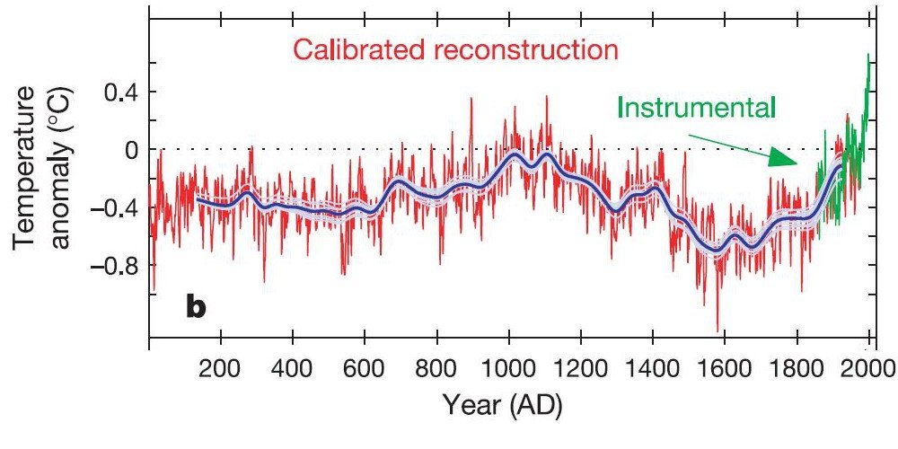
In the light of all this highly publicised scientific controversy, the lead author of the relevant section in the paleoclimate chapter (Chapter 6), Prof. Keith Briffa, toned down the conclusions. Briffa personally believed that the recent warming was unusual, and he had been one of the scientists who had teamed up with Mann to defend “the hockey stick”. But, he grudgingly conceded that they might have underestimated the “multi-centennial Northern Hemisphere temperature variability over the last [1000 years]”, i.e., the hockey stick graph was probably too flat and there could well have been a relatively warm Medieval Warm Period.
This partial stepping back from the hockey stick graph could have been a problem for the IPCC. It would have been hard to use this to move up on the scale, and probably would have meant moving back down the scale (at least to AR2’s 6, if not to AR1’s 5). However, the IPCC had another avenue they could pursue — focus on the results from computer models.
For AR4, the various climate modelling groups had been encouraged to carry out, and submit, a range of different simulation experiments. The results from these experiments were submitted to the CMIP3 project, which were then passed on to the IPCC authors. These experiments included a series of “hindcasts” (a “hindcast” is the opposite of a forecast) of 20th century temperature trends.
You might recall from our discussion of AR1 that, in the early days, most of the climate models didn’t bother to consider the possibility that global warming or global cooling could occur naturally, e.g., from changes in solar output. In the 1990s, this was justified on the basis that computing power was quite low. However, by the time AR4 was being written, this excuse was beginning to sound weak. As a result, some of the climate modelling groups had started to include at least one natural “forcing” in their simulations, in addition to the standard human-caused (“anthropogenic”) forcings. They would include either a “volcanic forcing” dataset, a “solar forcing” dataset or both.
About half of the climate models submitted to CMIP3 included “natural forcings” as well as the standard “anthropogenic forcings”. And five of the modelling groups also submitted a separate set of simulations which only included the “natural forcings”. When these “natural forcings only” hindcasts were analysed, there was almost no global warming over the 20th century. But, when the modellers included “anthropogenic forcings” as well, they were able to simulate a substantial “global warming” for the 2nd half of the 20th century.
Therefore, the IPCC used the new climate model results to justify moving up another notch on the scale to 8 (“very likely”) for AR4:
“Most of the observed increase in global average temperatures since the mid-20th century is very likely due to the observed increase in anthropogenic greenhouse gas concentrations.” [Emphasis in original].
2013: 5th Assessment Report (AR5)
The results of the CMIP3 hindcast experiments described above seem compelling to most people. Many people when they see the analysis think, “The modellers included the natural forcings, but they couldn’t explain the recent warming — it must be human-caused!”
Indeed, Bloomberg recently used an updated version of this argument using the results from one of the climate model groups (NASA GISS) in a popular 2015 online article. However, many scientists who are familiar with the data are unimpressed by these model results. They argue that the “natural forcings” included in the models are merely providing lip service to “natural climate change” and that the model-based argument for recent climate change being mostly human-caused is still essentially the same as it was back in the days of AR1.
The only mechanism by which the current climate models can simulate a long-term multidecadal “natural global warming” is through a steady increase in direct solar output (in Watts/m2). The other “natural forcing” they consider, i.e., stratospheric volcanic eruptions, is only capable of simulating short-term 2–3 year “global cooling” events.
Their so-called “internal variability” is little more than random noise, and is unable to simulate any long-term natural global warming or natural global cooling trends which may have occurred in the past. For this reason, many scientists who have studied natural climatic changes argue that the current models are not properly accounting for possible changes in oceanic and/or atmospheric circulations, indirect changes in solar activity (e.g., the role of cosmic rays), etc.
At any rate, even if we assume that “direct solar output” were the only way in which “natural global warming” could occur, it turns out that the solar output datasets favoured by the IPCC have been highly contentious and controversial.
As we discuss in Soon, Connolly & Connolly (2015) [$ abstract, online pdf], there are a lot of uncertainties and conflicting views on how solar output has changed since the 19th century (and earlier). Because the atmosphere interacts with the incoming solar energy, before the launch of space-based satellites, it was very difficult to accurately monitor how the Sun’s output has changed over time. Instead, we mostly have to rely on indirect proxies for solar activity, e.g., changes in the numbers and types of sunspots, monitoring of solar-related factors such as cosmic rays, etc. None of these solar proxies directly tell us how exactly the solar output has changed over time. And, depending on which proxies you use and how you analyse them, you can construct different estimates of solar output.
However, even for the satellite era, there is considerable controversy. When the researchers in charge of the main Sun-monitoring satellites started to analyse their results, many of them were finding that the Sun could have been a major driver of the recent global warming. In particular, the ACRIM group in charge of NASA’s ACRIM satellites were finding that solar output had generally increased from the early 1980s until the late 1990s. This was definitely “off message” for the climate modellers, and so a rival group, PMOD, decided to reanalyse the ACRIM data. They came up with several adjustments that they could apply to the data. After applying these adjustments, they managed to reverse the ACRIM trend and concluded that solar output had been decreasing since the start of the satellite era.
Dr. Judith Lean was the lead author in charge of the relevant section on solar variability in AR4, Chapter 2.7. She also happened to be the co-developer of the PMOD dataset, i.e., the rival to ACRIM. In a 2003 interview for NASA [Web archive link], she explained that one of the reasons she decided to develop the PMOD dataset was that the original ACRIM dataset might interfere with the international negotiations to reduce greenhouse gas emissions:
“The fact that some people could use [the ACRIM group’s] results as an excuse to do nothing about greenhouse gas emissions is one reason we felt we needed to look at the data ourselves. Since so much is riding on whether current climate change is natural or human-driven, it’s important that people hear that many in the scientific community don’t believe there is any significant long-term increase in solar output during the last 20 years.” — Dr. Judith Lean, August 2003.
Not only had Lean and her colleagues managed to construct a solar output model which showed a “cooling sun” for the satellite era, but she had also developed several longer proxy-based estimates of solar output back to the 17th century, e.g., Lean et al. (1995). These longer estimates (which were mostly based on sunspot numbers) implied that solar output had increased in the early 20th century, but only up to the 1950s. Afterwards, the solar output had gradually decreased.
Of the 14 of the 25 CMIP3 models which had included a “solar forcing” dataset, all but 3 of them used one of Lean’s datasets (INM-CM3.0, Russia; PCM, USA; UKMO-HadGEM1, UK). And of the 5 models that contributed to the “natural forcings only” project, only one of the models (PCM, USA) used a non-Lean dataset. So, in hindsight, it was not surprising that the hindcasts had been unable to simulate any natural global warming since the 1950s.
For AR5, the organisers of the follow-on project to CMIP3, i.e., CMIP5, strongly recommended to the modelling groups that they pick the Wang et al. (2005) reconstruction for their “solar forcing” dataset.
Wang et al. (2005) is another one of the estimates co-developed by Lean, and it shows even less solar variability than her previous estimates. For this reason, by using the Wang et al. (2005) reconstruction, the CMIP5 modellers would be able to justifiably say that they had included “solar forcing” in their hindcasts, but there was no danger that their “natural forcings only” hindcasts would simulate any global warming since the 1950s. Indeed, all of the CMIP5 modellers ended up using either Wang et al. (2005) or else a similar reconstruction, and this is what happened.
Since the CMIP5 hindcasts were giving basically the same result as the CMIP3 hindcasts, the authors of the “Detection and Attribution” chapter in AR5 (Chapter 10) felt they could repeat their model-based conclusion that “More than half of the observed increase in global mean surface temperature (GMST) from 1951 to 2010 is very likely due to the observed anthropogenic increase in greenhouse gas (GHG) concentrations” [Emphasis in original].
But, what about all of the controversy over which solar output dataset should be used? Or whether there were any other mechanisms for natural climate change which could explain the recent warming? If the IPCC were to genuinely reflect all of the scientific views described in the literature, then they would have had to admit that these problems had not been satisfactorily resolved. However, due to the “expert judgement” guidelines introduced in AR3, the lead authors didn’t need to do that.
Instead, the IPCC authors could just use their “expert judgement” guidelines to come up with reasons to criticise the “off message” studies suggesting a large solar role to recent climate change (e.g., those promoting the ACRIM dataset) and instead promote those studies which were “on message”, e.g., those promoting the PMOD dataset. This is what they did in Chapter 8.4, and this gave the all-clear to the Chapter 10 authors.
With that done, they felt they could use the CMIP5 hindcast results to justify moving up yet another notch to 9 (“extremely likely”) for AR5:
“It is extremely likely that human influence has been the dominant cause of the observed warming since the mid-20th century.” [Emphasis in original].
What next for AR6?
Since AR5, there have been a number of papers which have contradicted or disputed many of the previous IPCC claims and/or assumptions.
For instance, in Scafetta & Willson, 2014 [$ abstract, online pdf], the ACRIM group vehemently dispute the claims that Judith Lean’s PMOD reconstruction of solar output for the satellite era is reliable. Meanwhile, Wyatt & Curry (2014) [$ abstract, online pdf] have argued that the IPCC models seemed to have underestimated the so-called “internal variability” of the climate, i.e., the natural climatic changes that arise over decadal timescales from changes in ocean and wind patterns, sea ice cover, etc. Also, a number of recent scientific papers have suggested that the climate models are substantially overestimating how “sensitive” global temperatures are to changes in greenhouse gas concentrations, e.g., Spencer & Braswell (2014) [$ abstract, online pdf]; Lewis (2016) [$ abstract, online pdf]; Bates (2016); Christy & McNider (2017) [$ abstract, online pdf].
Several of the papers we have published directly contradict key claims made by AR5:
- In Soon, Connolly & Connolly (2015) [$ abstract, online pdf], we specifically criticise the AR5’s attribution statement, and argue that it is not scientifically justified. See this link for a summary of why.
- In Connolly, Connolly & Soon (2017) [link], we showed that the recent melting in the Arctic since the late 1970s was not as unusual as AR5 had claimed and that there had been a similar period of melting in the 1920s and 1930s, followed by a period of Arctic cooling up until the 1970s. See this link for a summary.
- In a 2019 paper in Geosciences [link], we showed that the IPCC models are unable to explain the changes in snow cover since records began.
Of course, there have also been papers which have supported the IPCC claims, or even arguing for an even greater human-caused role, e.g., Marvel et al. (2018) [$ abstract]. So, the authors of AR6 will doubtless be able to continue their practice of using their “expert judgement” to criticise (or ignore) the “off message” studies, while promoting the “on message” studies.
Conclusion
But, is there a way in which the IPCC can become more scientifically rigorous, while still allowing a justification for the COP meetings?
In our opinion, there is. And it is one that was already suggested by Pielke (2005), and repeated in his insightful 2010 book, “The Climate Fix”, but which seems to have been mostly ignored. That is, instead of the IPCC continuing to conform its definition of “climate change” to make it synonymous to the FCCC’s less scientific definition, why not encourage the COP to adopt the IPCC’s definition?
As Pielke’s 2005 article ($ abstract; free pdf) pointed out, if we use the more objective IPCC definition, then this dramatically opens up the relevant options for climate policy. According to the FCCC definition, effectively the only mechanism for reducing the impacts of “climate change” is through “climate mitigation”, i.e., reducing greenhouse gas emissions. However, if we use the IPCC definition, then “climate change” can be either human-caused, natural, or both. Under these circumstances, “climate adaptation” policies become at least as important as “climate mitigation”, if not more so. Climate adaption policies are policies designed to deal with the impacts of climate change regardless of why the climate changed.
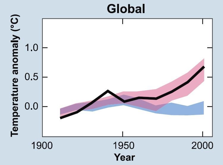
Climate mitigation policies only have relevance for human-caused climate change (from greenhouse gas emissions). However, climate adaptation polices are relevant regardless of how much climate change is human-caused and how much is natural. Therefore, if the COP meetings switch to the IPCC definition of “climate change”, then policymakers will be able to consider both climate adaptation and climate mitigation policies. As can be seen from Figure 7, adaptation policies currently comprise only 5% of the total global climate change expenditure.

For those readers who feel that climate mitigation is still a bigger priority than climate adaptation, you may find “the Hartwell Paper” interesting. This is a 2010 working paper written by several prominent climate policy experts and scientists. In the paper, they argue that adopting this IPCC definition actually allows for policies that could be more effective at carbon mitigation than the current approaches.
Meanwhile, the IPCC authors will no longer have to face the political pressure to align their assessment with the FCCC definition. Instead, they can go back to genuinely assessing the entirety of the relevant scientific literature (warts and all!).