
This essay was originally written as an invited guest post for Dr. Judith Curry’s “Climate Etc.” blog. A slightly abridged version was published there on 16th August 2017: Original link. The essay is a summary of the findings of our 2017 “Re-calibration of Arctic sea ice extent datasets using Arctic surface air temperature records” paper. It builds on some of our preliminary analysis that we described on this website in early 2014.
1. Introduction
Satellite observations indicate that the average Arctic sea ice extent has generally decreased since the start of the satellite records in October 1978. This change in Arctic climate is often promoted as evidence that humans are causing drastic climate change. For instance, an April 29th 2017 article in the Economist (“Skating on thin ice”, pg 16) implied that the Arctic is melting unusually, dramatically and worryingly:
“The thaw is happening far faster than once expected. Over the past three decades the [Arctic sea ice extent] has fallen by more than half and its volume has plummeted by three-quarters… SWIPA estimates that the Arctic will be free of sea ice in the summer by 2040. Scientists previously suggested this would not occur until 2070.”
The Economist (“Skating on thin ice”, pg 16), April 29th 2017
However, is the 1978-present satellite record really long enough to allow us to:
- a) Assess how unusual (or not) the recent trends are?
- b) Determine how much of the recent climate change is human-caused vs. natural?
Recently, we published a study in Hydrological Sciences Journal in which we extended the Arctic sea ice estimates back to 1901 using various pre-satellite era data sources (Abstract here).
HSJ have chosen this article as one of their “Featured Articles” which means that it is free to download for a limited time: here. But, if you’re reading this post after that offer has expired and you don’t have paywall access, you can download a pre-print here.
In our study, we found that the recent Arctic sea ice retreat during the satellite era actually followed a period of sea ice growth after the mid-1940s, which in turn followed a period of sea ice retreat after the 1910s. This suggests that the Arctic sea ice is a lot more dynamic than you might think from just considering the satellite records (as the Economist did above). So, in this post, we will review in more detail what we currently know about Arctic sea ice trends.
2. Relevance for the wider climate change debate
For many people, the term “climate change” has become synonymous with “melting ice”. For example, in June 2016, Steentjes and colleagues carried out an interesting survey of 4,000 Europeans (taken from France, Germany, Norway & UK) on their views on climate change. See here for details. One of the questions the survey asked was, “what first comes to mind when you hear the phrase ‘climate change’?” The fifth most popular answer (13%) was “ice caps melting/rising sea levels”.
This association also seems to be common among scientists. Some readers might be familiar with the Doran & Zimmerman, 2009 (Open Access) study, “Examining the scientific consensus on climate change”. This study is one of the main sources for the popular (but misguided) belief that “97% of scientists agree on climate change”. However, the study also provided some interesting insights the reasons for scientists’ views on climate change.
In case you’re unfamiliar with the study, in 2008, as part of her M.Sc. research for Prof. Peter Doran, Maggie Zimmerman surveyed 3,146 Earth scientists and asked them if they believed:
- That mean global temperatures had “generally risen” when “compared with pre-1800s levels”. 90% of the respondents agreed, i.e., they believed that there has been some global warming since before the 1800s.
- That human activity was “a significant contributing factor”. 82% agreed with this second part. Although, unfortunately, they weren’t asked how much a contribution they considered “significant”, e.g., did they mean 5%, 10%, 50%, 100%, or something else? In other words, their questions didn’t distinguish between scientists who believe climate change is “mostly natural”, those who believe it is “mostly (or entirely) human-caused” and those who believe it is a combination of human and natural factors.
As an aside, some of you may be wondering how the above figure of 82% ended up being reported as “97%”. This was because the 82% figure refers to their full dataset, but when they looked at a subsample of 77 of the respondents who had put down “climate scientist” as their area of specialisation (instead of geochemistry, geology, oceanography, etc.), 75 of them answered “yes” to the second question. 75 out of 77 is 97.4%. To this day this figure is one of the main sources for the popular belief that 97% of scientists believe humans are responsible for “climate change”.
More importantly for this post, in her M.Sc. thesis, Ms. Zimmerman provided some other insights from her survey (thanks to Barry Woods for pointing out the link to her online thesis). She also asked the 82% of Earth scientists who answered “yes” to the second part, “what do you consider to be the most compelling argument […] that human activity IS a significant factor in changing mean global temperatures?”
The most popular answer (72.5%) was “the coupled change in atmospheric CO2 and average global temperature”, but significantly for this post, the second most popular answer (11.3%) was “the rate of glacial and sea ice melt”. In other words, the recent decrease in Arctic sea ice is considered one of “the most compelling arguments” (among Earth scientists) for a human contribution to climate change.
While the fact that Arctic sea ice has decreased over the satellite era is a good example of “climate change”, this doesn’t actually tell us whether recent climate change is mostly human-caused or natural. Indeed, in a survey of the US public, Hamilton, 2012 (Open access) found that the majority (60%) of people who believe climate change is mostly natural are aware of the Arctic sea ice decline since 1978. Admittedly, he found the figure was higher amongst those who believe climate change is mostly human-caused (80%). But, this observation seems to be well-known amongst both groups.
So, what exactly does the satellite data tell us about sea ice trends?
3. Sea ice trends during the satellite era
The Arctic and Antarctic sea ice extent satellite data can be downloaded from the US National Snow & Ice Data Center (NSIDC) here. In the graphs below, we’ve plotted the average annual sea ice extents from this satellite data for both the Arctic and the Antarctic. For comparison, we’ve also shown Arctic air temperature trends since 1900 (adapted from our HSJ article).
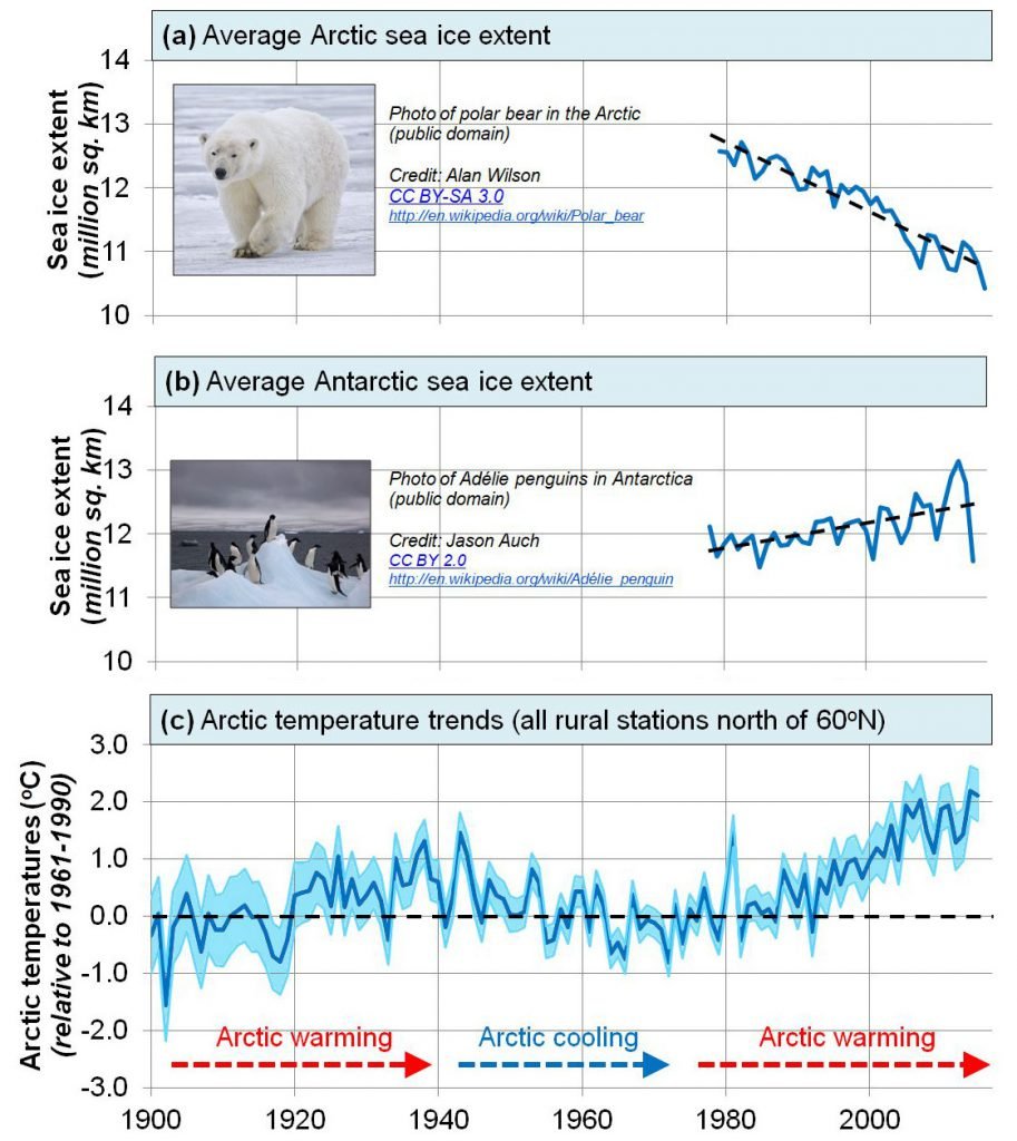
We can see that, yes, the average Arctic sea ice extent has generally decreased since the start of the satellite record. Although, interestingly the average Antarctic sea ice extent has generally increased over the same period. However, when we look at the much longer Arctic temperature record we can see that this is not surprising. The Arctic region has been warming since the late 1970s (when the satellite records began), but this followed a period of Arctic cooling from the 1940s to the early 1970s! In other words, if the satellite records had begun in the 1940s and if the Arctic sea ice extent is related to Arctic temperatures, we would probably have detected a period of Arctic sea ice growth.
4. What about the Antarctic?
As an aside, some readers may have been surprised to see that Antarctic sea ice extent has been generally increasing since the start of the satellite record, as there seems to be a popular belief that the Antarctic ice is melting dramatically. There seem to be several factors for this mistaken belief:
1. Conflation between the Arctic and the Antarctic. Most people who aren’t actively interested in the polar regions have a tendency to conflate the two polar regions together. If you’re unsure which is which, the Arctic is the polar region in the Northern Hemisphere, and it’s the place where you can find polar bears. The Antarctic is the polar region in the Southern Hemisphere, and is the place where you can find penguins.
2. The computer models have been predicting since the 1980s that the Antarctic ice sheets and sea ice should have been melting dramatically from the model-predicted human-caused global warming. Some studies have tried to come up with post-hoc explanations for why the models were wrong about this, e.g., Zhang, 2007 (Open access). However, while the model predictions were actually wrong, they were so widely reported that many people seem to have assumed the predictions were correct.
3. The one part of Antarctica which does seem to have seen warming – the Antarctic Peninsula in West Antarctica – seems to receive a lot of media attention. In particular, the occasional collapse of different parts of the Larsen ice shelf over the last few decades has been widely publicised. For instance, the discussion of the 2002 collapse of Larsen B shelf was an especially dramatic part of Al Gore’s 2006 film (An Inconvenient Truth). And the recent July 2017 collapse of part of the Larsen C shelf (coincidentally, just in time for Al Gore’s new film, “An Inconvenient Sequel”!) was reported by CNN, the BBC, The Guardian, the Telegraph, etc.
To provide some context for this final point, it might be helpful to briefly compare the Antarctic Peninsula with the rest of the Antarctic continent. The maps below are adapted from Figure 3 of O’Donnell et al., 2011 (Open access) and show the distributions of different temperature trends across Antarctica for two time periods, 1979-2003 and 1957-2006. The red colours correspond to warming trends and the blue colours correspond to cooling trends.
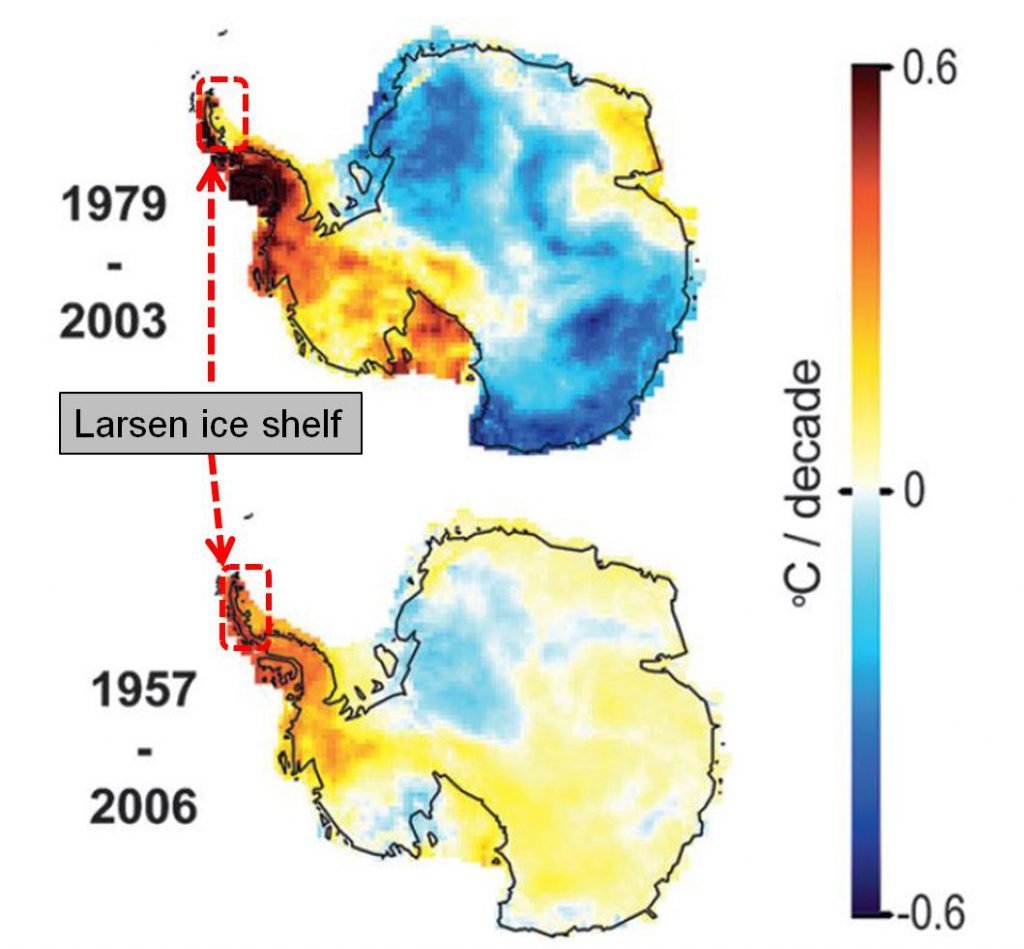
For any colour-blind readers who find O’Donnell et al.’s colour scheme confusing, while the top left parts of the map (the Larsen ice shelf and the rest of the Antarctic Peninsula) showed a fairly “dark red” warming trend for these periods, most of the rest of the continent showed little or no warming, and many regions showed “blue” cooling trends!
O’Donnell et al., 2011 calculated a warming trend for the Antarctic Peninsula of +0.35 ± 0.11°C/decade for the 1957-2006 period, but they didn’t find any significant warming for the continent as a whole. So, for the rest of this post, we will mostly focus on Arctic sea ice, since this region has shown warming over the satellite era.
5. What does the IPCC say?
For many people, the UN’s Intergovernmental Panel on Climate Change (IPCC) reports are the go-to source for information on climate change. Indeed, from several discussions we have had with the Irish government and governmental agencies, we have been told that in Ireland the science considered for Irish governmental policies is currently limited to what is contained in the IPCC reports. It is likely that many other countries have taken a similar approach.
In the IPCC Working Group 1’s most recent Assessment Report (5th Assessment Report, 2013 – henceforth IPCC 5AR), their Summary for Policymakers section placed a particular focus on the Arctic satellite trends to support their claim that “(w)arming of the climate system is unequivocal, and since the 1950s, many of the observed changes are unprecedented over decades to millennia… the amounts of snow and ice have diminished…” (Section B, Summary for Policymakers, IPCC 5AR).
According to the IPCC, the key points on trends in “the cryosphere” (i.e., the frozen parts of the planet) are as follows:
“Over the last two decades, the Greenland and Antarctic ice sheets have been losing mass, glaciers have continued to shrink almost worldwide, and Arctic sea ice and Northern Hemisphere spring snow cover have continued to decrease in extent (high confidence)”
IPCC 5AR, [Section B3, Summary for Policymakers IPCC 5AR]
Although they acknowledged later in their report that Antarctic sea ice extents had actually increased over the same period, the authors seem to have felt this wasn’t as noteworthy as the Arctic decrease. Instead, they focused on the trends for the Greenland and Antarctic land ice (“ice sheets”) which was based on only two decades of data.
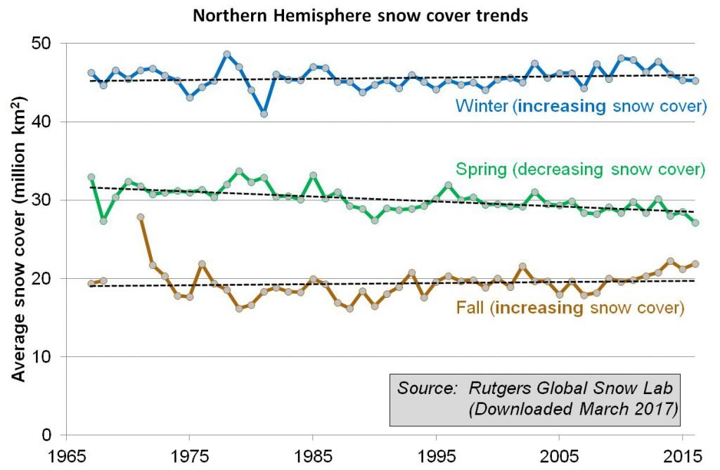
Also, while they felt it was important to point out that Northern Hemisphere spring snow cover showed a decrease over the last few decades, they didn’t point out that the snow cover for winter and fall showed a slight increase over the same period.
So, the IPCC summary of trends for the cryosphere seems to have been remarkably selective and biased towards only describing those datasets which showed decreases in ice cover.
Moreover, we should remember that the IPCC’s 5th Assessment Report only considered the scientific literature up until mid-2013, and their 6th Assessment Report isn’t due until 2021. Therefore, it is worth looking at some of the advances since 2013.
For instance, in 2015 a NASA study of the Antarctic ice sheets found that they had been gaining mass over the last two decades (Zwally et al., 2015 – open access) – see here for a press release summary. Although some researchers have disputed the NASA study, e.g., see here, it directly contradicts the one of the IPCC’s main conclusions on ice cover. With that in mind, let us now consider what happened to Arctic sea ice extents before the satellite era.
6. Arctic sea ice changes during the pre-satellite era
One of the reasons there has been such interest in the satellite-based sea ice records is that the satellites are monitoring most of the planet and provide almost continuous coverage. But, people were also monitoring Arctic sea ice before the satellite era using various land, ship, submarine, buoy and aircraft measurements.
In the 1990s and early 2000s, Profs. Walsh and Chapman decided to try to combine together some of these pre-satellite measurements to extend the satellite record back to the early 20th century. You can see from the figure below, that their estimates implied that there was almost no variability in Arctic sea ice extent before the satellite era!

For many years, their “Walsh and Chapman dataset” was assumed to be fairly reliable and accurate, and it was widely used by the scientific community.
As can be seen from this clip, it even was shown in Al Gore’s 2006 An Inconvenient Truth film, although Gore seems to have been confused about what data he was showing and mistakenly claims that the Walsh & Chapman graph is based on “submarine measurements of ice thickness”.
By the way, we suspect the submarine measurements Gore refers to are probably the ones from Rothrock et al. 1999 (Open access), but those measurements are a lot more limited than Gore implies, and it had already been published in 1999, so it’s unclear why Gore felt he needed to “persuade them to release it”.
However, when we looked in detail at the available pre-satellite data, we realised that there were serious problems with the Walsh & Chapman estimates.
The main problem is that the pre-satellite data is unfortunately very limited. If a ship travelled through a particular region in a given season, then they could have reported how much ice was in that region, or whether it was ice-free. But, what do you do if there were no ships (or airplanes, buoys, etc. ) in that region?
It seems that in a lot of cases when Walsh & Chapman didn’t have measurements for a given region they effectively ended up assuming that those regions were ice-filled!
For example, in the figure below, the map on the left shows the main data source used by Walsh & Chapman for August 1952. It’s an estimate of the Arctic sea ice extent that was compiled by the Danish Meteorological Institute (DMI). On the map, the red lines indicate the ice boundaries where the DMI actually had taken measurements – in this case, mostly around Greenland and eastern Canada. The white regions on the rest of the map indicate regions where “ice supposed, but no information at hand”. In other words, the DMI was guessing that there might be ice there, but didn’t know!
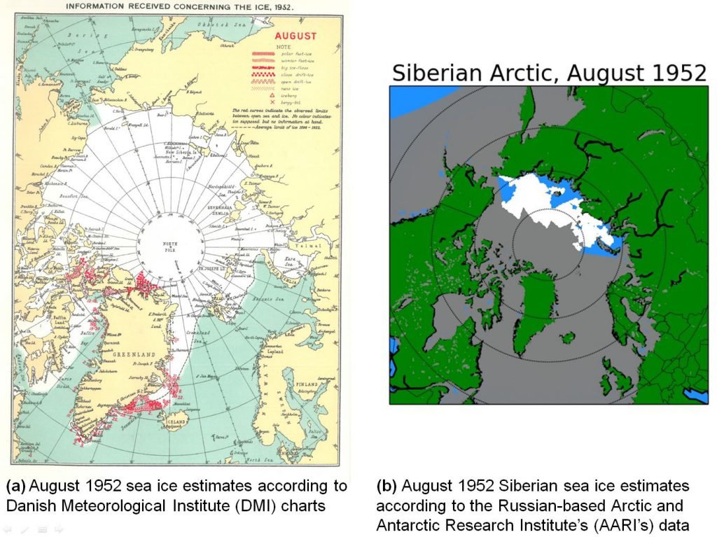
This period was in the middle of the Cold War and unfortunately there was very little data-sharing between the Soviet Union and western countries like Denmark. So, the DMI had almost no information for the Russian Arctic. However, as it happens, the Russians were making their own observations of the Russian sea ice using aerial reconnaissance, ships, buoys, etc. In the 21st century, some Russian scientists began digitizing this data and publishing it. The map on the right hand side shows the Russian observations for the exact same month (August 1952). The blue regions were ice-free, the white regions were ice-filled and the grey regions were regions they weren’t measuring.
Notice how all of the Siberian Arctic regions that the Russians could see were ice-free were assumed to be ice-filled by the DMI?
The Walsh & Chapman estimates assumed that the DMI’s guesses were accurate, but they weren’t!
Now, we must point out that while we were carrying out our study which used both the Russian data and the DMI data, Walsh and Chapman also updated their estimates. And, the new 2017 Walsh et al. dataset (Open access) uses the Russian dataset too.
However, as we discuss in the paper, their approach still ends up effectively assuming that most of the regions without observations were “ice-filled”! To us, this is a very unwise assumption, particularly for the earlier years when there were very few observations.
So, we realised that the pre-satellite data needs to be re-calibrated to account for the limited observations and also the changes in different data sources (airplanes vs. ships vs. buoys, etc.) for different regions and times. For a detailed discussion of our re-calibration procedure, we’d recommend reading our paper (Abstract here). But, essentially, we used Arctic temperature records from weather stations on land to ensure that the sea ice measurements from each of the data sources show a similar response to Arctic temperatures to that observed in the satellite era.
After re-calibration, we obtained the following result including error bars:
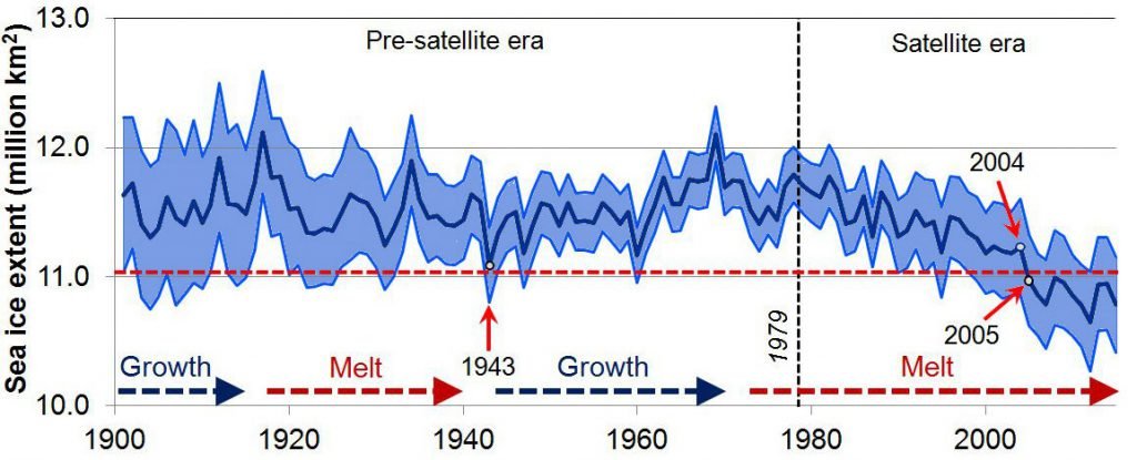
There are several points to notice:
- While Arctic sea ice has indeed been generally decreasing since the start of the satellite era, this coincidentally followed a period of Arctic sea ice growth from the 1940s to 1970s!
- Indeed, the Arctic seems to routinely alternate between periods of sea ice growth and sea ice retreat. This is quite different from the previous Walsh & Chapman estimates which implied that Arctic sea ice was almost constant before the satellite era!
- If we ignore the error bars, perhaps you could argue that sea ice extents since 2005 are lower than they have been since 1901. However, we shouldn’t ignore the error bars. We can see that the lower error bars for the pre-satellite era have been lower at several stages than the upper error bars for the entire satellite era. In other words, the recent low values are still consistent with our estimates for the pre-satellite era.
A useful test of the Global Climate Models used by the IPCC reports (called “CMIP5” models) is to see how good they are at “hindcasting” Arctic sea ice trends. A “hindcast” is a “forecast” that goes backwards in time.
Below, we compare our summer reconstruction with the average of the IPCC’s climate model hindcasts.
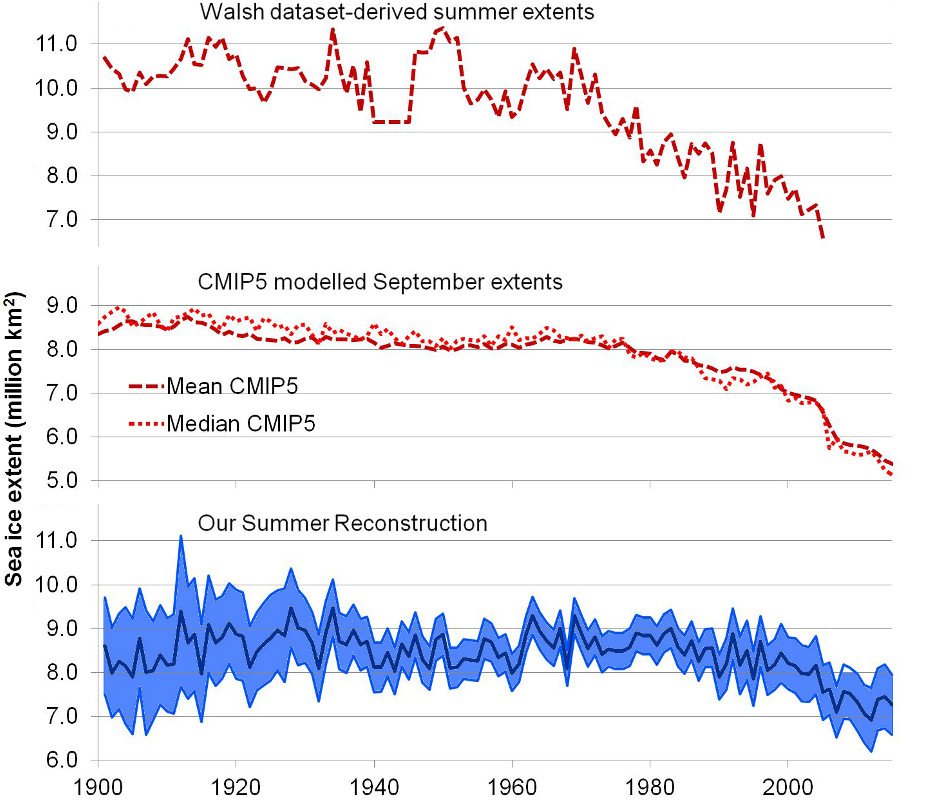
We can see that the IPCC climate models were completely unable to reproduce the different growth and retreat periods.
7. Arctic sea ice changes over the last 10,000 years
In recent years, several researchers have developed an interesting new “proxy” for Arctic sea ice cover, called “PIP-25”, which can be used for estimating long-term changes in Arctic sea ice extent. A “proxy” is a type of measurement which can be used as an indirect estimate of some property – in this case, Arctic sea ice cover.
In 2007, Prof. Simon Belt and colleagues noticed that a type of algae which seems to only grow in sea ice produces a specific group of molecules called “IP-25” – see Belt et al., 2007 (link to abstract, link to Google Scholar). They found that if the sea ice in a region melts in the summer, some of this IP-25 will sink to the bottom of the ocean as part of the ocean sediment. However, if there is no sea ice, or if the sea ice remains frozen all year, then the ocean sediment for that year doesn’t contain any IP-25. They realised that if you drill an ocean sediment core for that region, you could use the presence of IP-25 as a proxy for “seasonal sea ice”, i.e., ice that only forms for part of the year.
Later, it was realised that if the IP-25 was absent you could also use the presence of certain species of phytoplankton to distinguish between periods with permanent ice cover (less phytoplankton growth because the sea ice reduces the amount of sunlight under the ice) and ice-free conditions (more phytoplankton growth). So, by combining the IP-25 and phytoplankton measurements in an ocean sediment core, you have a “PIP-25” proxy series (“P” for phytoplankton) which can distinguish between three types of sea ice cover:
- Permanent ice cover (low IP-25 and low phytoplankton)
- Seasonal ice cover (high IP-25)
- Mostly ice-free (low IP-25, but high phytoplankton)
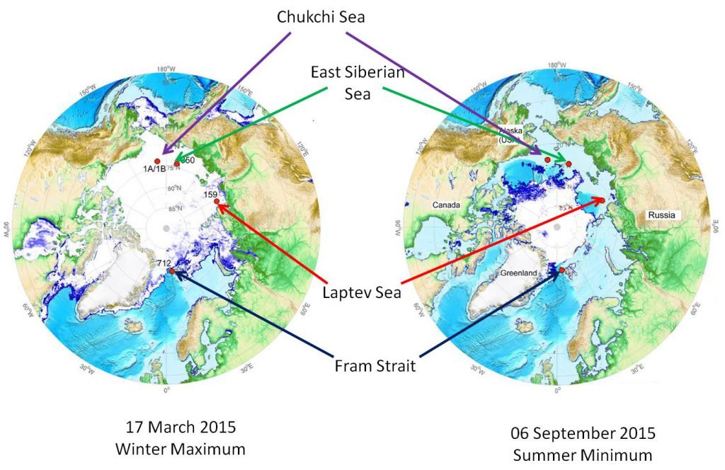
In Stein et al., 2017 (abstract here, although the paper is paywalled), Prof. Rüdiger Stein and colleagues presented the results from two new PIP-25 ocean sediment cores (from the Chukchi and East Siberian Seas) and compared them with another two cores from earlier studies in different parts of the Arctic (one from the Laptev Sea and the other from Fram Strait).
We have adapted the maps below from Figure 2 of Stein et al., 2017, with some editing to make the locations easier to see. The maps show the location of the four cores relative to the maximum and minimum Arctic sea ice extents in 2015. The four cores are quite well distributed throughout the Arctic and so should give us a reasonable estimate of how sea ice has varied throughout the Arctic over longer time scales.
Notice that all four locations were ice-free during the summer minimum (06 September 2015), but three of the locations (the Chukchi Sea, East Siberian Sea and Laptev Sea cores) were ice-covered during the winter maximum. In other words, these three locations currently experience “seasonal sea ice cover”. The remaining location (the Fram Strait core) was still outside the ice extent even during the winter maximum (17 March 2015). So, currently that location is “mostly ice-free”. However, as we will see, the PIP-25 sediment cores suggest that these conditions have changed over time.
For the four plots below, we have digitized the PIP-25 results for the four sediment cores from Figure 10 of Stein et al., 2017. Roughly speaking, PIP-25 values below about 0.5 indicate that the region was mostly ice-free at the time (Stein et al., 2017 use the term “reduced sea-ice cover”), while values above about 0.7 indicate that the region was permanently ice-covered, i.e., it remained ice-covered throughout the entire year (Stein et al., 2017 use the term “perennial sea-ice cover”). Values between 0.5 and 0.7 indicate that the region experienced “seasonal ice coverage”, i.e., it was usually ice-covered during the winter maximum, but ice-free during the summer minimum.
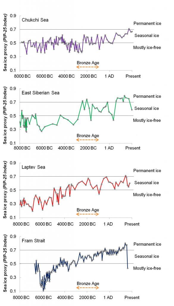
As we discussed above, three of the locations (the Chukchi Sea, East Siberian Sea and Laptev Sea sites) currently experience “seasonal ice coverage” and the Fram Strait site is currently “mostly ice-free”. However, according to the PIP-25 data, over the last 10,000 years, all four of these sites have gone through extensive periods with less ice coverage as well as extensive periods with more ice coverage. In particular, all four locations seem to have experienced much less ice coverage 6,000-8,000 years ago (i.e., well before the Bronze Age) than they do today.
This suggests two points particularly relevant to our discussion:
1. Arctic sea ice extents have shown a lot of variability over the last 10,000 years (at least), so we shouldn’t be too surprised that the extents have substantially changed since the start of the satellite records in 1978.
2. Despite the widespread belief that the current Arctic sea ice coverage is “unusually low” (based on a combination of the 1978-present satellite records and computer model results), it seems that the coverage was actually a lot lower 6,000-8,000 years ago.
8. Summary
- While Arctic sea ice has generally declined since the start of the satellite era in 1978, Antarctic sea ice has generally increased over the same period.
- While there seems to have been some warming in part of Antarctica (the western peninsula) and this has received a lot of media attention, most of the continent hasn’t warmed and in many regions has actually cooled.
- After re-calibrating the pre-satellite data, it now transpires that Arctic sea ice has alternated between periods of sea ice retreat and growth. The satellite record coincidentally began at the end of one of the sea ice growth periods. This has led to people mistakenly thinking the post-1978 sea ice retreat is unusual.
- The results from new sea ice proxies taken from ocean sediment cores suggest that Arctic sea ice extent has varied substantially over the last 10,000 years. They also suggest that Arctic sea ice extent was actually less before the Bronze Age than it is today.
- The current Global Climate Models are unable to reproduce the observed Arctic sea ice changes since 1901, and they seem to dramatically underestimate the natural sea ice variability.
Citation for the study
R. Connolly, M. Connolly and W. Soon (2017). Re-calibration of Arctic sea ice extent datasets using Arctic surface air temperature records. Hydrological Sciences Journal, 62, 1317-1340. https://doi.org/10.1080/02626667.2017.1324974 (pdf).